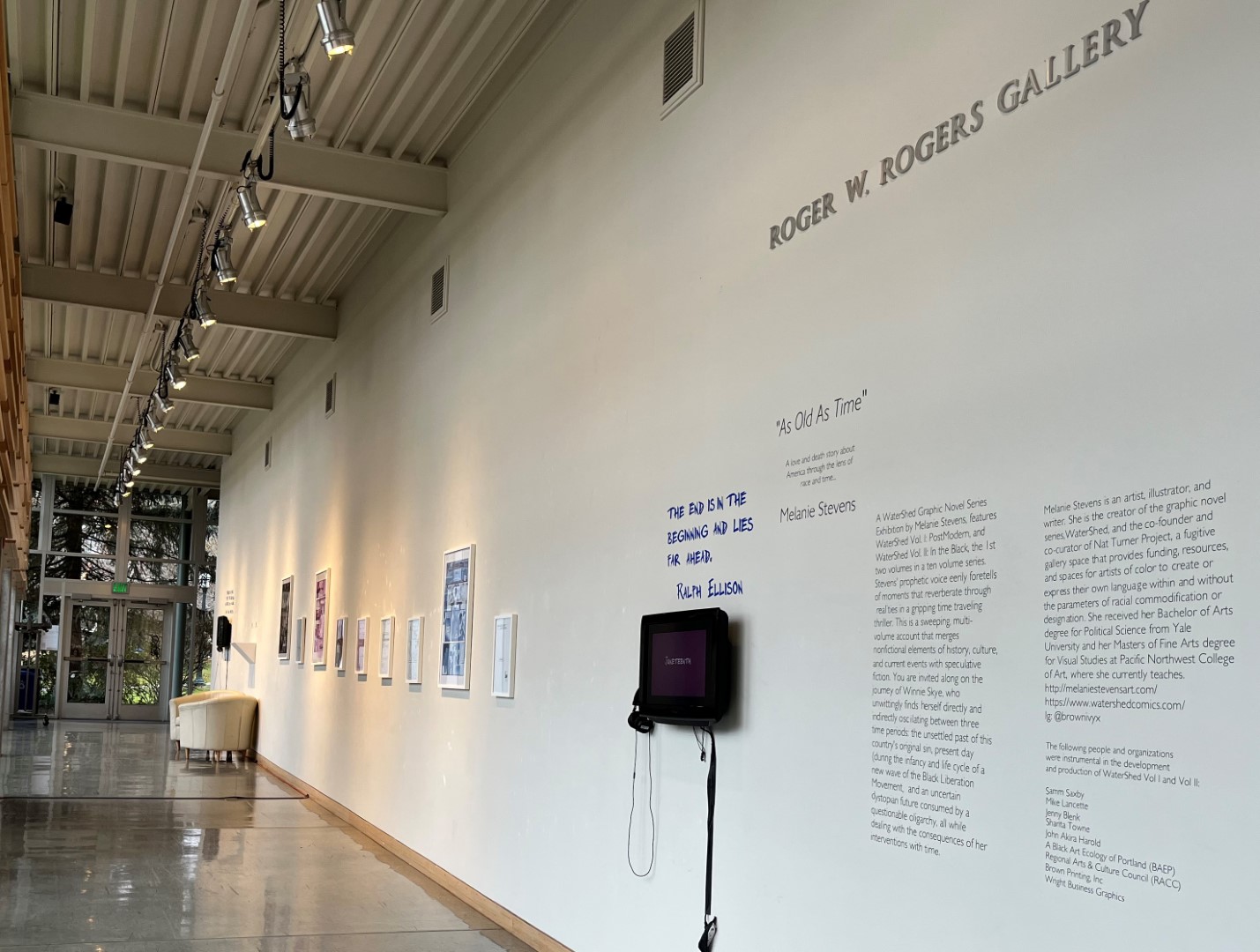
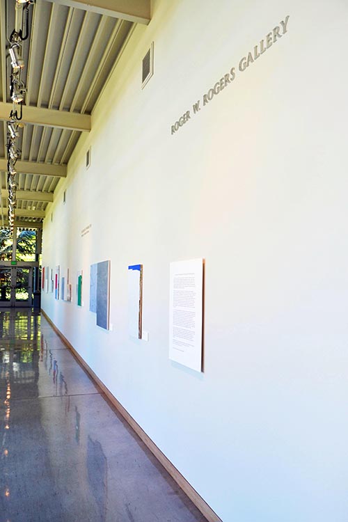
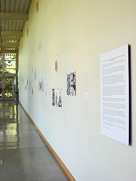
Roger W. Rogers Gallery
The Roger W. Rogers Gallery is housed within the Mary Stuart Rogers Music Center and is named in memory of the father of Colonel John S. Rogers '63. Both the Mary Stuart Rogers Music Center and the Rogers Gallery were made possible by a generous gift from the Mary Stuart Rogers Foundation. The Department of Art has administered the gallery since 2009, and curates two exhibitions a year in the Rogers Gallery.
The Mary Stuart Rogers Music Center is open from 8 am to 5 pm Monday-Friday during the regular semester.
Current Exhibitions:
-
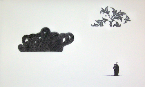
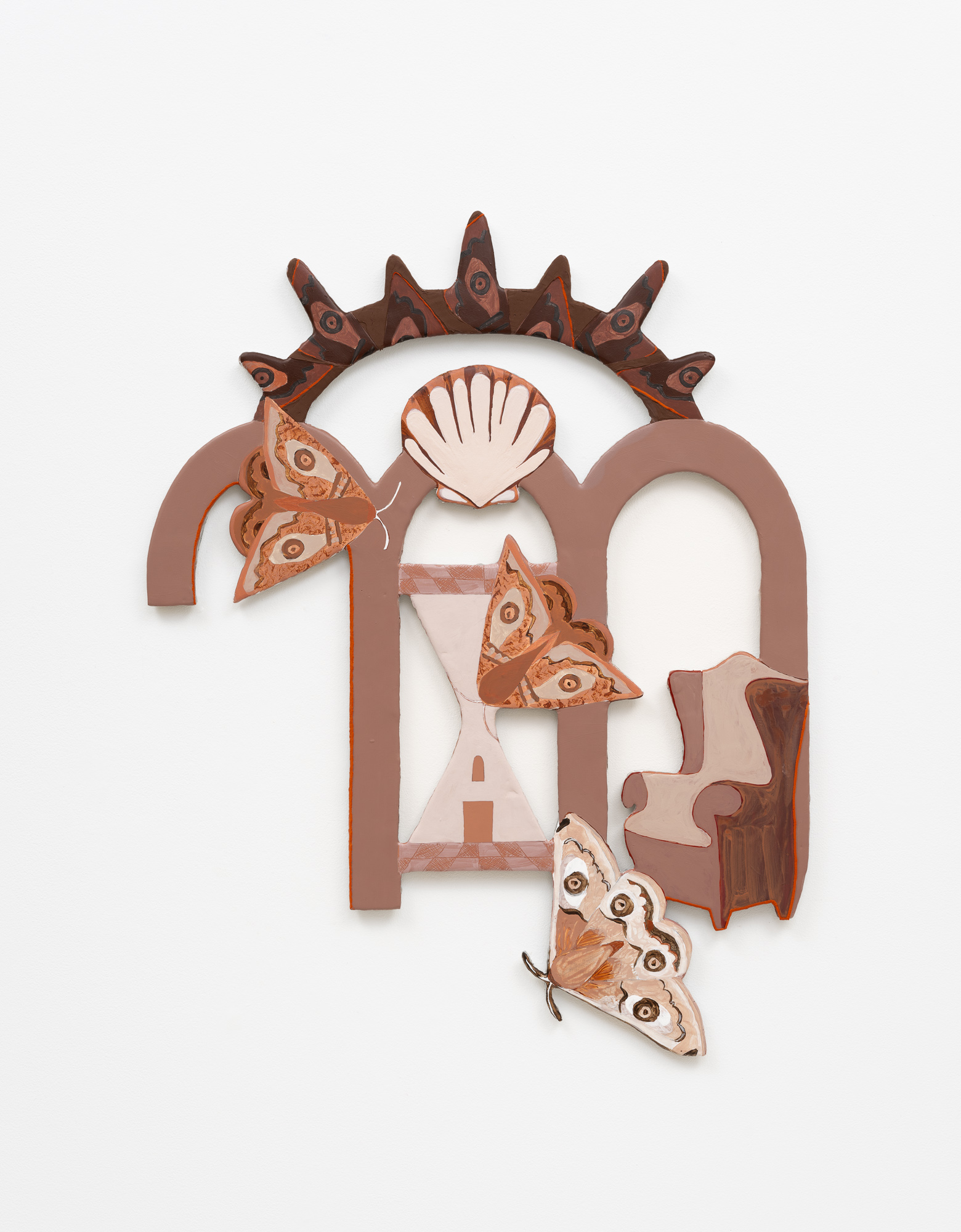
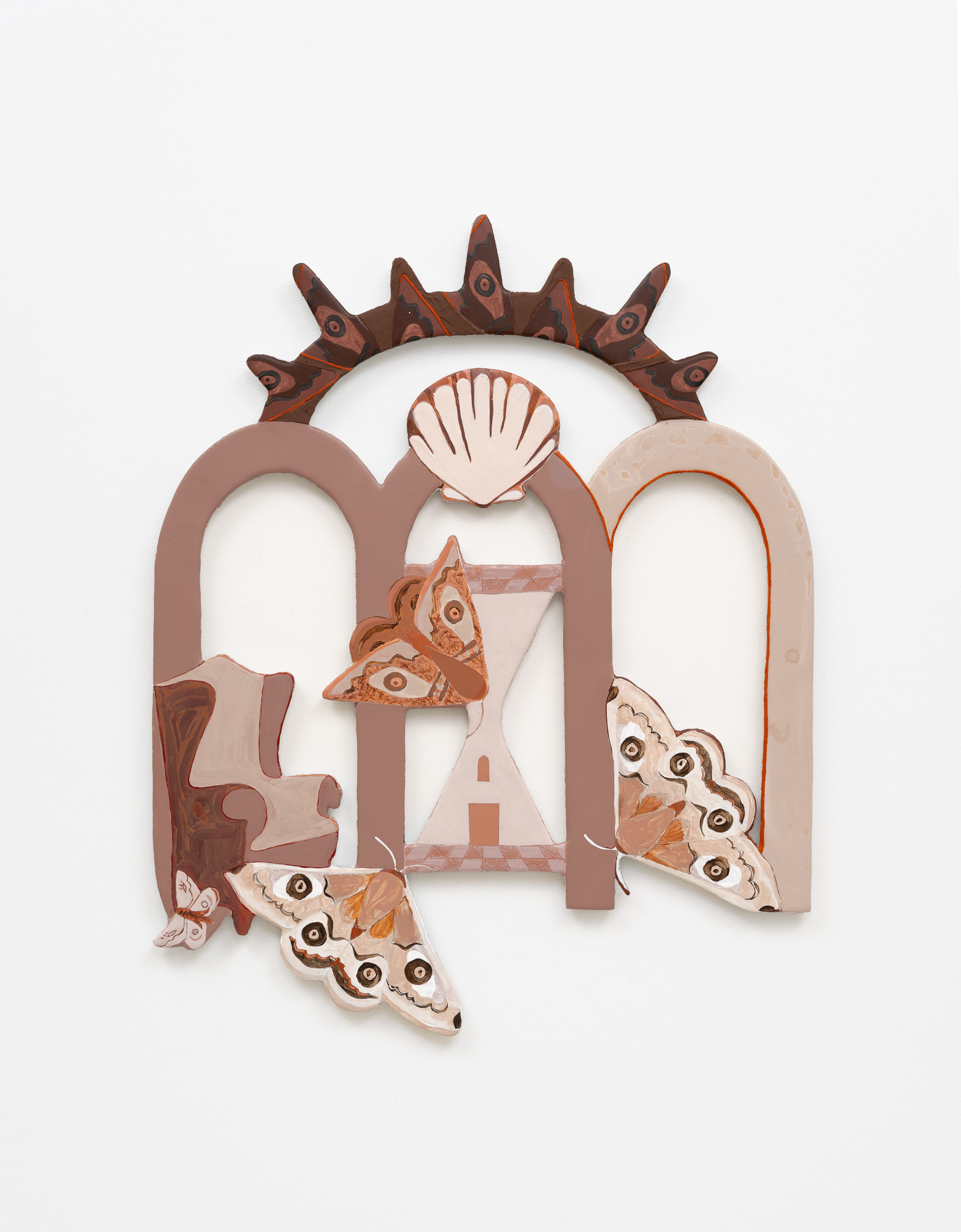
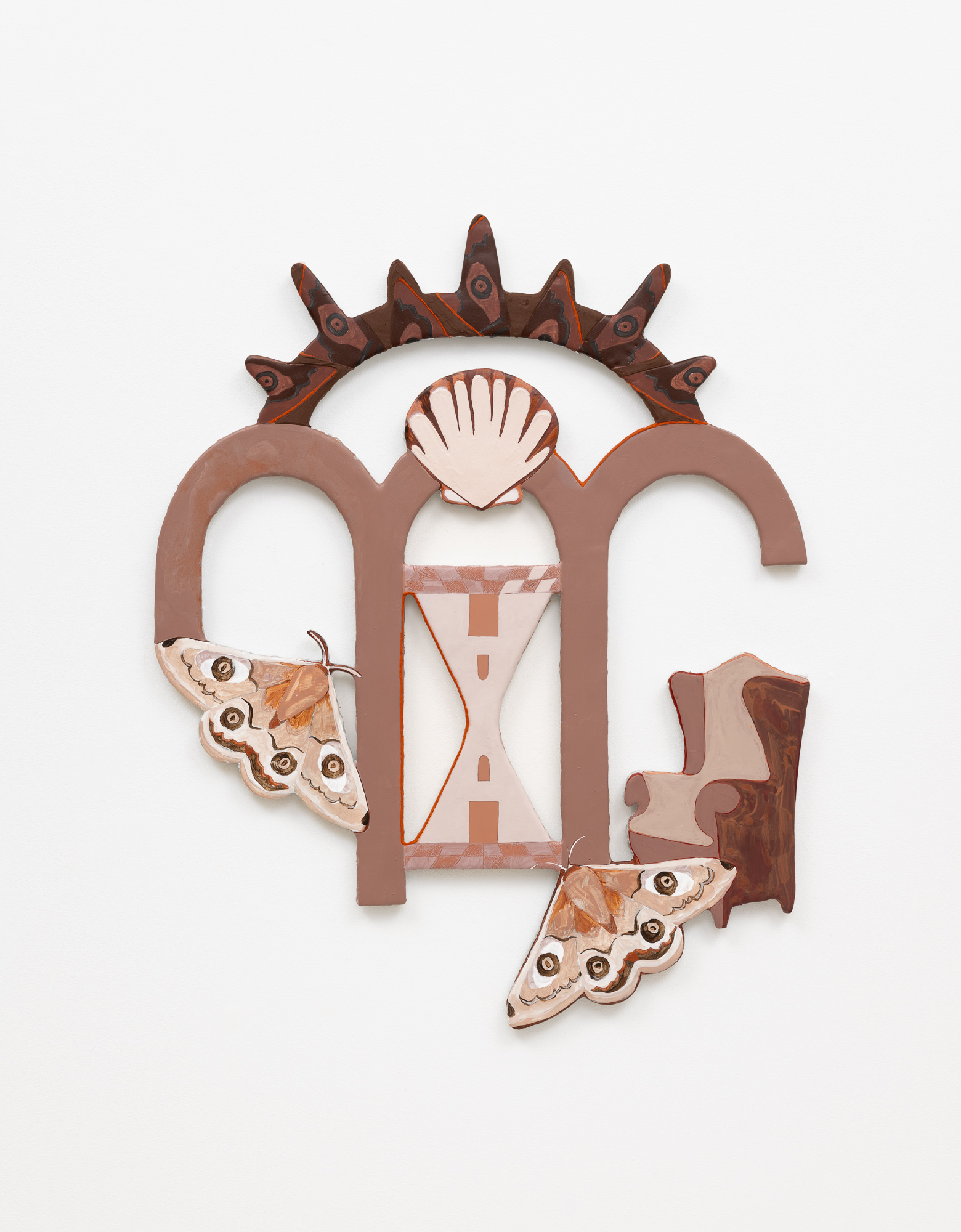
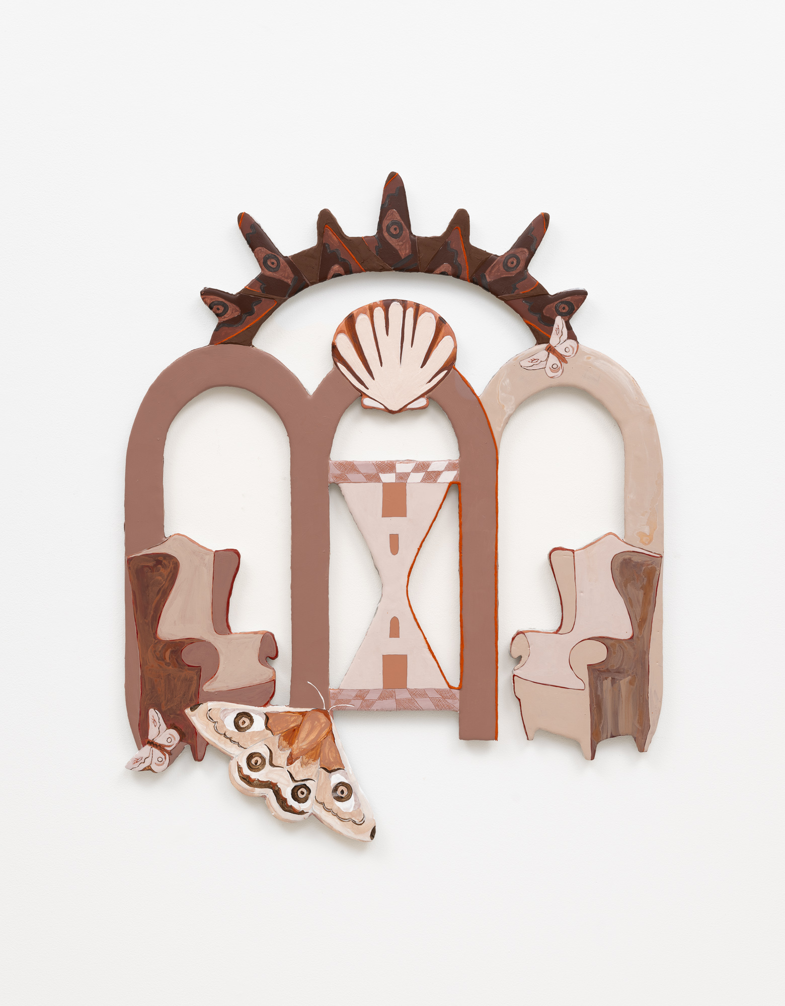
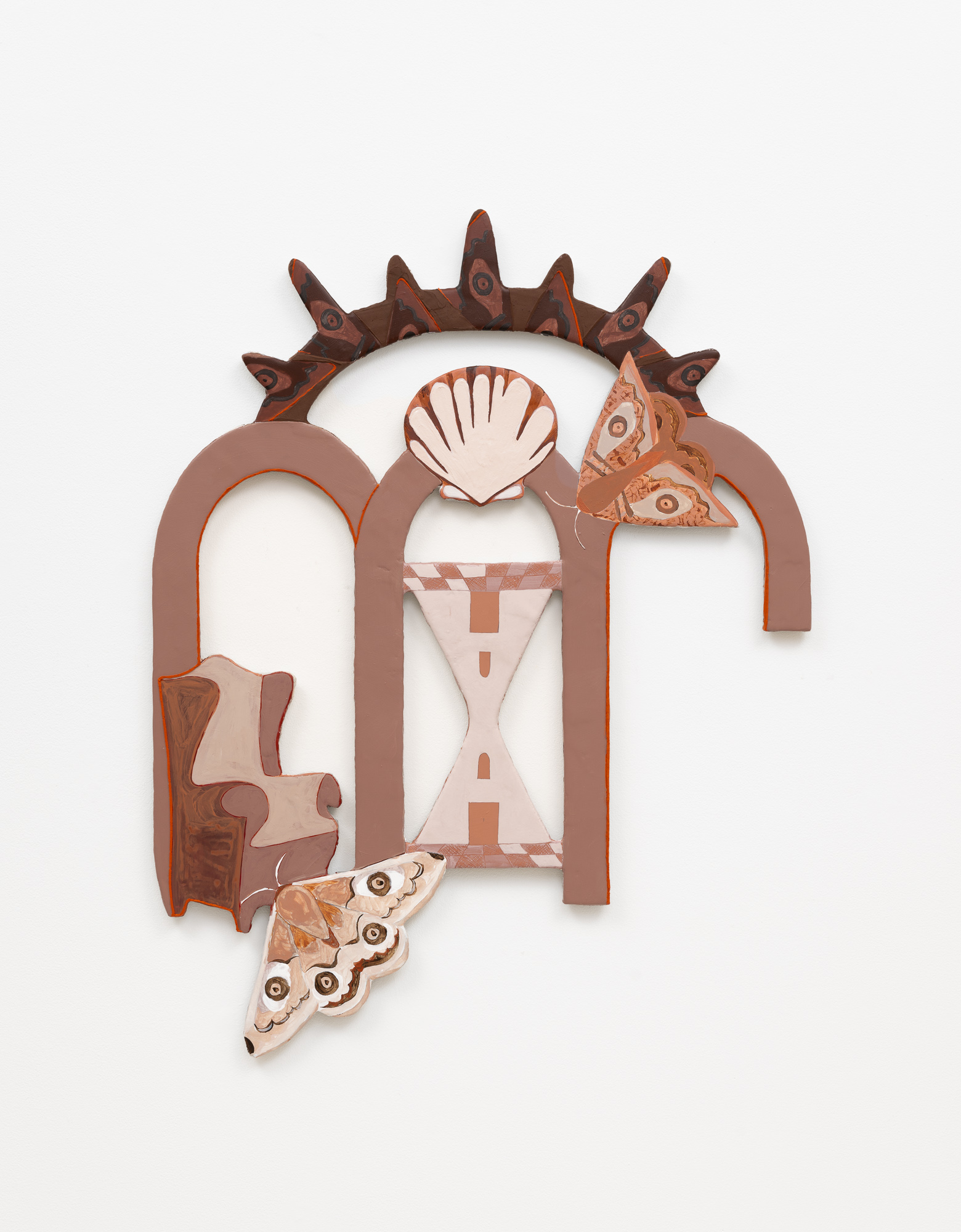
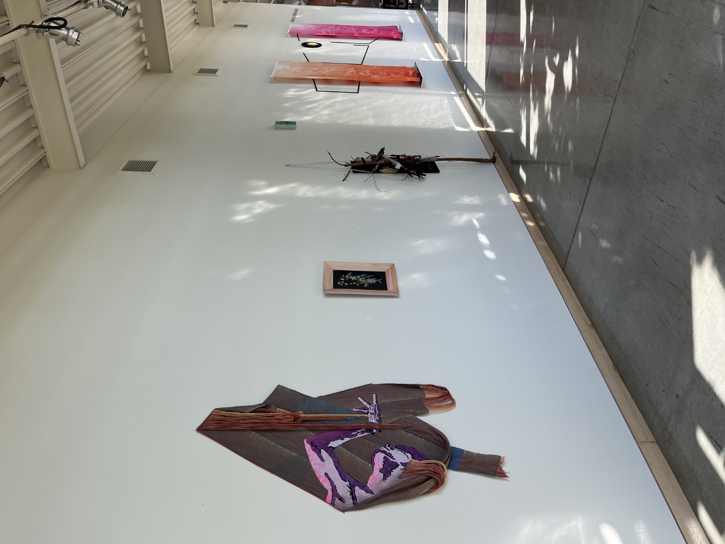
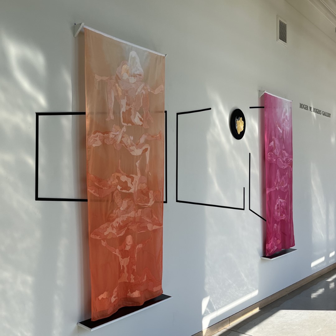
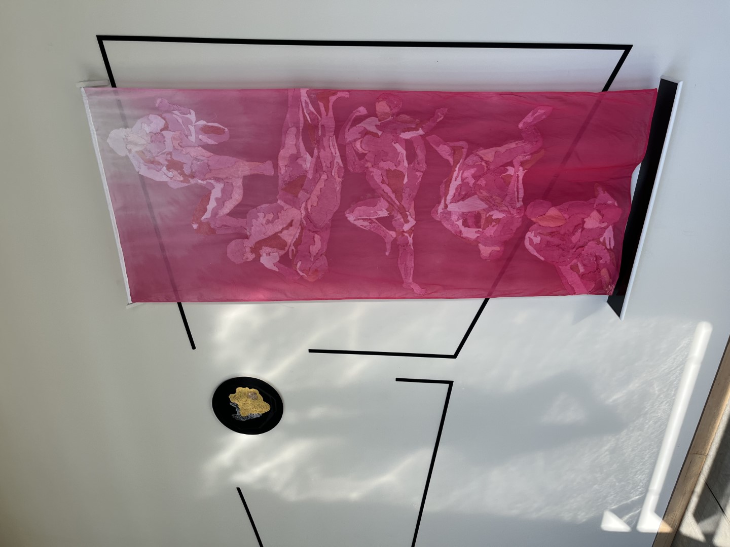
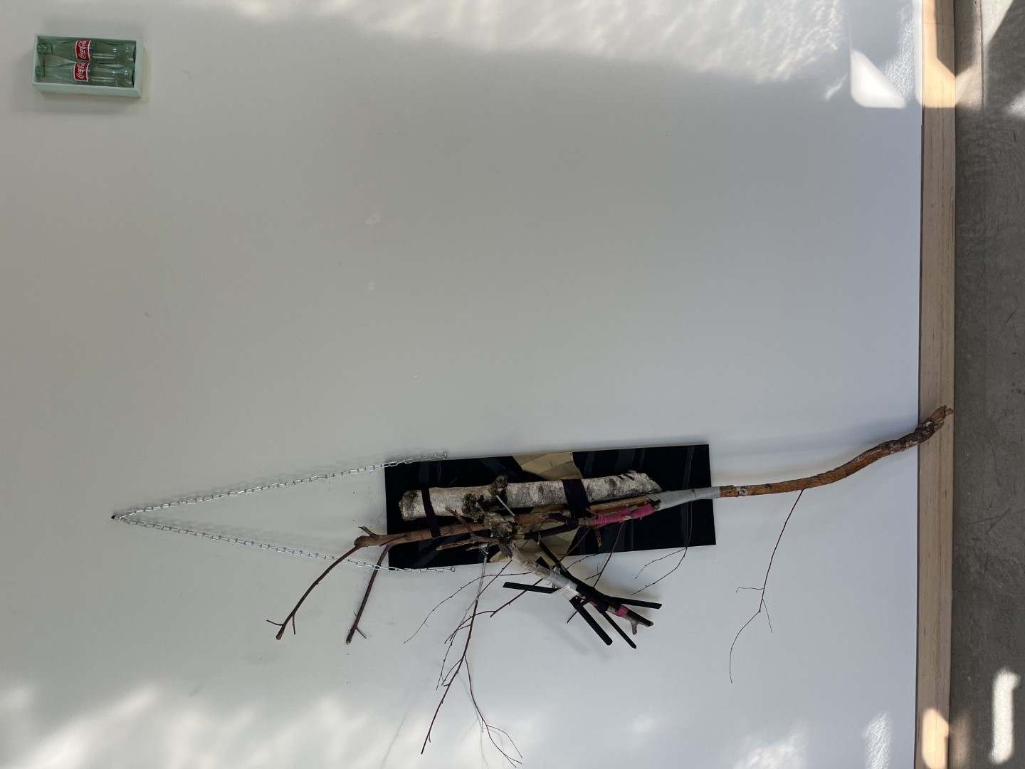
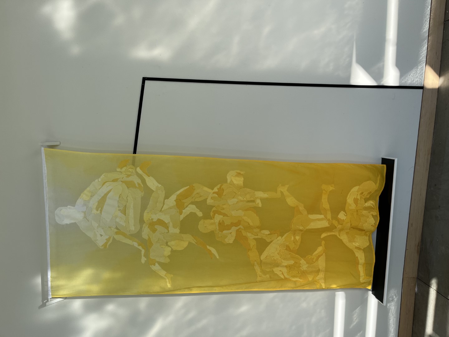
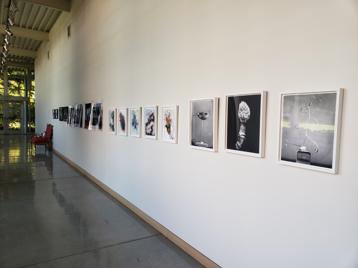
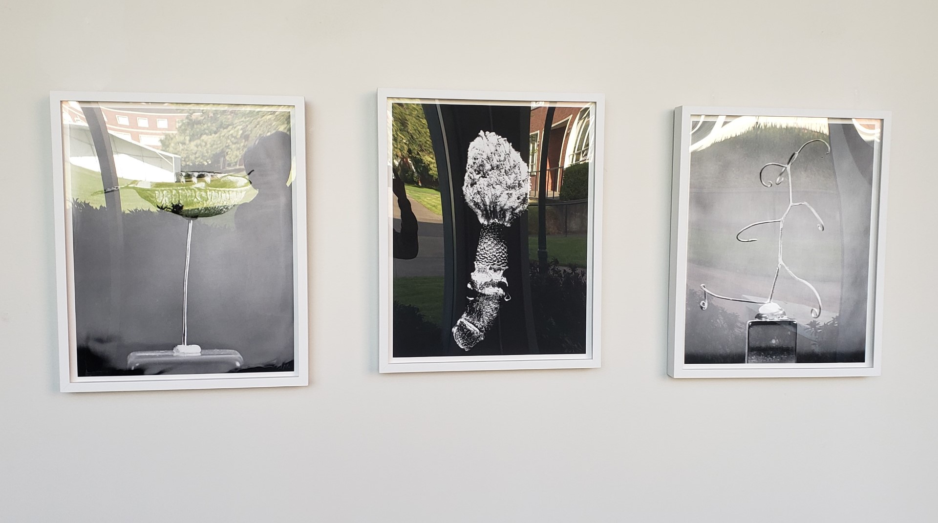
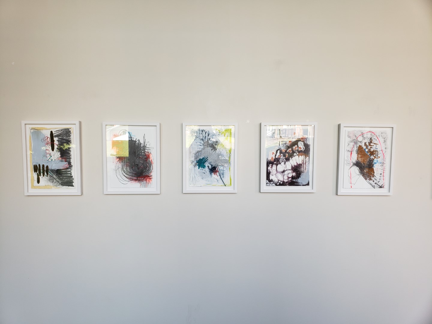
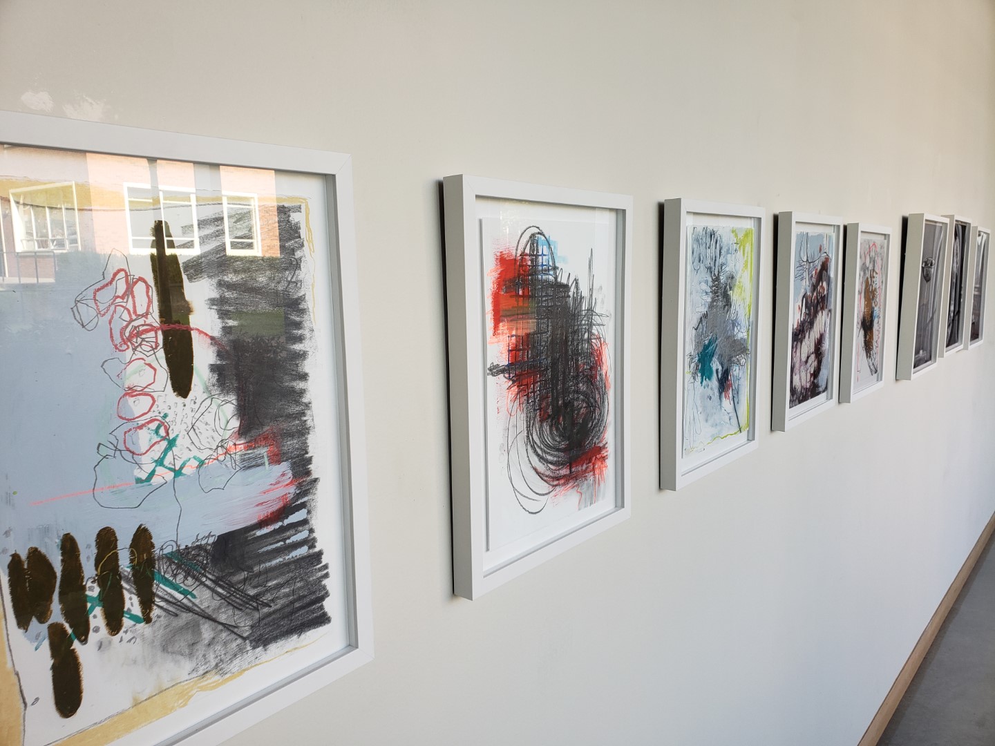
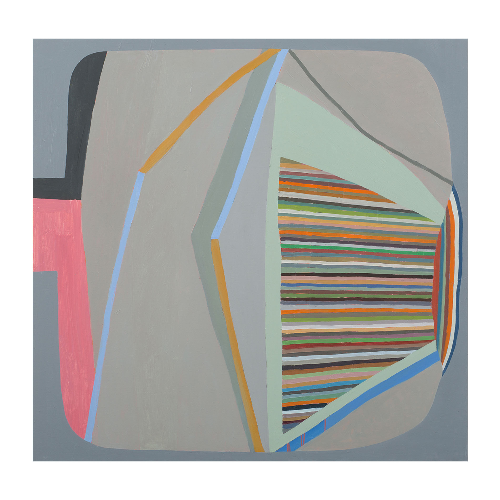
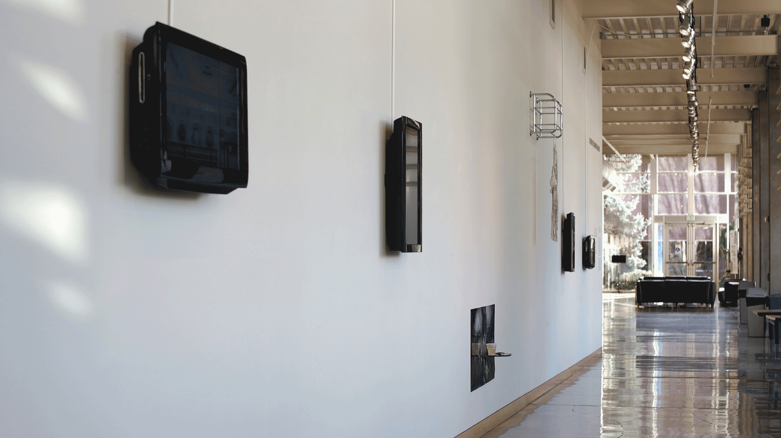
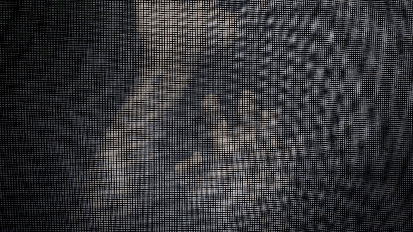
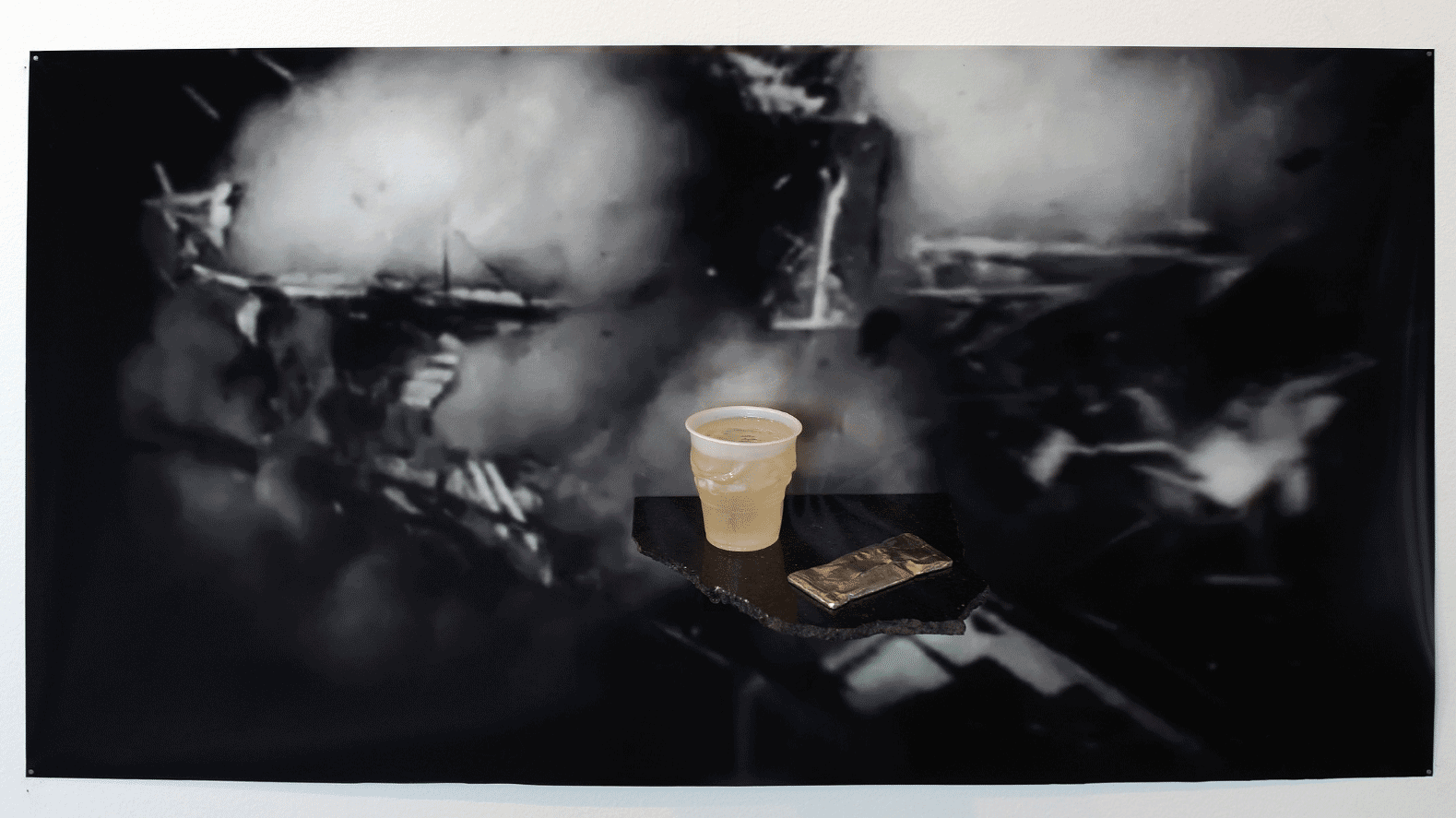
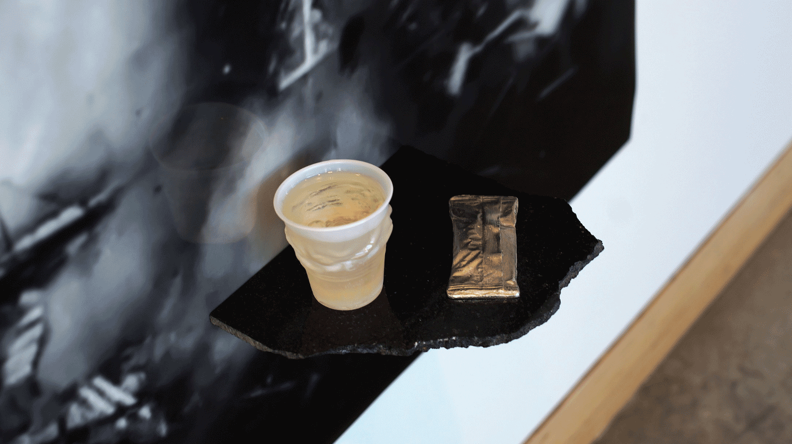
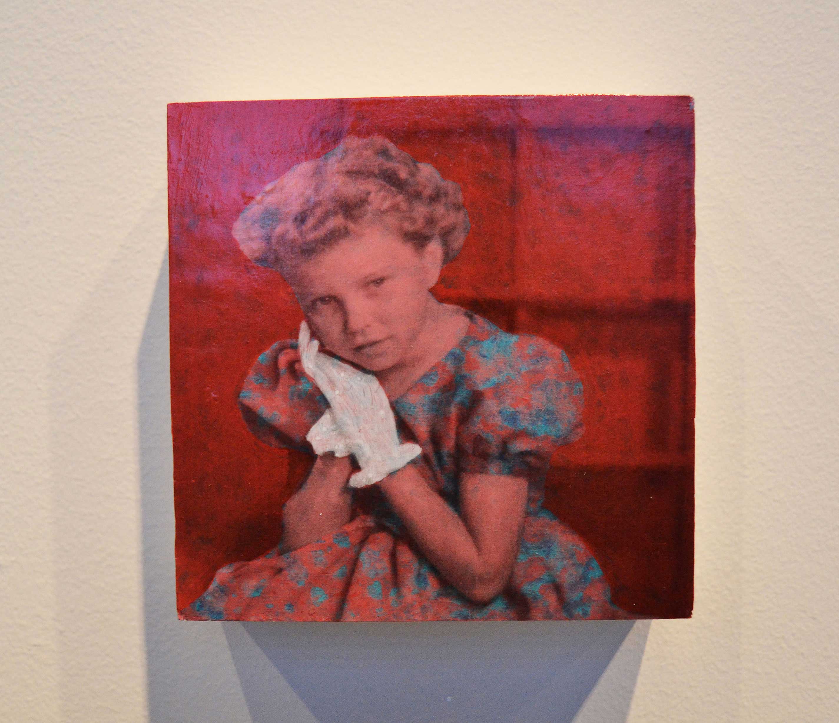
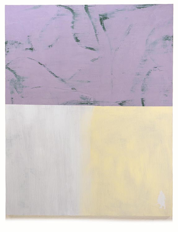
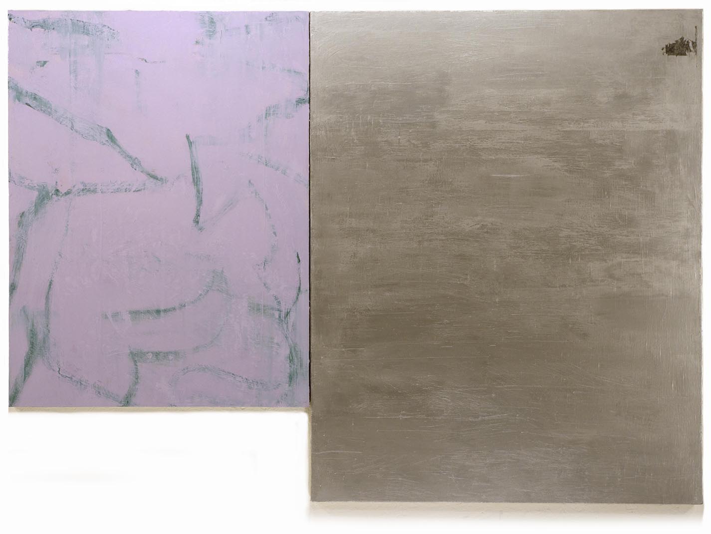
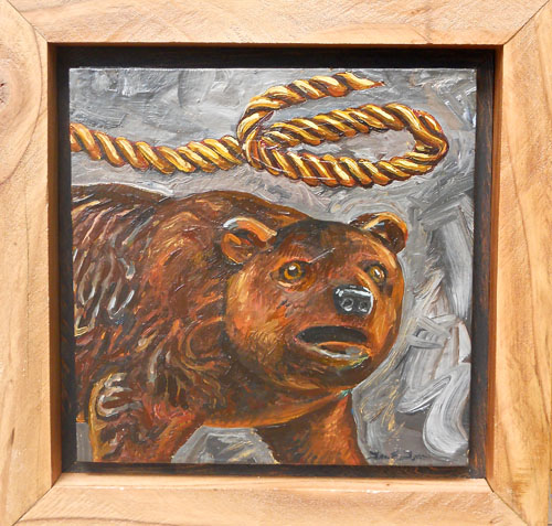
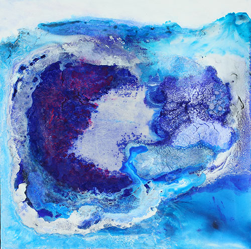
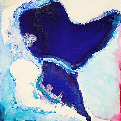
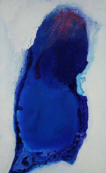
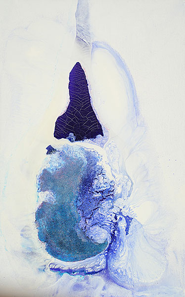
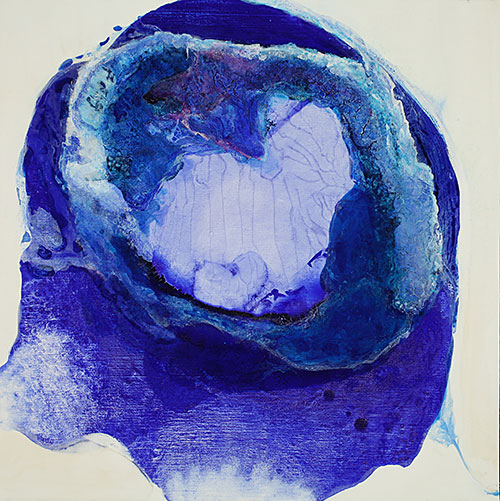
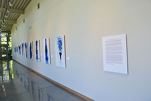
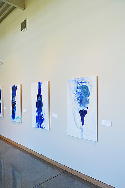
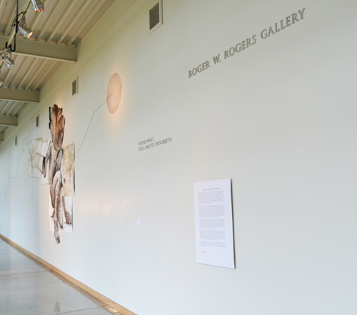
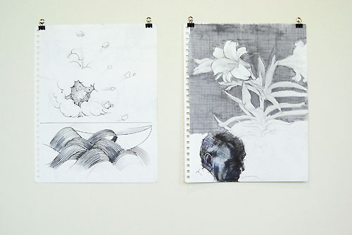
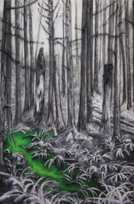
What Death in All Its Hunger Cannot Consume: Rachael Zur
(Fall 2025)
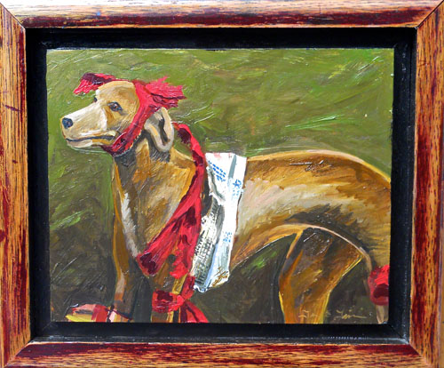
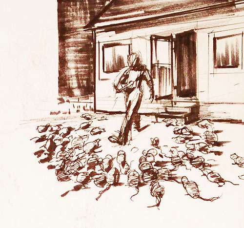
Memory meanders towards grandfather’s chair, where he would often read aloud. The placement of the chair in the room shifts each time it is called to mind, as remembering is also an act of reimagining. Reimagining mingles with fragmented family stories to capture the essence of a life. Objects from his home hold echoes of the care he had offered to others. Love, being a verb (wherein gestures of care generate energy, an energy that can’t be destroyed), flavors this home, imbuing it with a grandeur that the walls never expected to hold. The details about the man he once was grow foggy, while his warmth feels present still.
Come time,
Come rust and moths,
Come decay,
Feast on everything!
and find that love
still remains.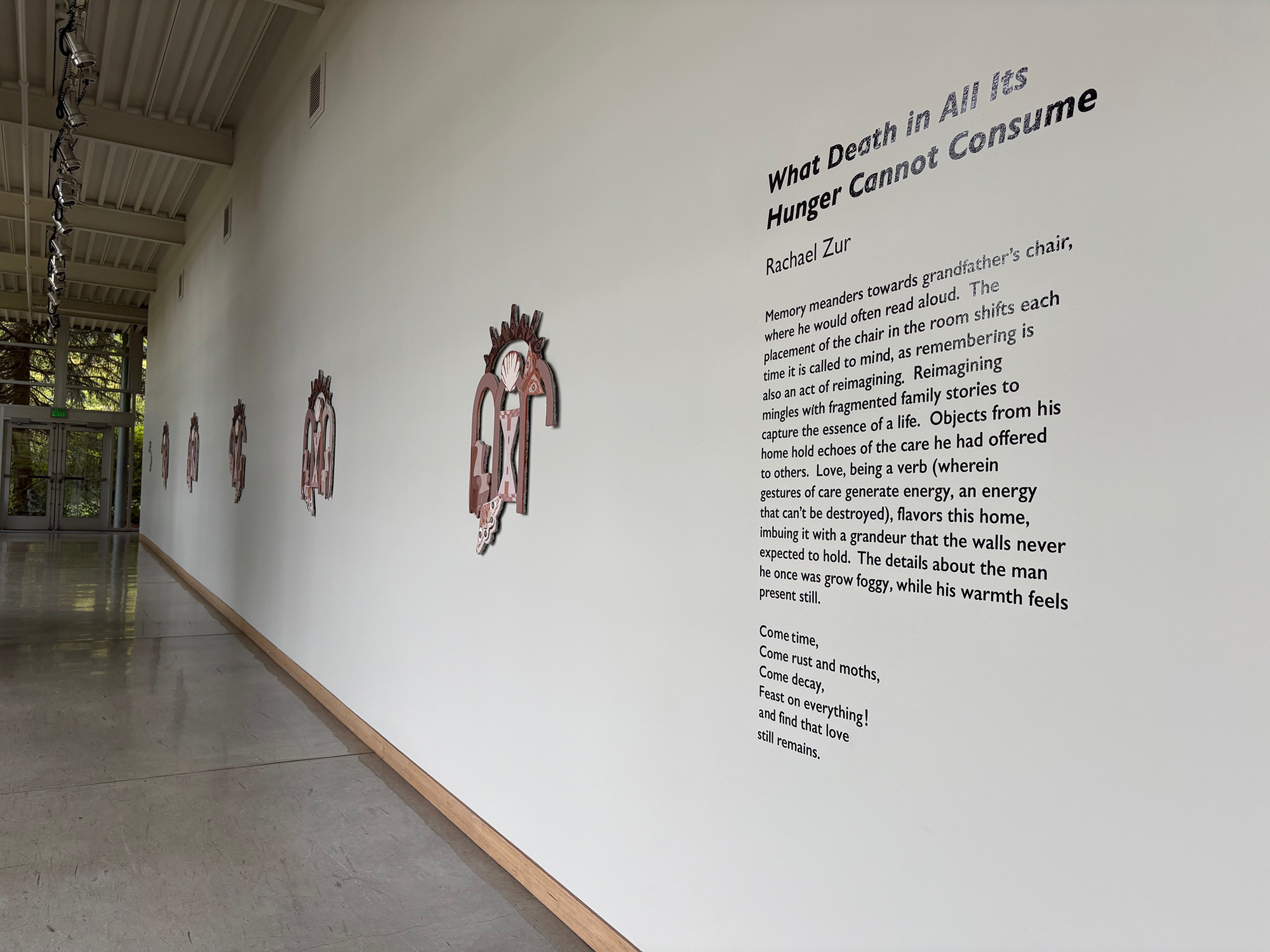
Previous Exhibitions:
-
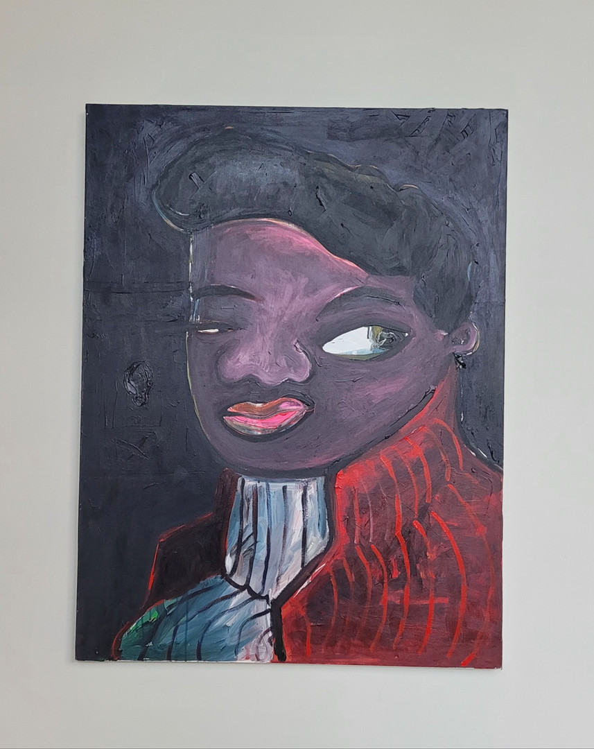
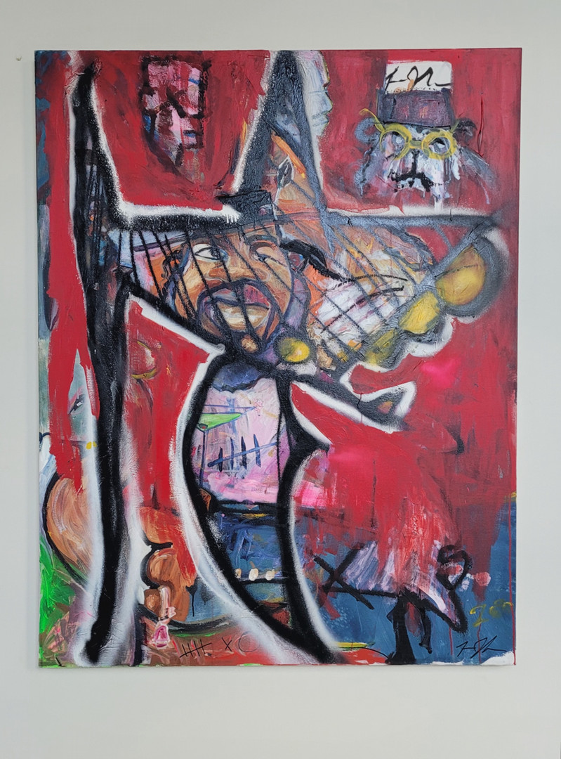
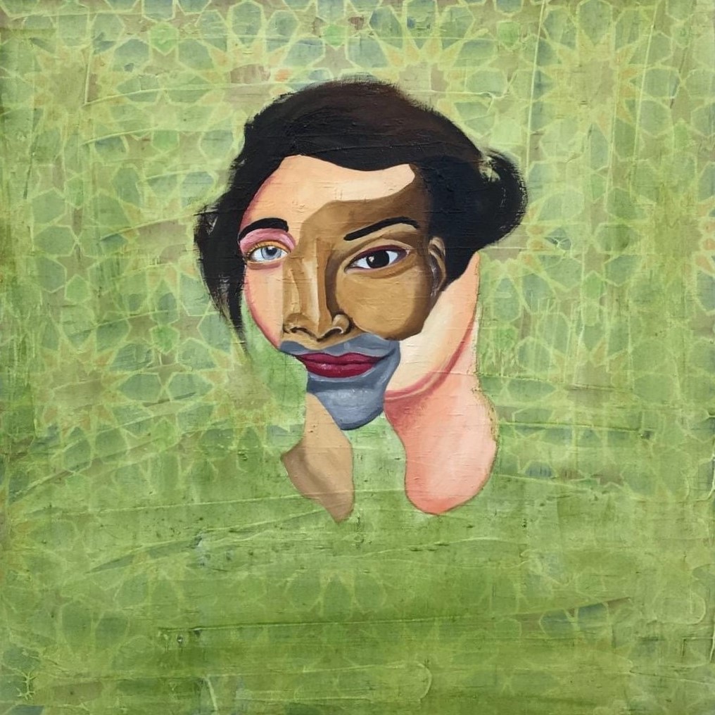
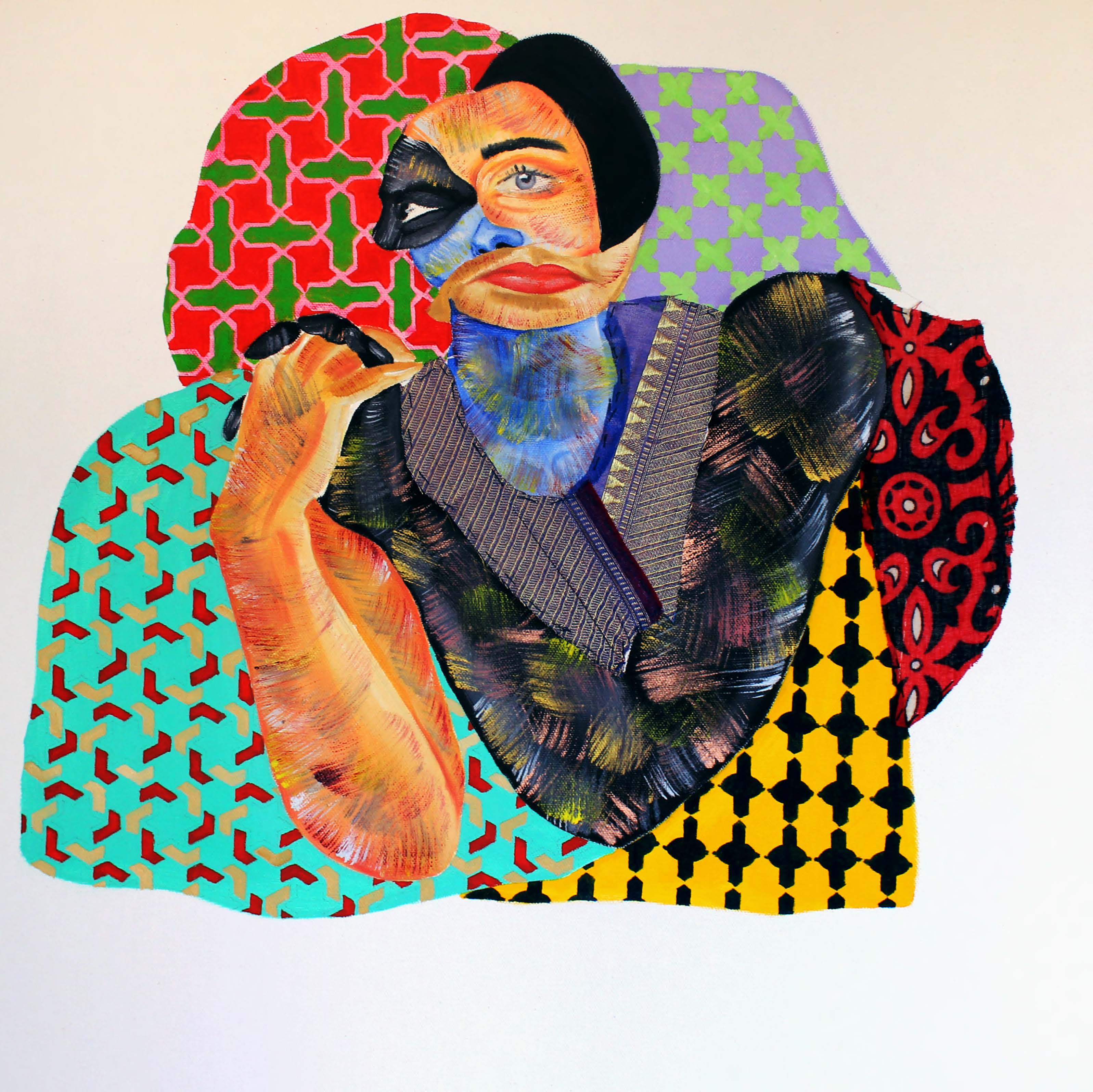
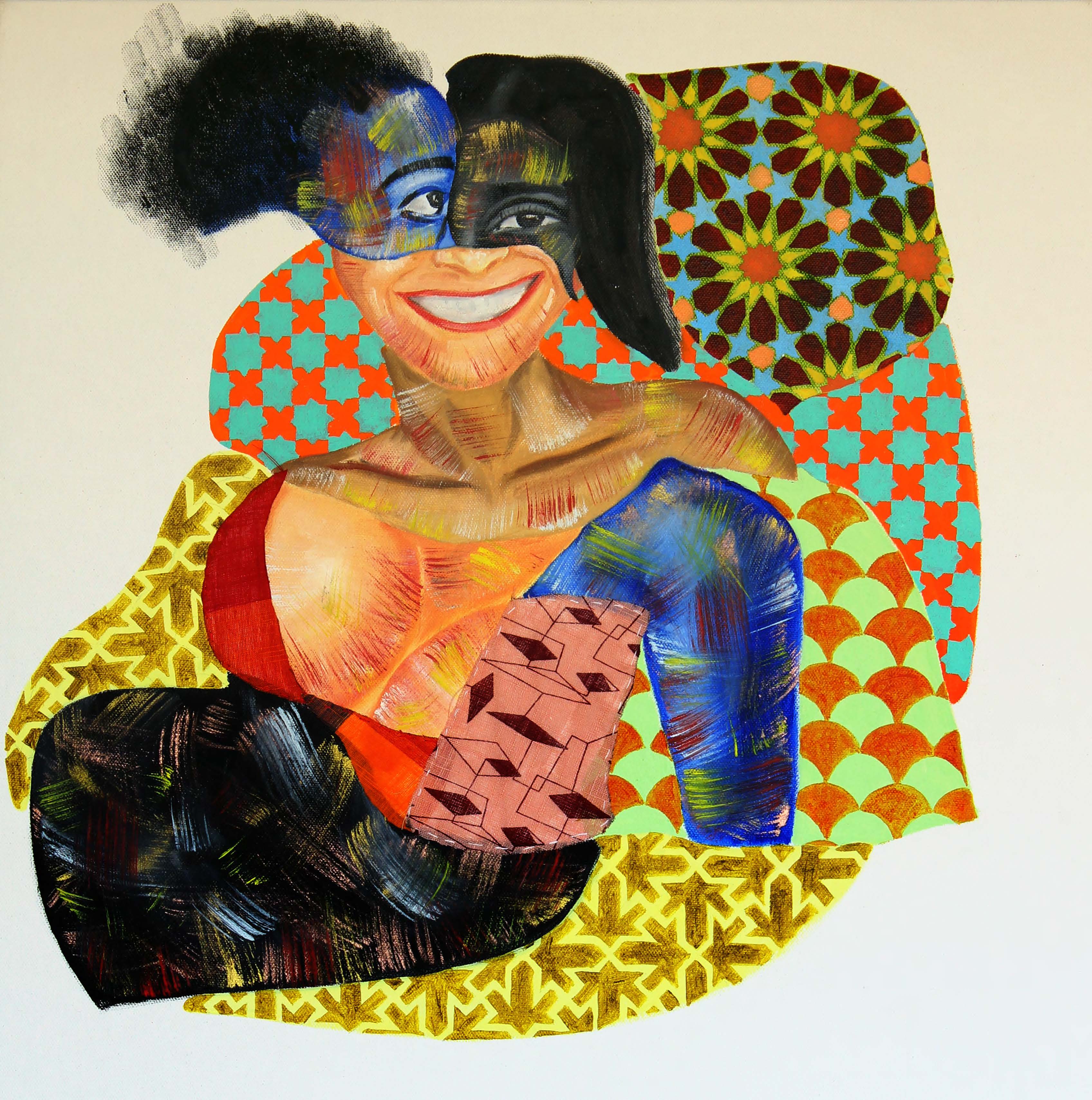
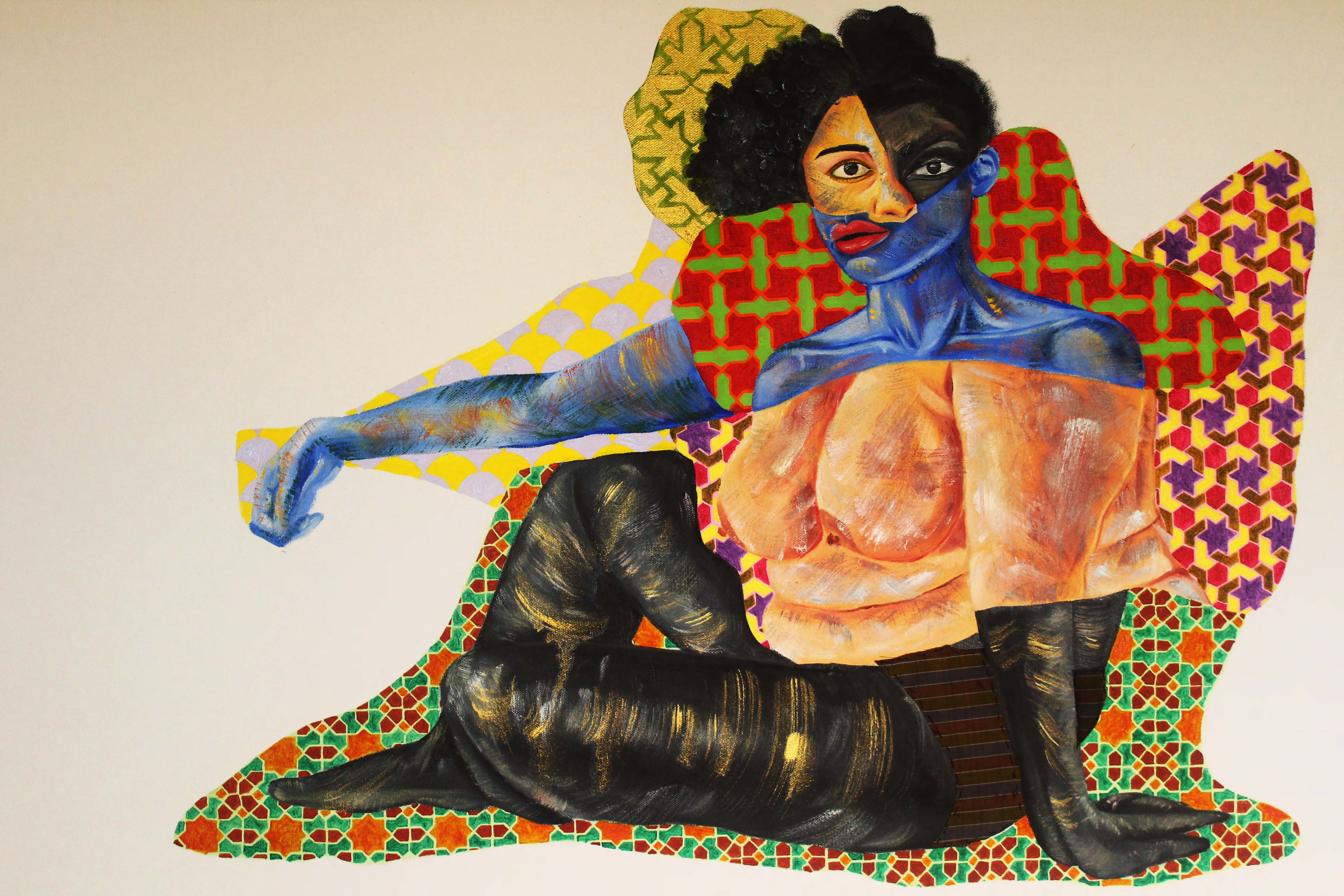
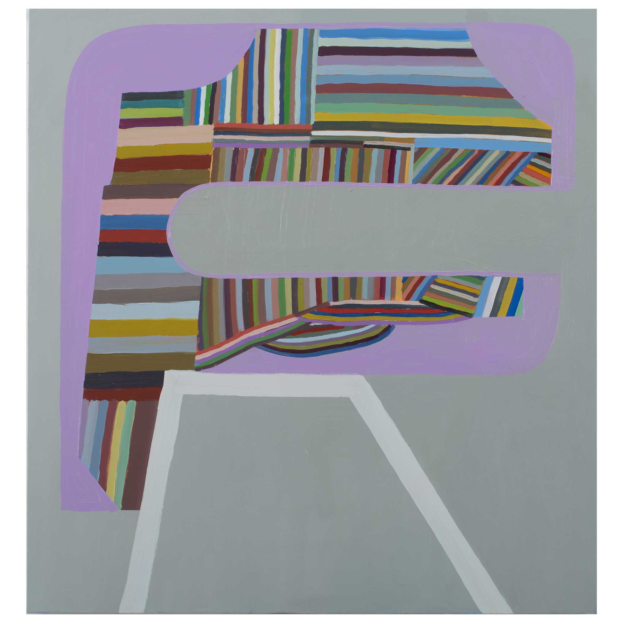
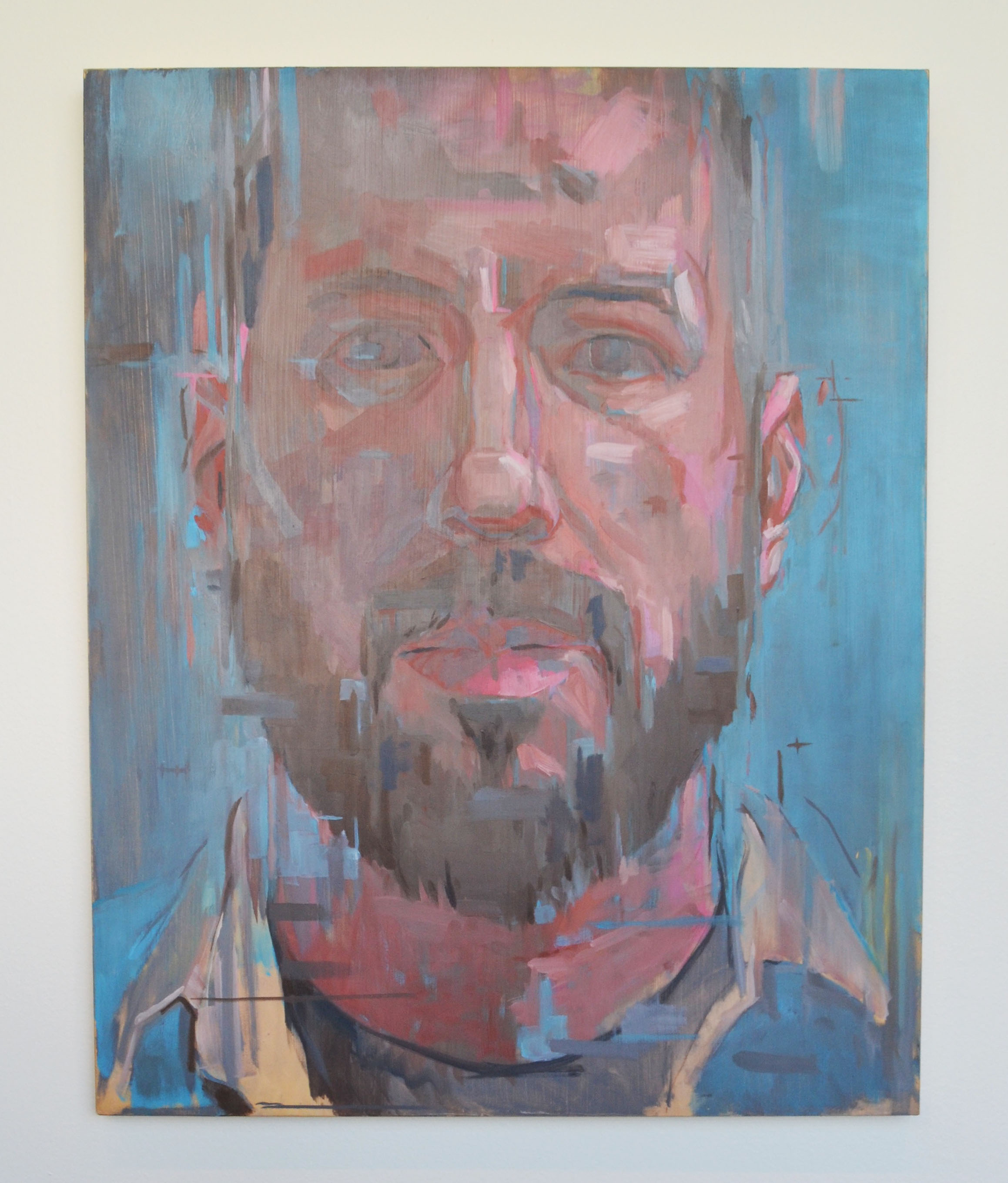
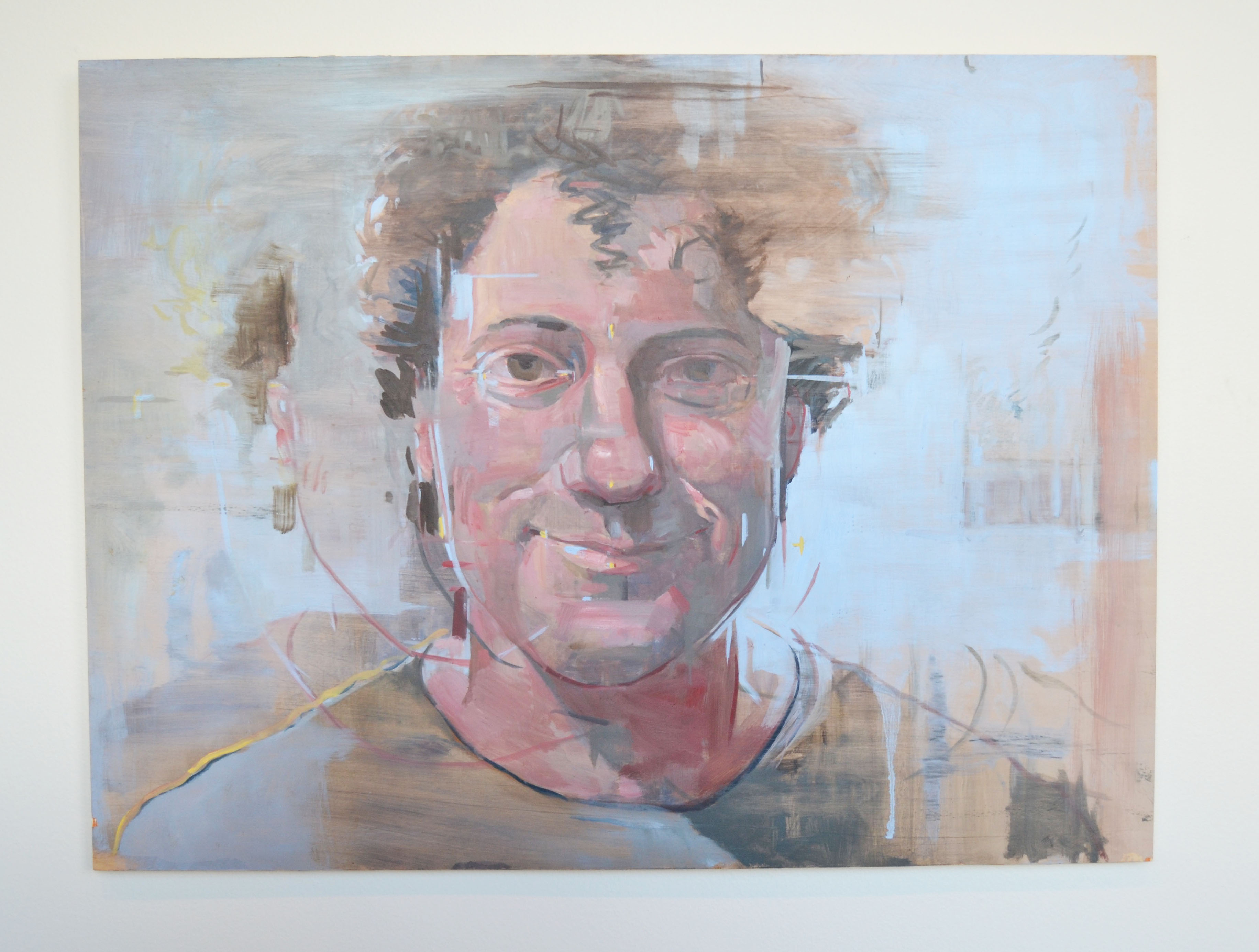
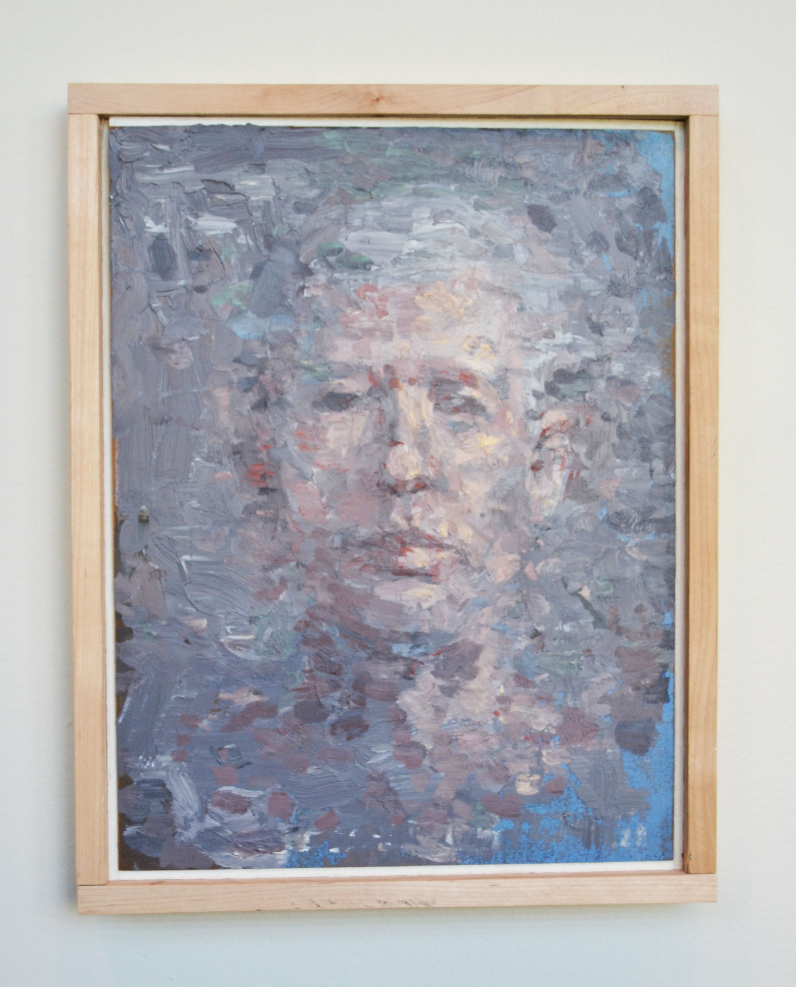
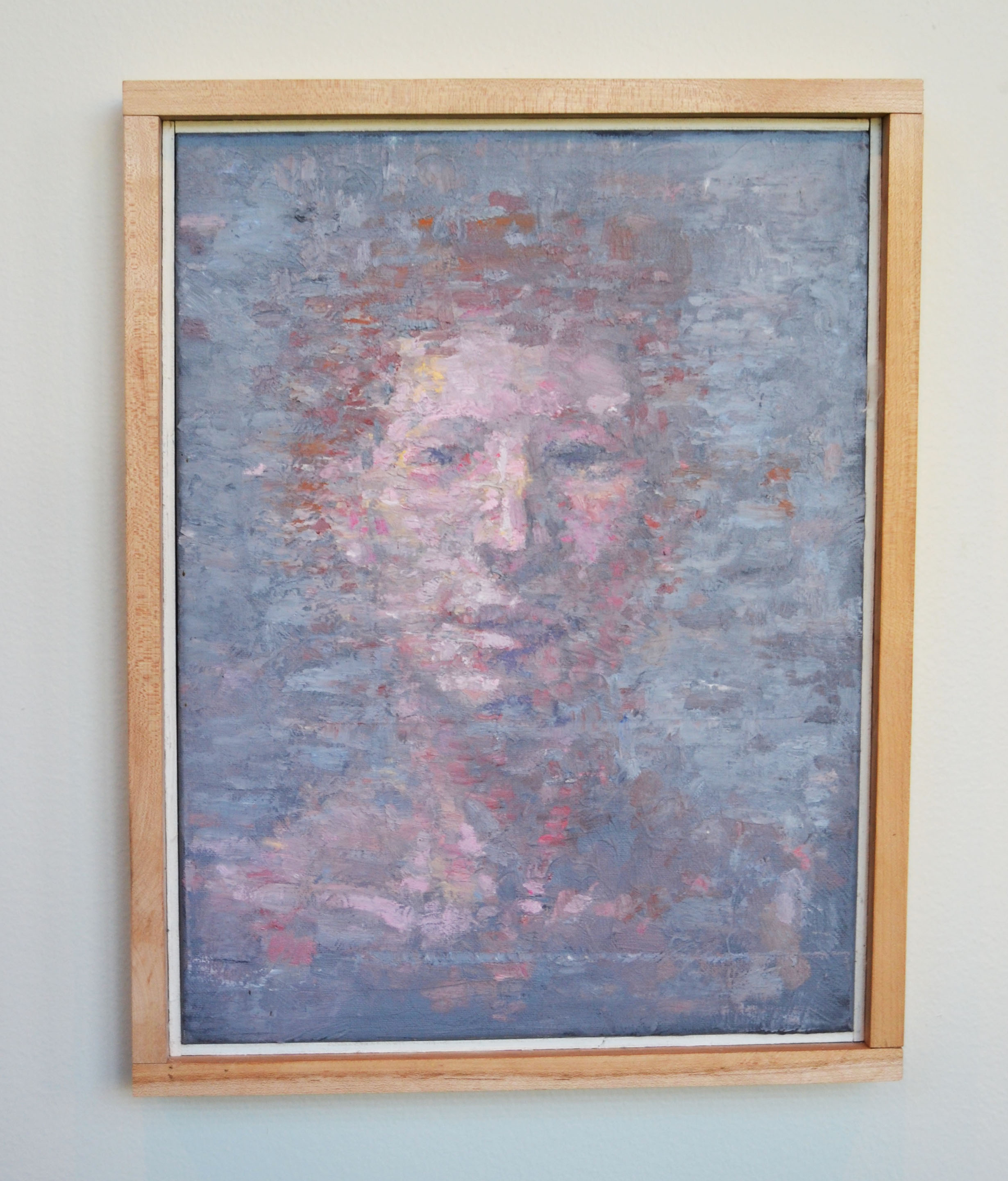
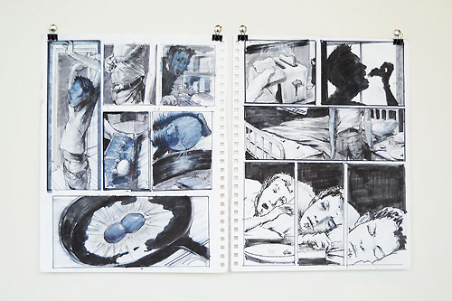
The Blackest Place I Know: Travis Isaac Johnson
(Spring 2025)
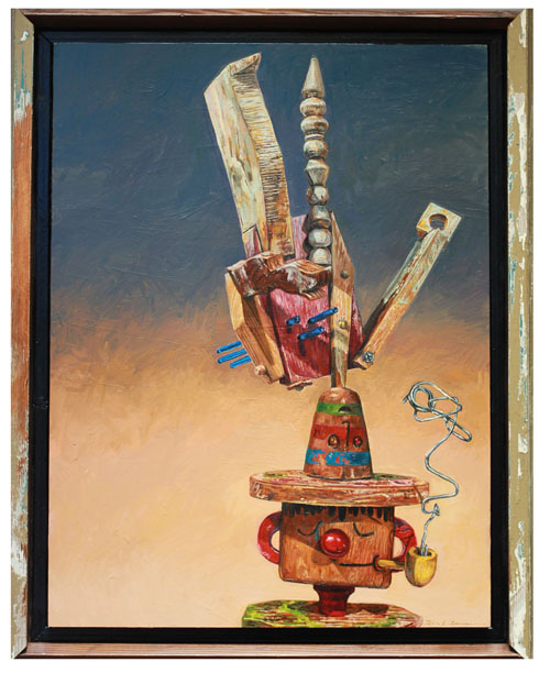
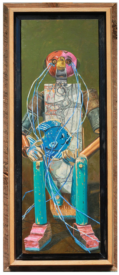
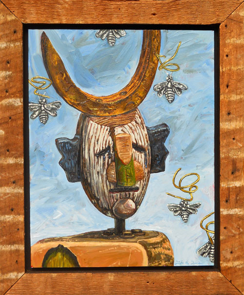
“The Blackest Place I Know,” is my deepest internal vibration reflected in a series of pictures. This ensemble of paintings oscillates between representational portraiture and abstraction. This collection of work in one sense, is a fragmented abstraction from a larger body of work that sits as an imagined fictional self-depiction. These works are both memories and a possible knowing of a desired future. The paintings drift from depicting my father, and myself, to a chaotic abstract expression. These paintings may also be a kind of phantasmagoric ghost print of the truth. These works never rest in one space, and never tell the full story. But the painted depiction of the eyes, gives some of the clues. The blackest place I know, might be an unresolved enigmatic knowing that is best expressed through painting.
-
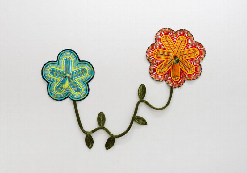
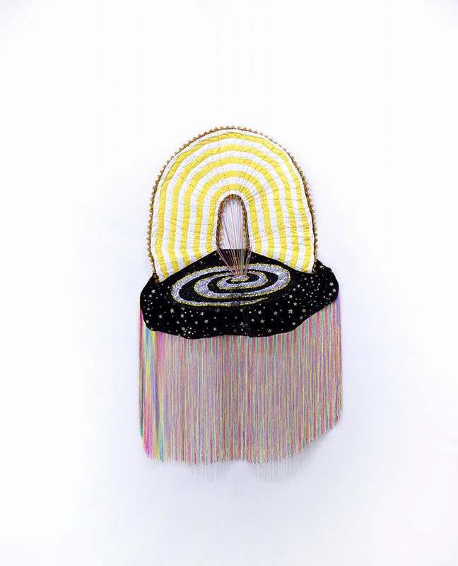
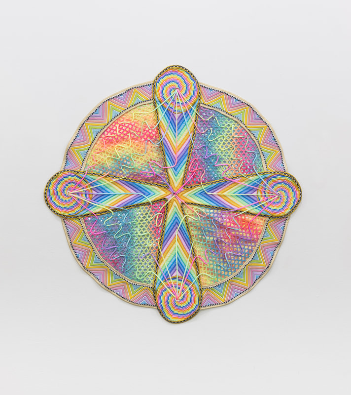
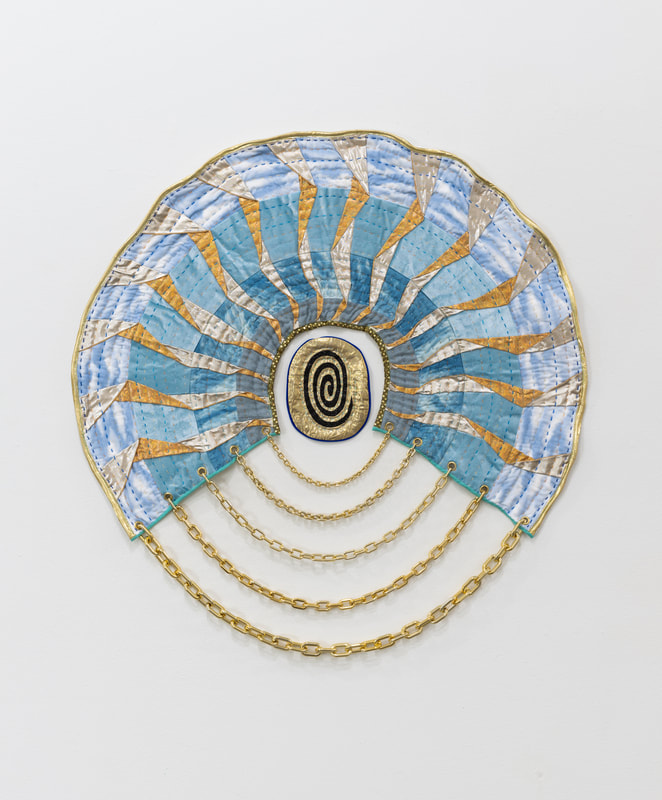
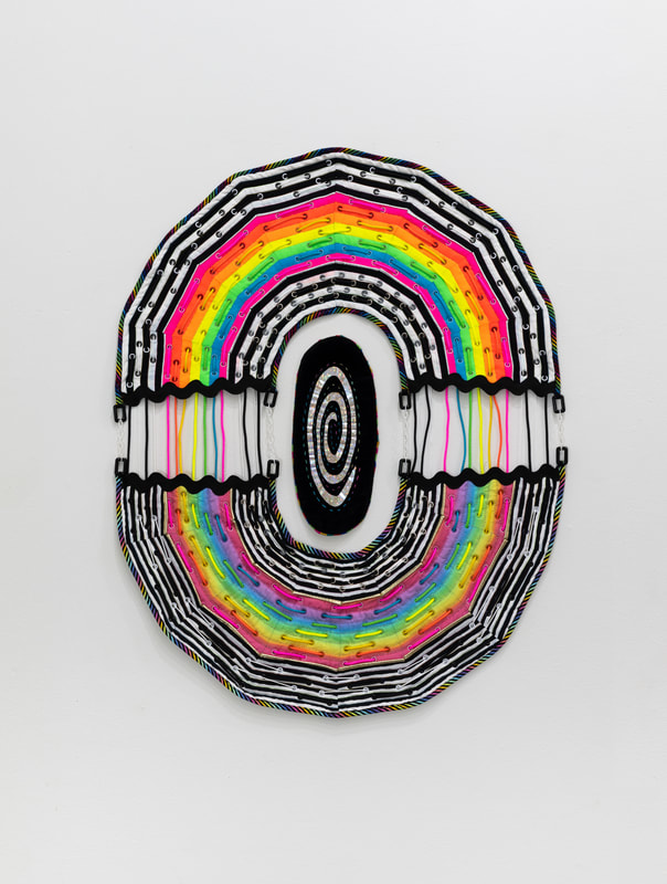
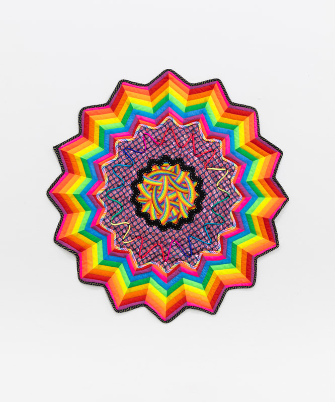
When I Look At You I See My Reflection: Andrea Alonge
(Fall 2024)
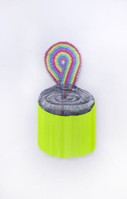
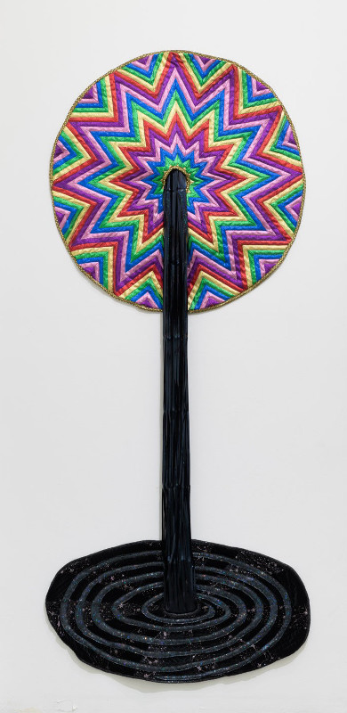
Andrea Alonge creates quilted artworks about connection, introspection, and physicality in a digital world. Costume fabric, quilting fabric, embroidery, surface embellishment, sequins, yarn, and beads bring domestic tactility to forms that reference digital, universal, and mathematical symbols. Zero is both the void from which we come and the center to which we return, one of the base elements of computer programming. The profile icon is the place we choose an image to represent who we are and see who the other is- the circle we click to glimpse someone’s story. The digital world is where we connect, show many sides of our personalities, go to escape and get lost in the meditative scroll. This show is a near-palindrome, the works reflecting one another like the mirror in Lewis Carroll’s Through The Looking Glass. Each piece has its fraternal twin, someone to talk to, connected but different, self and shadow-self. The work is labor-intensive, and is made by hands in tandem with machines, a reflection of manufacturing in our society, but also of the digital space itself. We are all together, reflecting one another back and forth across great distances with our hands guiding the machines.
-
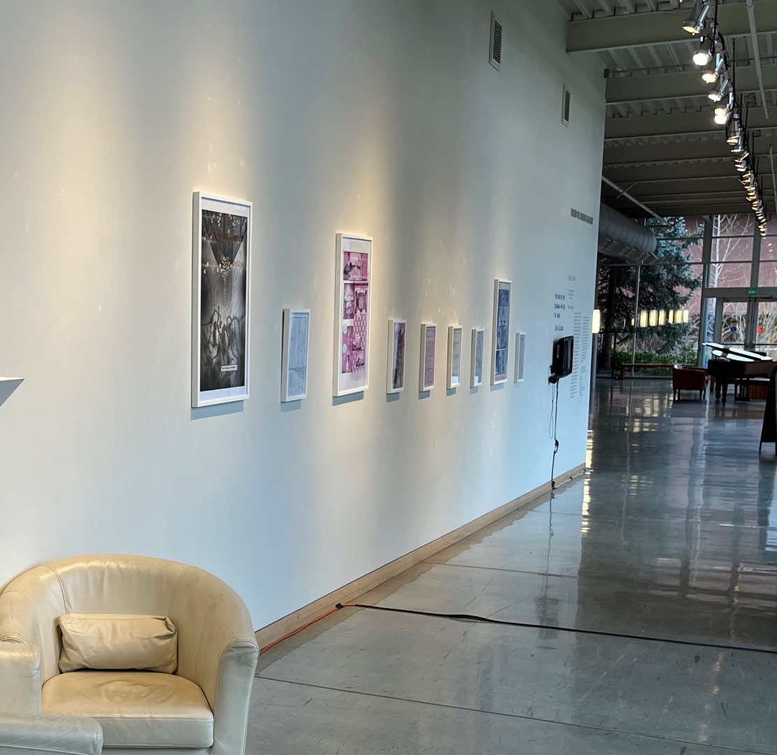
As Old As Time: Melanie Stevens
(Spring 2023)
“A love and death story about America through the lens of race and time…”
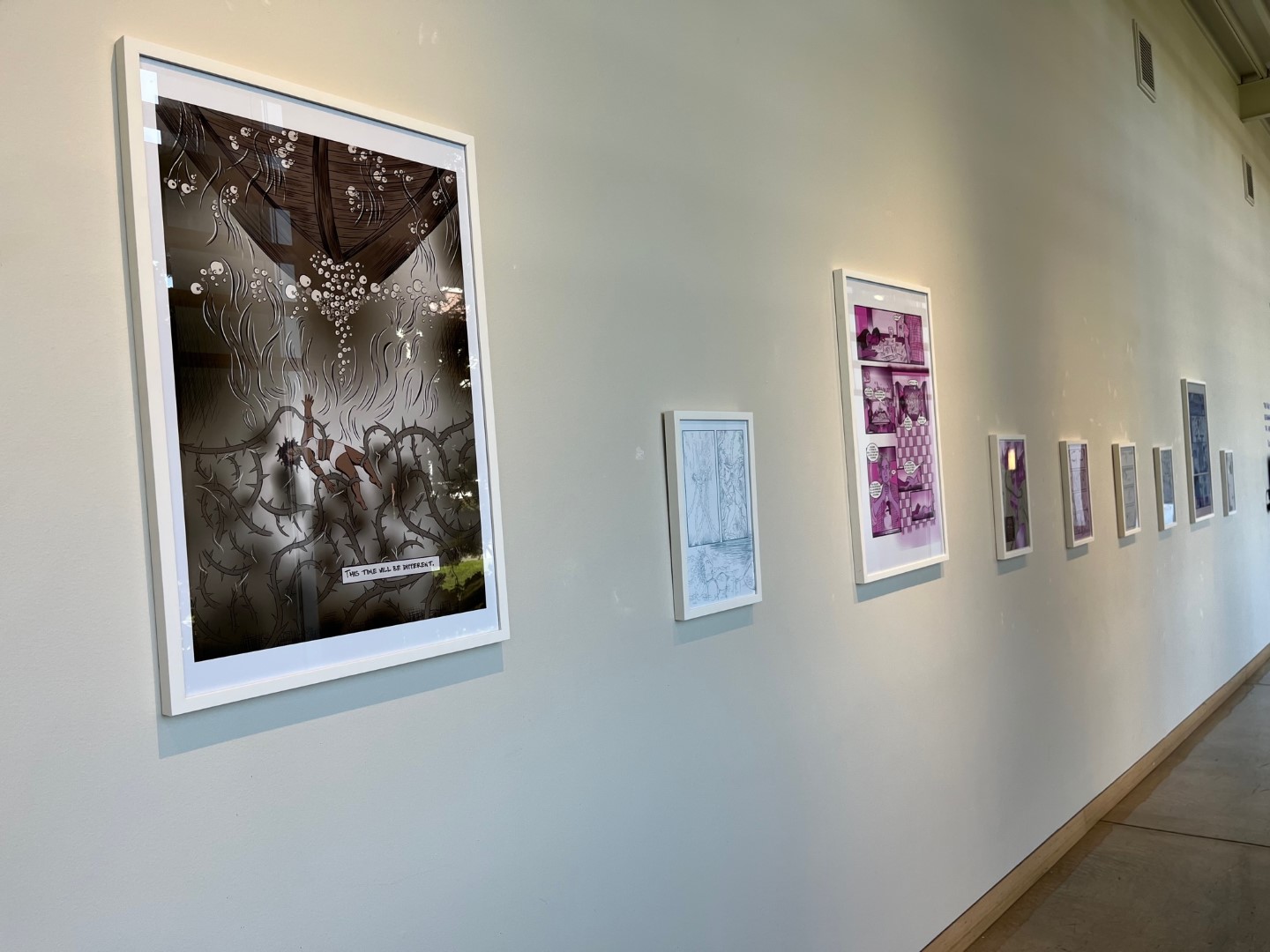
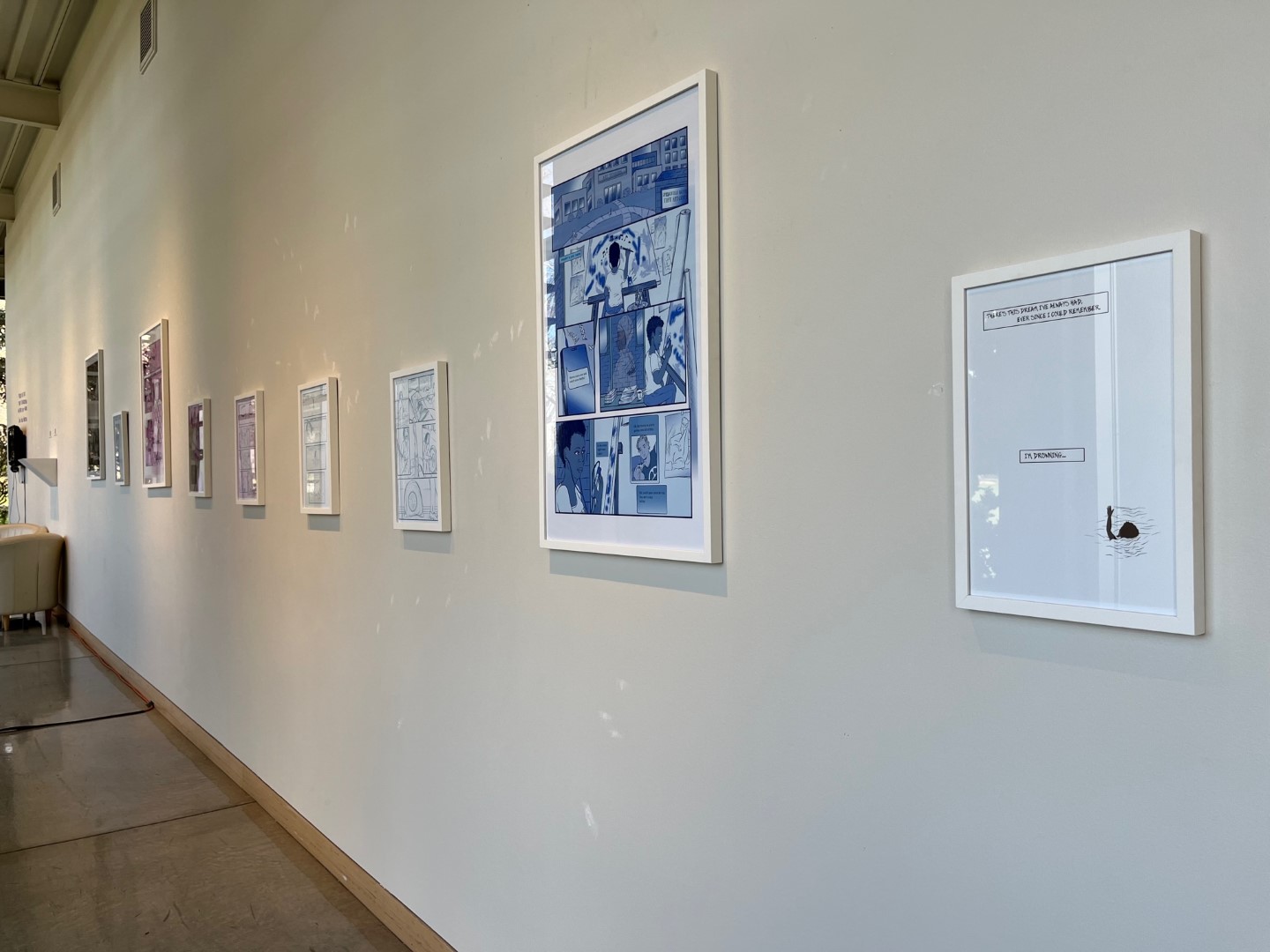
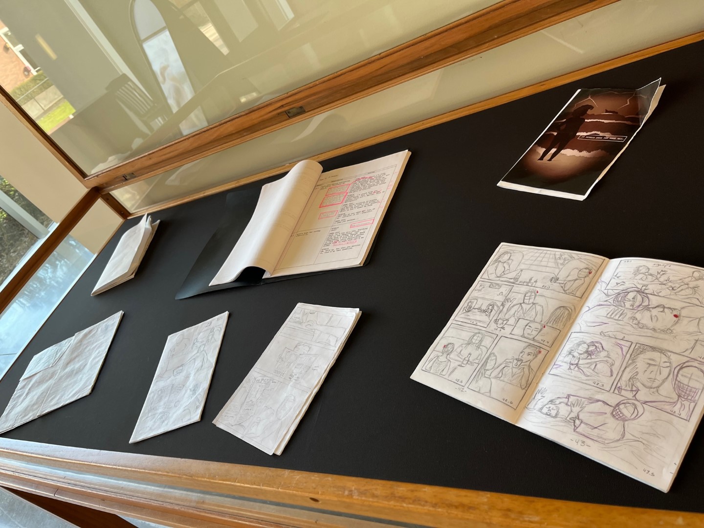
A WaterShed Graphic Novel Series Exhibition by Melanie Stevens, features WaterShed Vol. I: PostModern, and WaterShed Vol. II: In the Black, the 1st two volumes in a ten volume series. Stevens’ prophetic voice eerily foretells of moments that reverberate through realities in a gripping time traveling thriller. This is a sweeping, multi-volume account that merges nonfictional elements of history, culture, and current events with speculative fiction. You are invited along on the journey of Winnie Skye, who unwittingly finds herself directly and indirectly oscillating between three time periods: the unsettled past of this country’s original sin, present day (during the infancy and life cycle of a new wave of the Black Liberation Movement), and an uncertain dystopian future consumed by a questionable oligarchy, all while dealing with the consequences of her interventions with time.
Melanie Stevens is an artist, illustrator, and writer. She is the creator of the graphic novel series, WaterShed, and the co-founder and co-curator of Nat Turner Project, a fugitive gallery space that provides funding, resources, and spaces for artists of color to create or express their own language within and without the parameters of racial commodification or designation. She received her Bachelor of Arts degree for Political Science from Yale University and her Masters of Fine Arts degree for Visual Studies at Pacific Northwest College of Art, where she currently teaches.
Ig: @brownivyx
-
In a tea seasoned lofty lavish floral chit-chattery antique airy room: Andrew Douglas Campbell
(Fall 2022)
Artist Statement:
“this sissy sits and sips whilst he lisps and sips again."
Artist Bio:
Andrew Douglas Campbell is an artist and delinquent sissy from Chicago, currently residing in Eugene Oregon where he makes art, supports art, and teaches art. Unsure about how to formally introduce himself, here is a list of past and present institutions he is affiliated with: Tropical Contemporary, Linn-Benton Community College, University of Oregon, Lillstreet Art Center, ThreeWalls Gallery, School of the Art Institute of Chicago. Andrew Douglas Campbell is probably craving ramen or a peach, and he has had the pleasure of exhibiting art in Chicago, Portland, Eugene, Corvallis, Seattle, and New York.
-
Figure Ground: Tammy Jo Wilson
(Spring 2022)
Artist Statement:
I seek to share through my work a partial view of my black female experience. I hope to reach those among us looking for a broader understanding of commonalities rather than differences. Historically rooted in the feminist art movement my work attempts to further the unraveling of antiquated thinking around women in art and society. The viewer experiences and remembers synchronously the traditions of painting and photography; combined with a contemporary approach layering symbolism and the abstracted figure. I offer a visual entrance to an expanded view of the human experience and the uncomfortable surreal realities I have experienced and we have faced together.
Bio:
Tammy Jo Wilson is a black artist, curator, and arts organizer residing just south of Portland, Oregon in historic Oregon City. She received her BFA from the Pacific Northwest College of Art and her MFA from San Jose State University. She co-curated the exhibit An Artistic Heritage in 2019, Art Makes History and You are Not a Robot in 2020. Wilson started curating the traveling exhibition Black Matter in 2020, featuring all Oregon-based black artists. Wilson is co-founder and President of the arts organization Art in Oregon, a statewide visual arts non-profit working to foster culturally rich regional communities through partnerships, advocacy, and investment in artists, businesses, educational spaces, and community spaces. Additionally, she has worked in the art department at Lewis & Clark College as the Visual Arts & Technology Program Manager for the past eleven years. In her own art practice, Wilson has exhibited her work nationally and was awarded the Leland Ironworks Golden Spot Artist Residency in 2017, performed in the SALT: Above a Whisper at Shaking the Tree Theatre in 2018, and was featured in the two women exhibit Biological Dissonance at the Parrish Gallery in Newberg, Oregon in 2019. She currently has solo exhibitions of her artwork at the Gretchen Schuette Gallery in January of 2022.
-
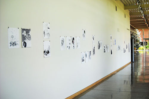
Studio Art: Faculty Show
(Fall 2021)
Studio Art Faculty Group Show
Roger W. Rogers Gallery
Spring 2021
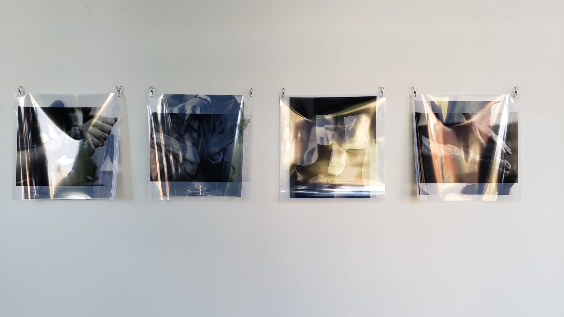
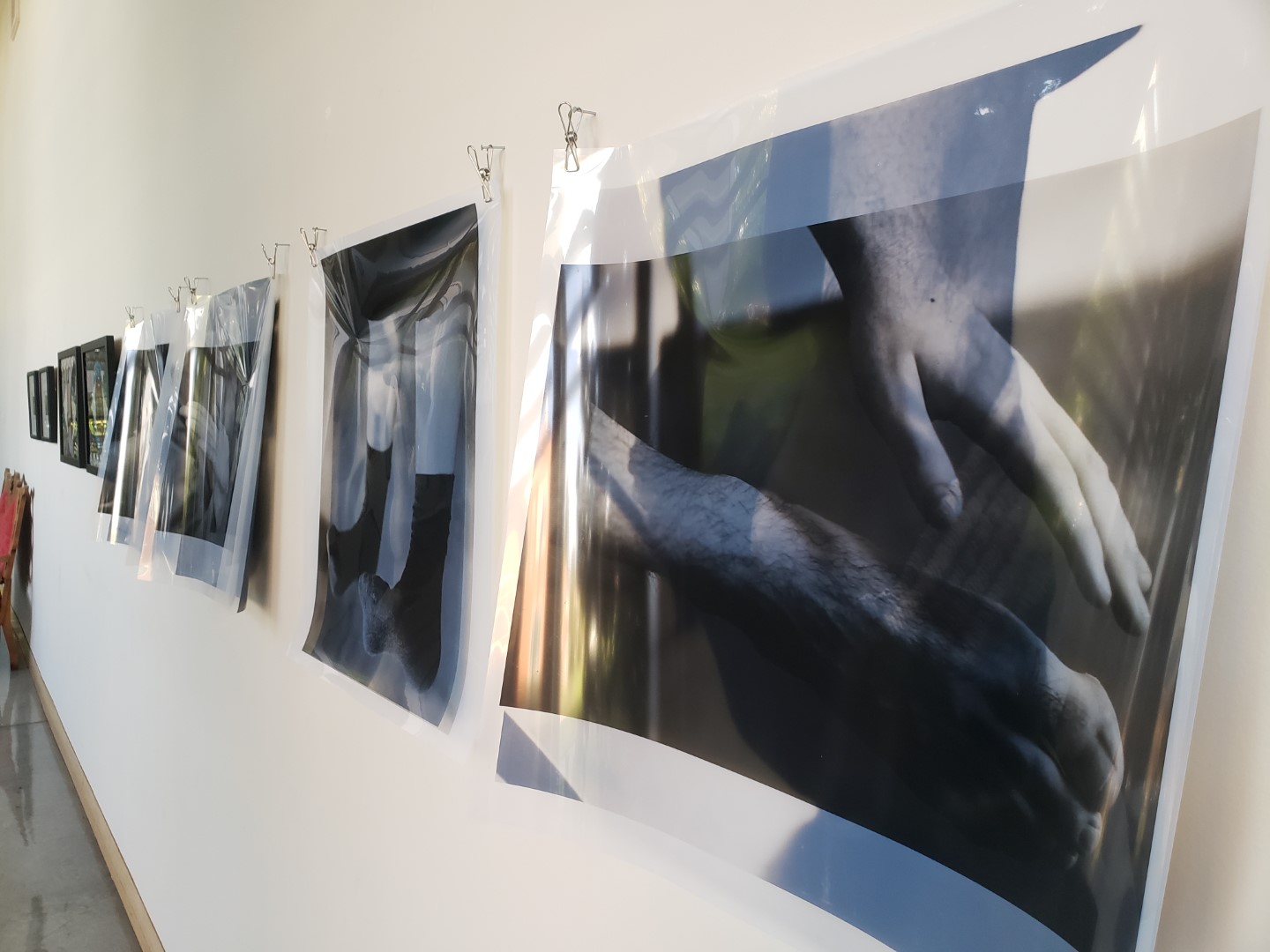
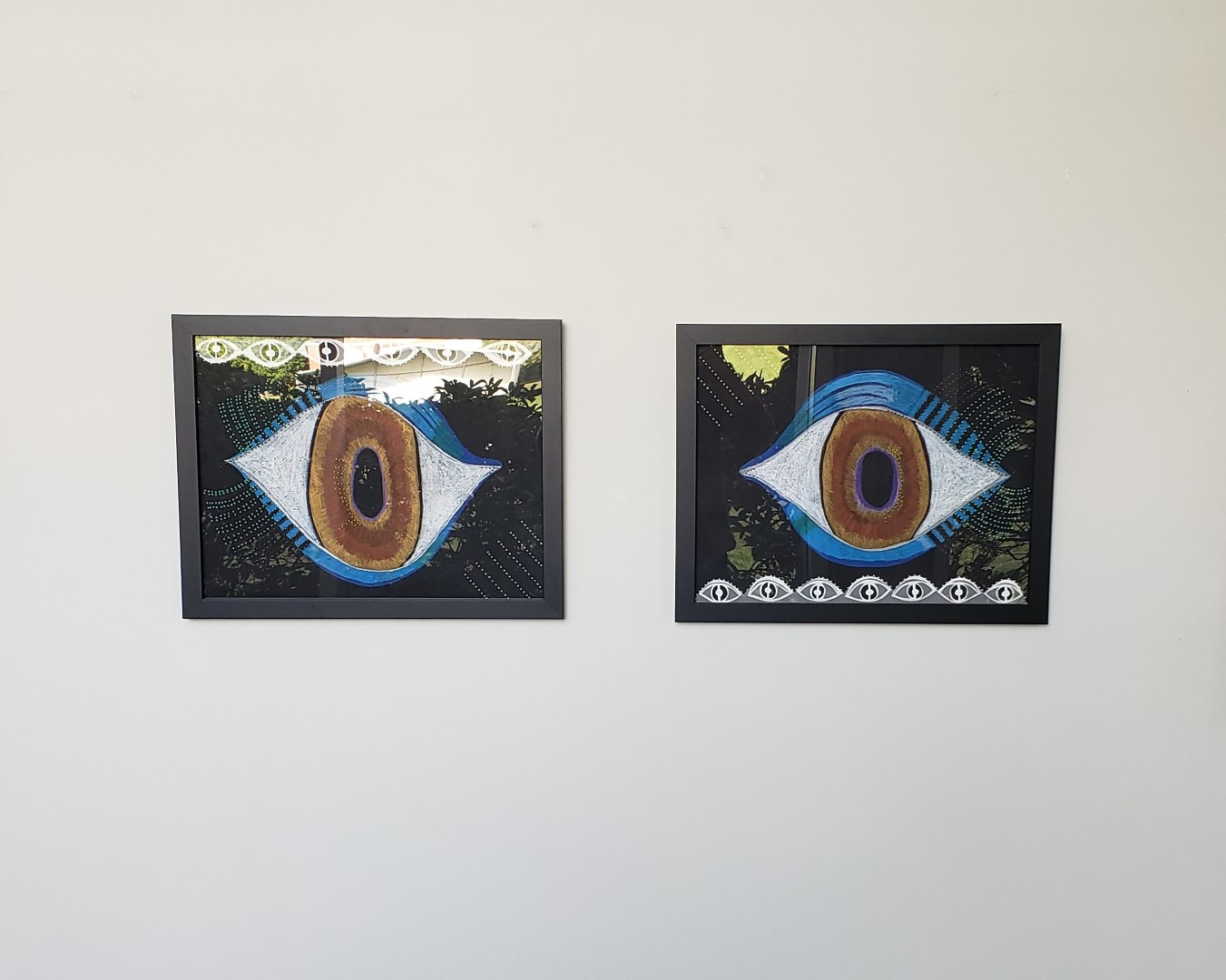
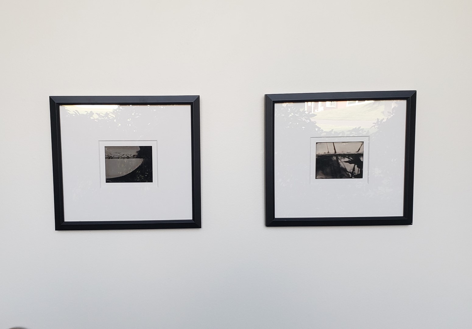
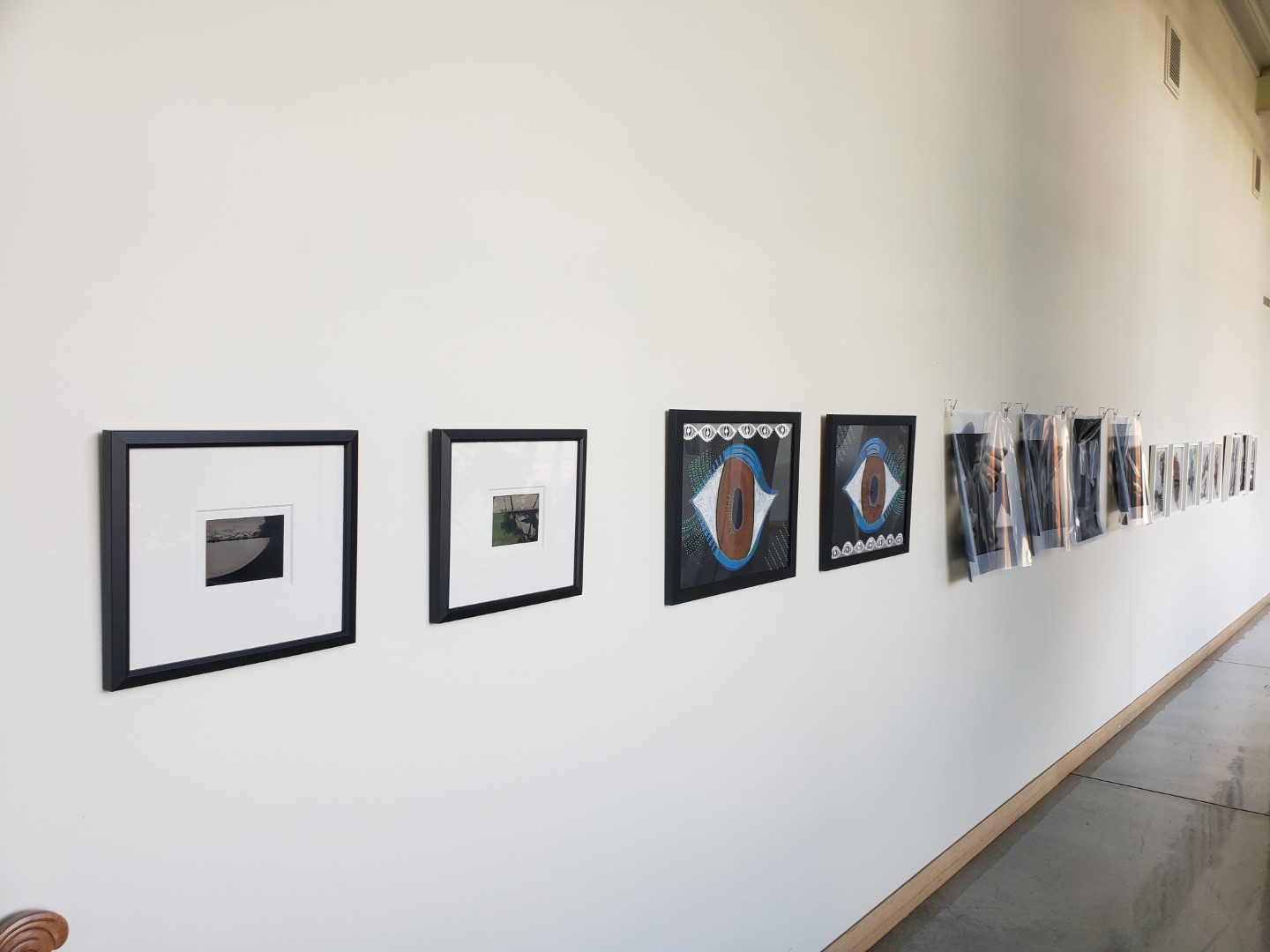
For the Spring 2021 semester, Rogers Gallery Intern Billy Ullman curated a show featuring the work of the four current Art Department faculty members: Alexandra Opie, Cayla Skillin Brauchle, Chelsea Couch, and Kathryn Cellerini Moore.
The photographs by Alexandra Opie feature extreme macro closeups of everyday plants and found objects, as well as images printed using the antique tintype technique.
Cayla Skillin-Brauchle’s mixed media drawings of large, vibrant eyes were inspired by her time spent in India in 2012, studying elaborately adorned Indian cargo trucks.
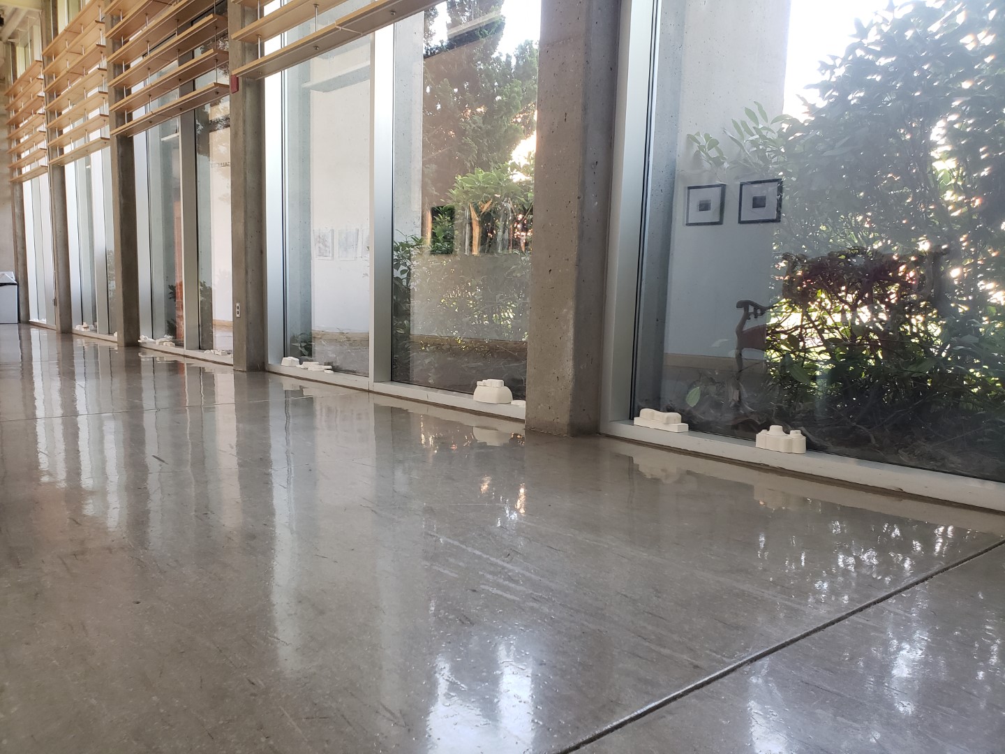
Chelsea Couch’s work is in the form of dual-layered photographs printed on transparencies, as well as small sculptures displayed along the window-sill across from the gallery wall.
The drawings from Kathryn Cellerini Moore emphasize spontaneous moments of mark-making, resulting in energetic images containing no preconceived themes or ideas.
-
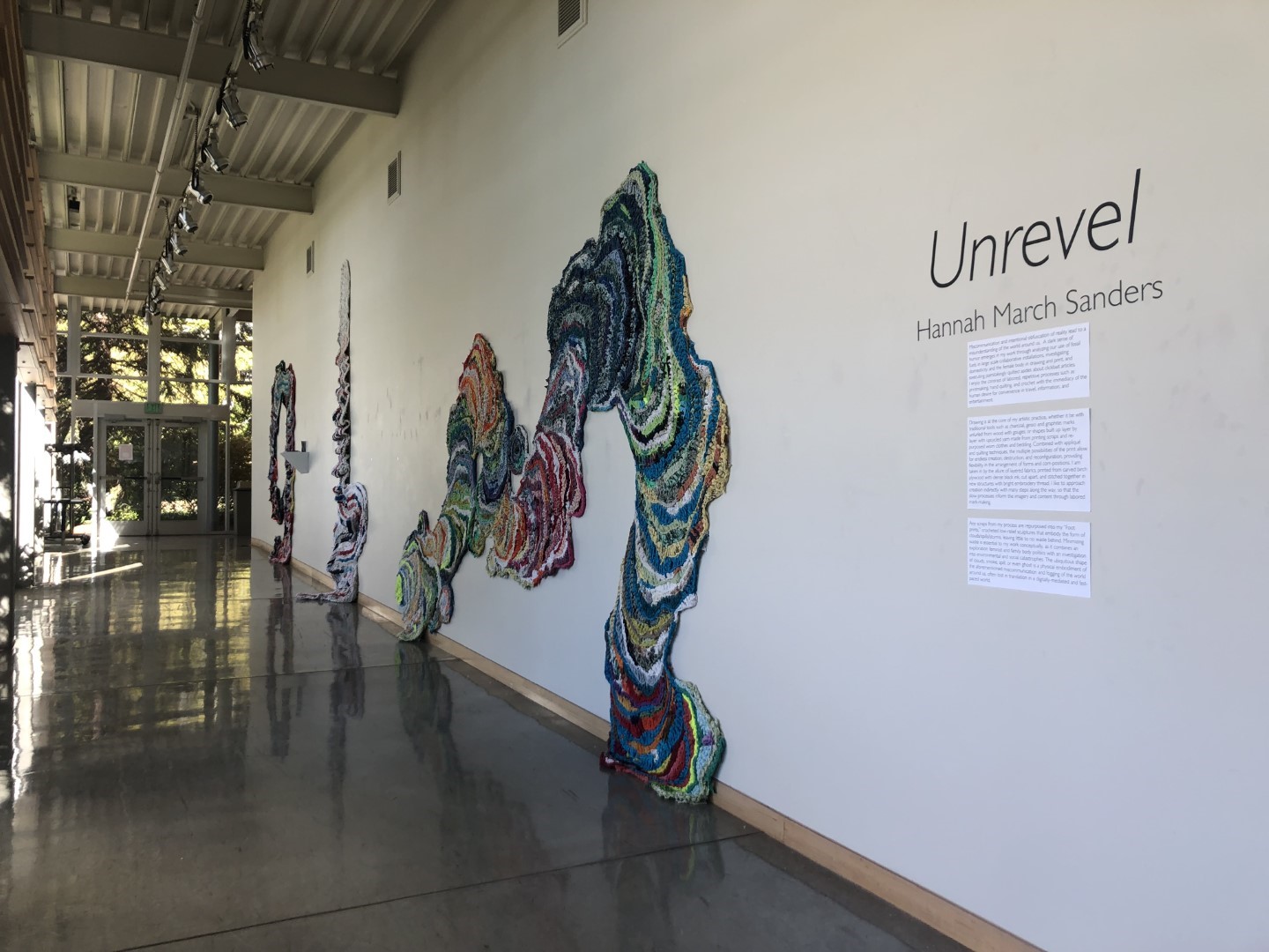
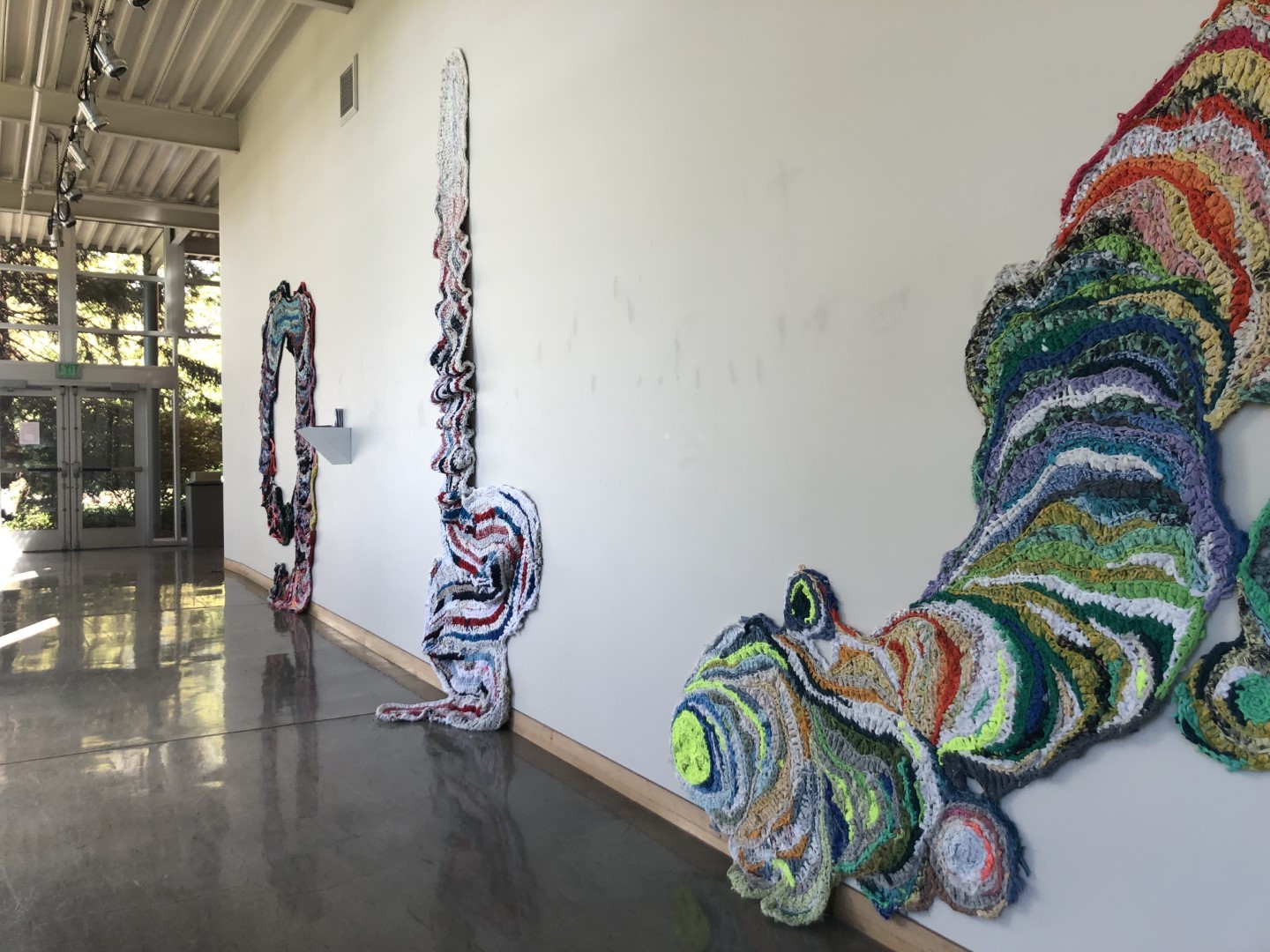
Unrevel: Hannah March Sanders
(Spring 2021)
Artist Statement, 03.05.2020
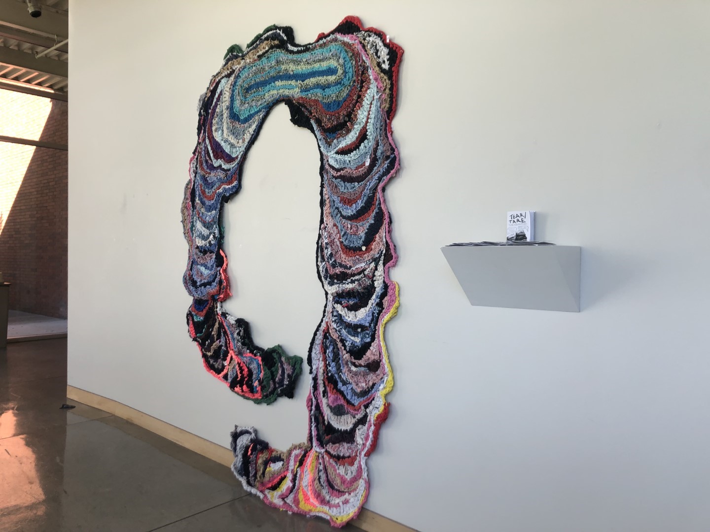
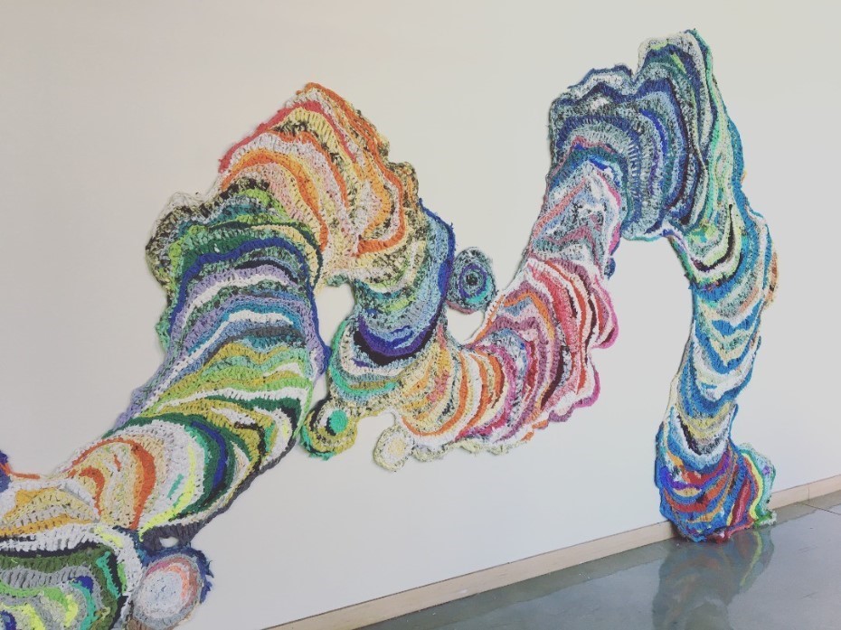
Miscommunication and intentional obfuscation of reality lead to a misunderstanding of the world around us. A dark sense of humor emerges in my work through analyzing our use of fossil fuels in large scale collaborative installations, investigating domesticity and the female body in drawing and print, and executing painstakingly quilted asides about clickbait articles. I enjoy the contrast of labored, repetitive processes such as printmaking, hand quilting, and crochet with the immediacy of the human desire for convenience in travel, information, and entertainment.
Drawing is at the core of my artistic practice, whether it be with traditional tools such as charcoal, gesso and graphite; marks unfurled from wood with gouges; or shapes built up layer by layer with upcycled yarn made from printing scraps and re-purposed worn clothes and bedding. Combined with appliqué and quilting techniques, the multiple possibilities of the print allow for endless creation, destruction, and reconfiguration, providing flexibility in the arrangement of forms and compositions. I am taken in by the allure of layered fabrics, printed from carved birch plywood with dense black ink, cut apart, and stitched together in new structures with bright embroidery thread. I like to approach creation indirectly, with many steps along the way, so that the slow processes inform the imagery and content through labored mark-making.
Any scraps from my process are repurposed into my “Foot prints,” crocheted low-relief sculptures that embody the form of clouds/spills/storms, leaving little to no waste behind. Minimizing waste is essential to my work conceptually, as it combines an exploration feminist and family body politics with an investigation into environmental and social catastrophes. The ubiquitous shape of clouds, smoke, spill, or even ghost is a physical embodiment of the aforementioned miscommunication and fogging of the world around us, often lost in translation in a digitally-mediated and fast-paced world.
-
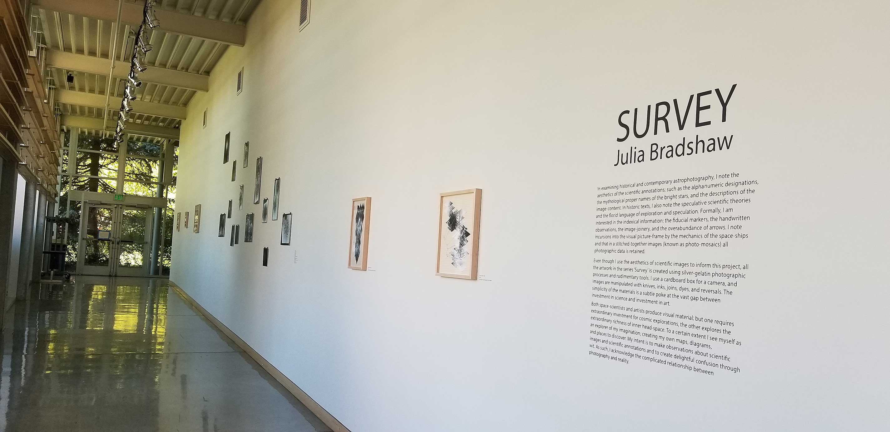
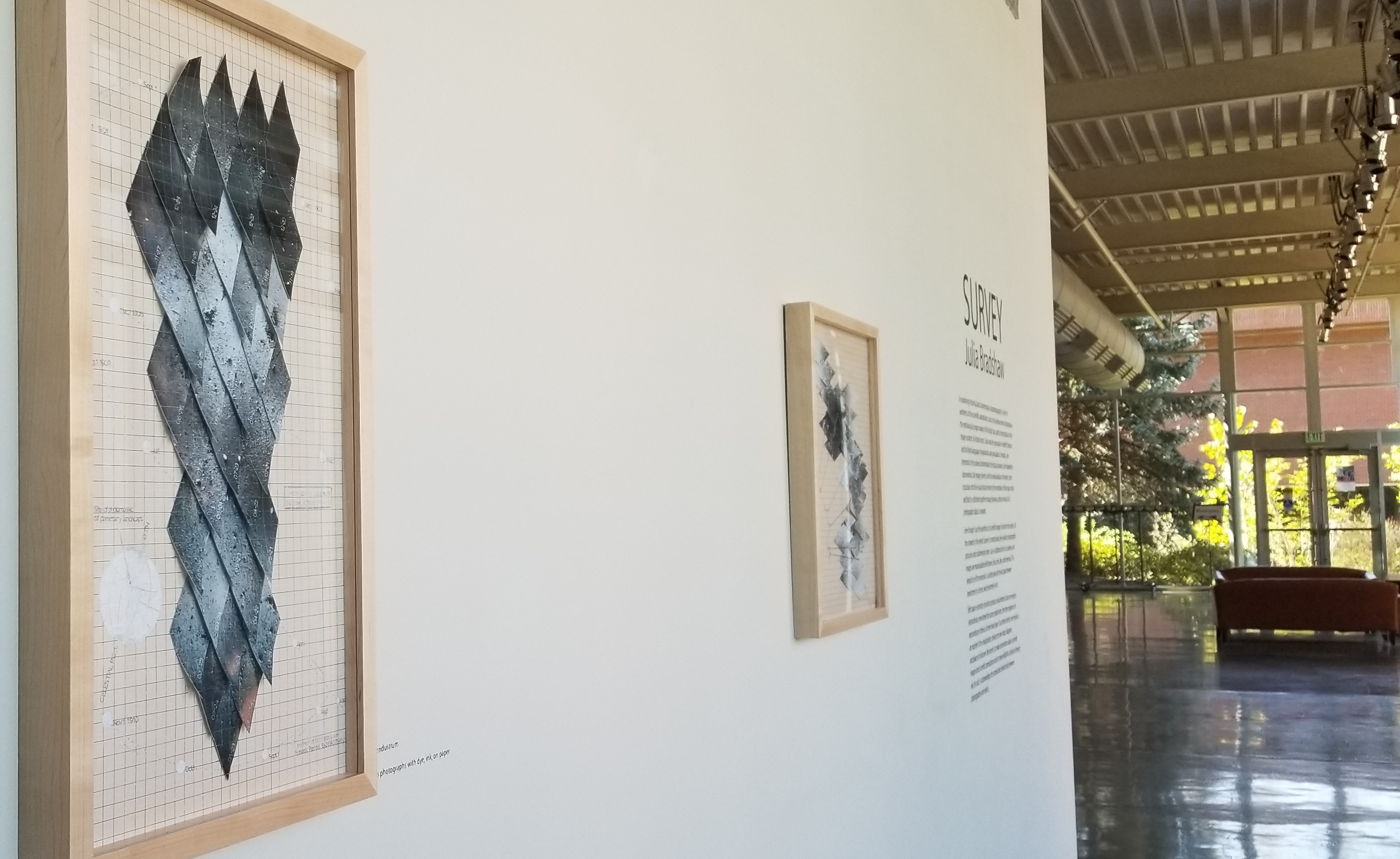
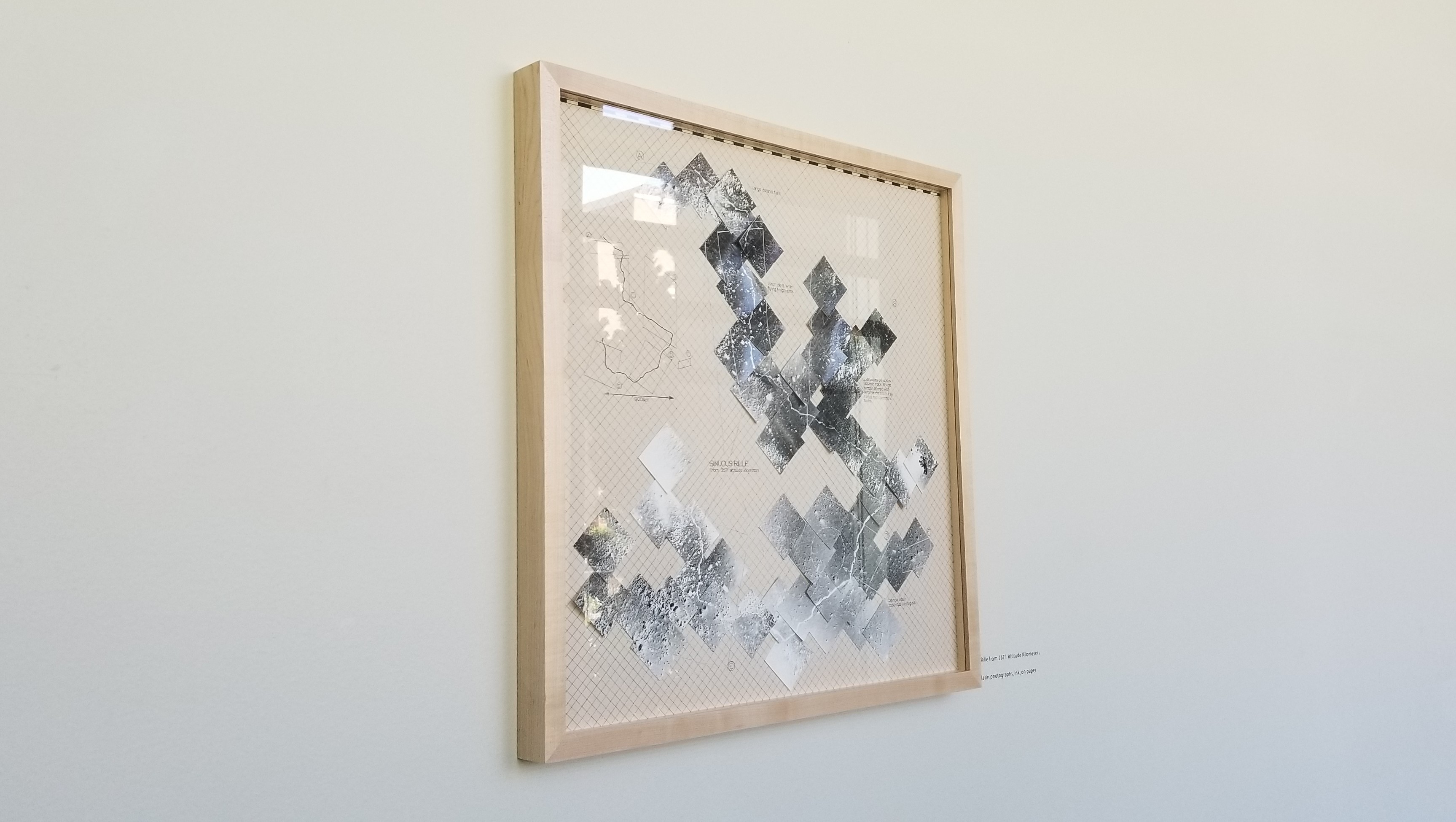
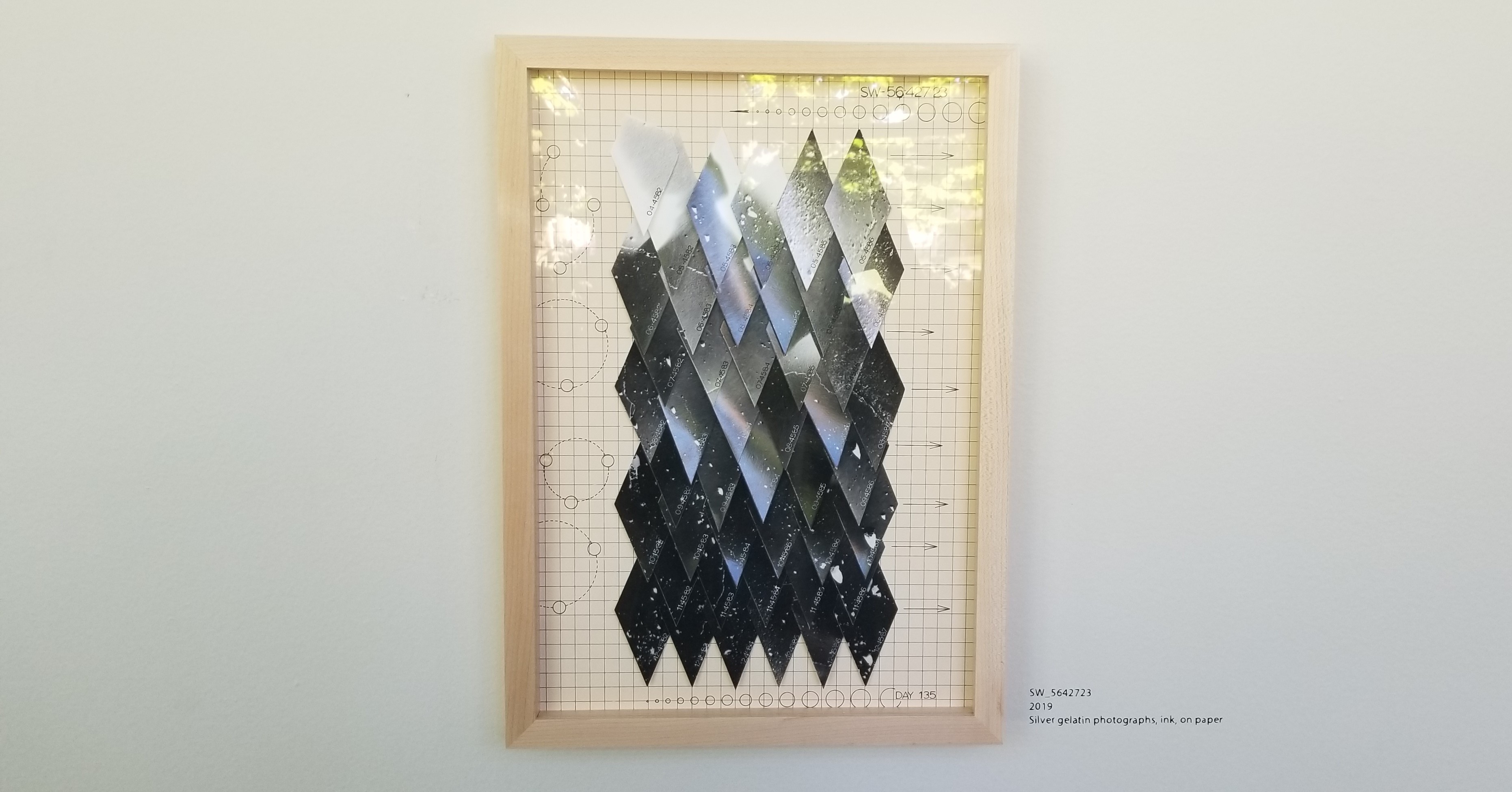
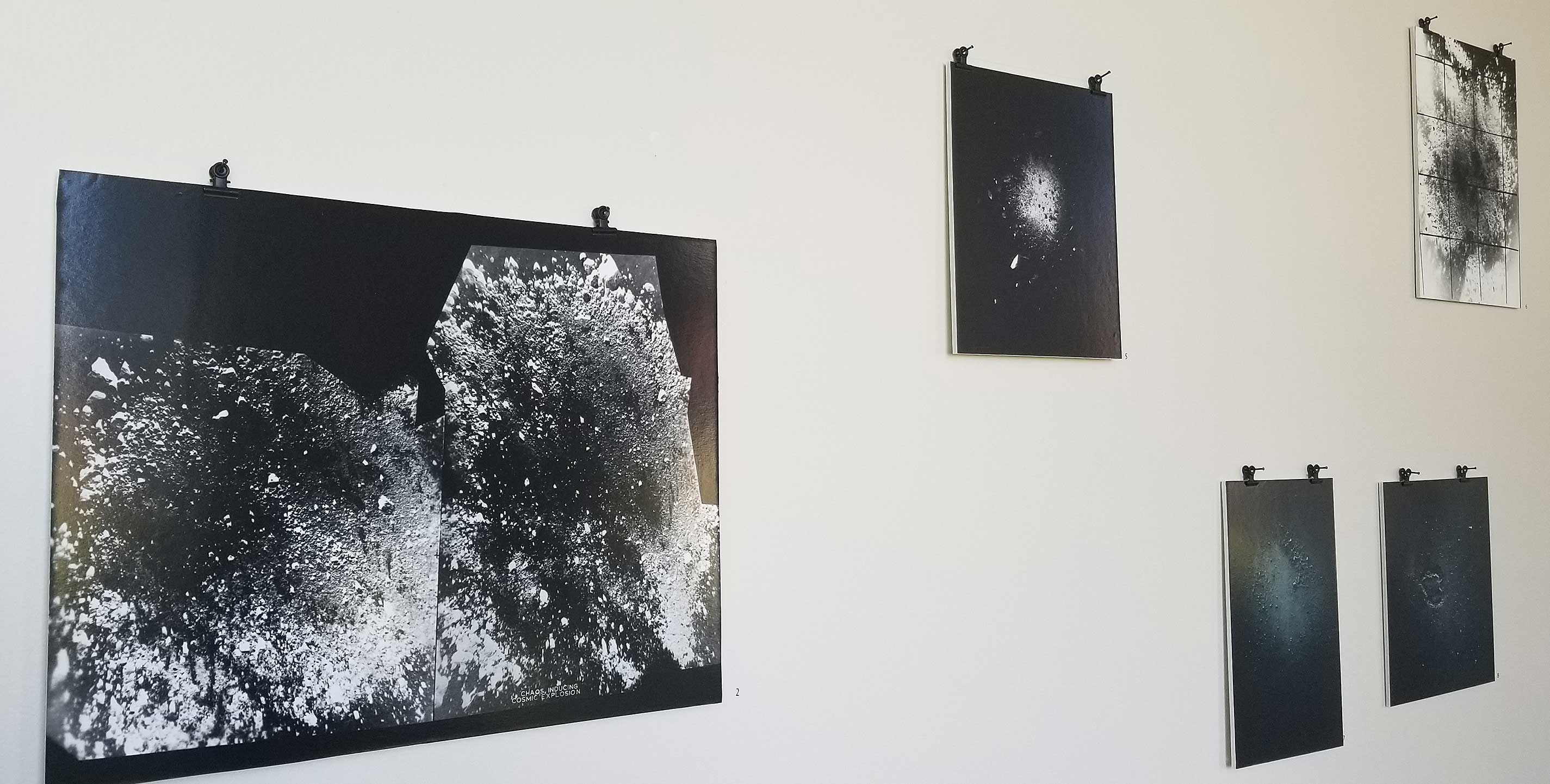
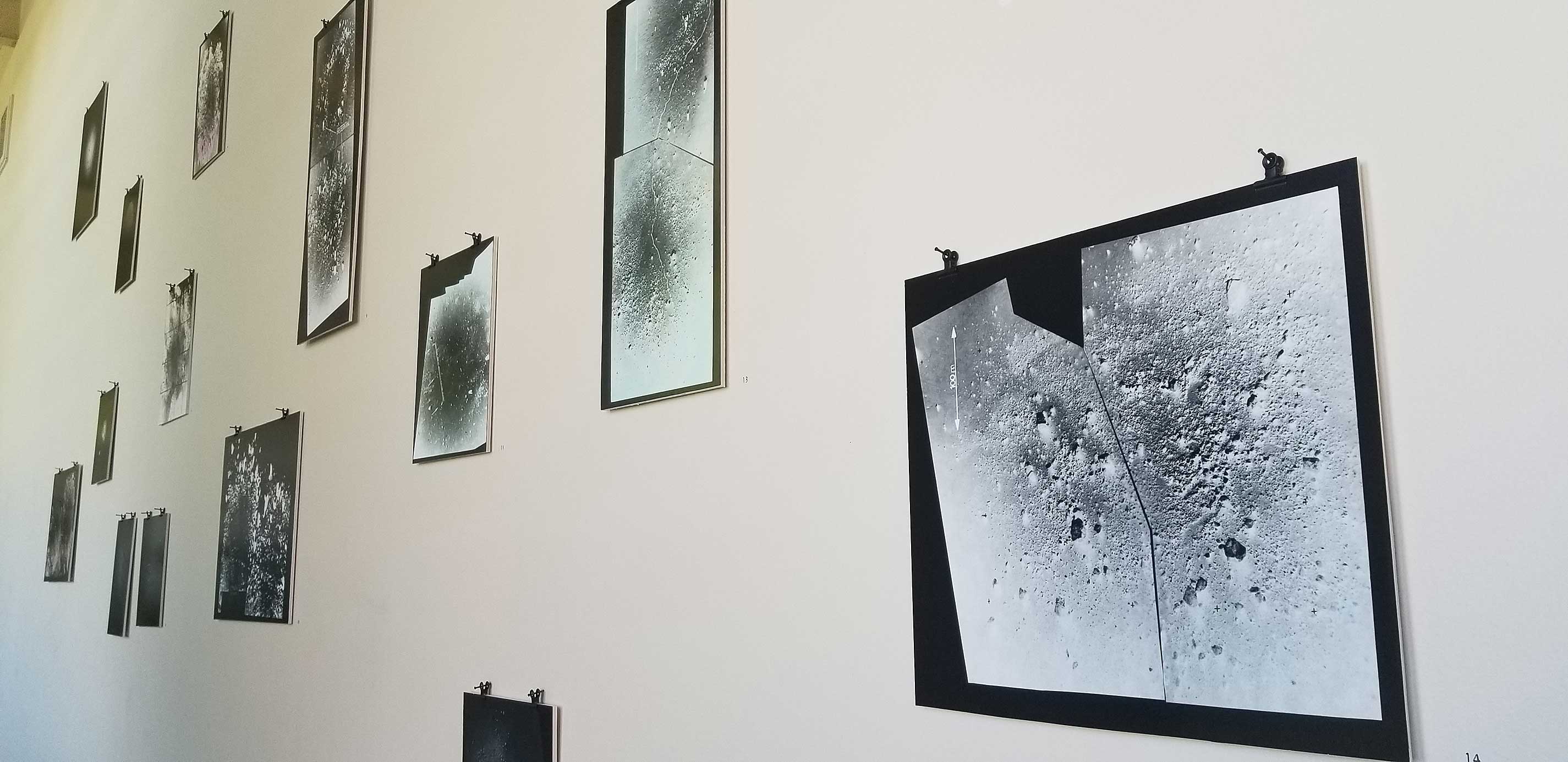
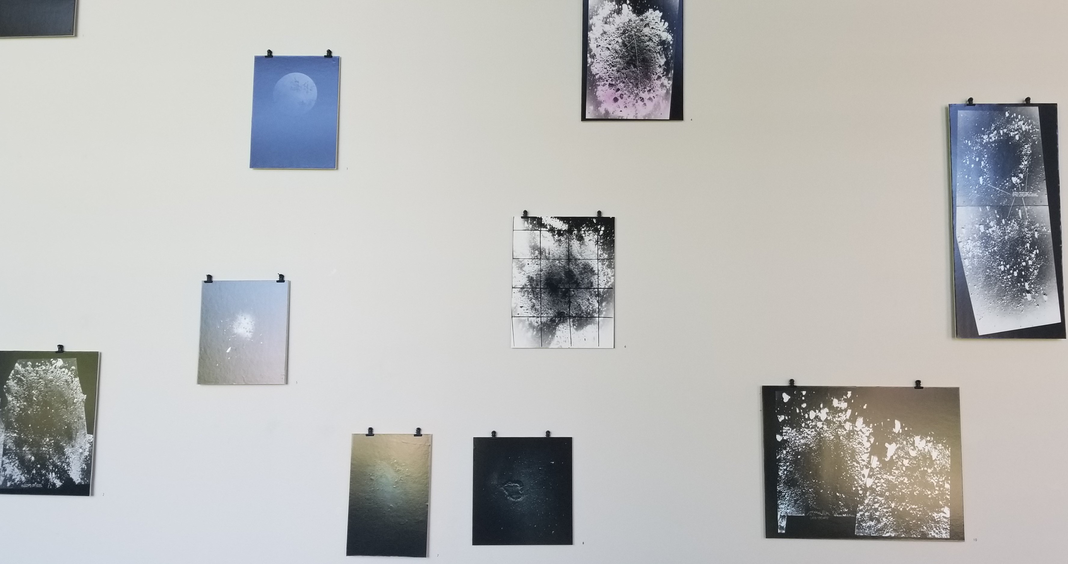
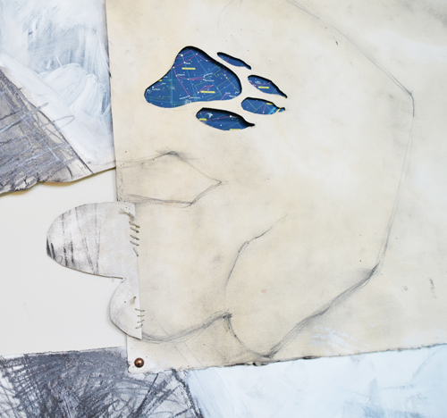
Survey: Julia Bradshaw
(Spring 2020)
In examining historical and contemporary astrophotography, Julia Bradshaw notes the aesthetics of scientific annotations such as alphanumeric designations, the mythological proper names of bright stars, and the descriptions of image content. In historic texts, she also notes the speculative scientific theories and florid language of exploration and speculation. Formally, Bradshaw is interested in the indexical information: the fiducial markers, the handwritten observations, the image-joinery and the overabundance of arrows. She notes incursions into the visual picture frame by the mechanics of the spaceships, and that in stitched-together images (known as photo-mosaics), all photographic data is retained.
Even though Bradshaw uses the aesthetics of scientific images to inform this project, all the artwork in Survey is created using silver-gelatin photographic processes and rudimentary tools. She uses a cardboard box for a camera, and images are manipulated with knives, inks, joins, dyes and reversals. The simplicity of the materials is a subtle poke at the vast gap between investment in science and investment in art.
Both space scientists and artists produce visual material, but one requires extraordinary investment for cosmic explorations, while the other explores the extraordinary richness of inner head space. To a certain extent, Bradshaw sees herself as an explorer of her imagination, creating maps, diagrams and places to discover. Her intent is to make observations about scientific images and scientific annotations and to create delightful confusion through wit. As such, Bradshaw acknowledges the complicated relationship between photography and reality.
-
Tell Me, Who Am I: Subarna Talukder Bose
(Fall 2019)
In these paintings, Subarna Talukder Bose contemplates the idea of skin that seems to take the center stage in defining identity, race, origin and human persona in our society. Coming from a country with a post-colonial hangover, the debate over fair and dark is a vital social dialogue that she has experienced all her life. By challenging the concept of ideal skin, she wants to find the true representation of individuality. In this process, she also picks up tokens of religious diversity through her patterns and stitched fabric. The patterns and fabric tell stories of the centuries-old Hindu and Muslim culture that have blended thoroughly into a harmonious whole in India.
Her process involves combining images randomly for unexpected chances and territories, pushing figurative representation and looking for unconventional beauty. For the patterns, she draws inspiration from Mughal and Hindu architecture and Indian miniature paintings, which she has grown up seeing and admiring.
Subarna was born and raised in Kolkata, India. She now lives and works in Oregon. Bose’s work has been curated by Blake Shell of Disjecta PDX and Bruce Burris, a Hallie Ford Fellow. Her work was included in the 2019 Around Oregon Annual. Recently, she was part of Pacific Coast Review, Zevitas Marcus Gallery in Los Angeles. She is also the cover artist of New American Paintings 2019, Pacific Coast Issue 139. She holds a BA in English Literature and a PG Dip in Journalism.
-
Withinwithout: Cara Tomlinson
(Spring 2019)
Cara Tomlinson’s creative work has a variety of overlapping foci, exploring construction and evolution of self, boundaries of subjectivity, and the interconnection of self and environment. One of her longest-lasting questions as an artist is how to represent the human and animal body from the perspective of being one. Where do our bodies end and begin in the mind and the environment? How do you create symbolic forms for experience as a living body interacting with other bodies? Over the years, she has arrived at an interchangeable alphabet of forms that are rearranged and juxtaposed to explore these questions. Withinwithout defines an ongoing series of paintings focused on the body as form and process, and the moveable boundaries of inside/outside, order/disorder and animal/human. In this exhibition, she specifically focuses on the processes of vision, metabolism, permeability and sedimentation.
Working with the medium of oil paint, Tomlinson conceives the act of painting as a metaphor for co-evolution of the self and environment that addresses ideas of subjectivity, agency and materiality. A painting is an object governed by a condensed historical, pictorial and material language. As she paints, she co-evolves a criteria along with the image and material. Calibrating color is a large part of her process. She works with a tonal palette that is especially sensitive to changing light conditions; her paintings are meant to be lived with and experienced through changing light. Color in painting is both material (mineral and oil) and the effect of energy. As such, it is one of the aspects of painting that carries into the environment transmitting beyond its container.
-
Levitate: Anne Magratten
(August 28 – December 7, 2018)
To levitate could be conceived of as a supreme form of avoidance. The thing above refuses to touch the thing below. Yet these high and low entities are defined by their relationship to one another. Acts of levitation happen everyday. We hover above topics (propelled by repulsion, shame, embarrassment, denial, or malice) and this requires effort. The act of levitation always generates precarity, as gravity constantly threatens to exert direct contact.
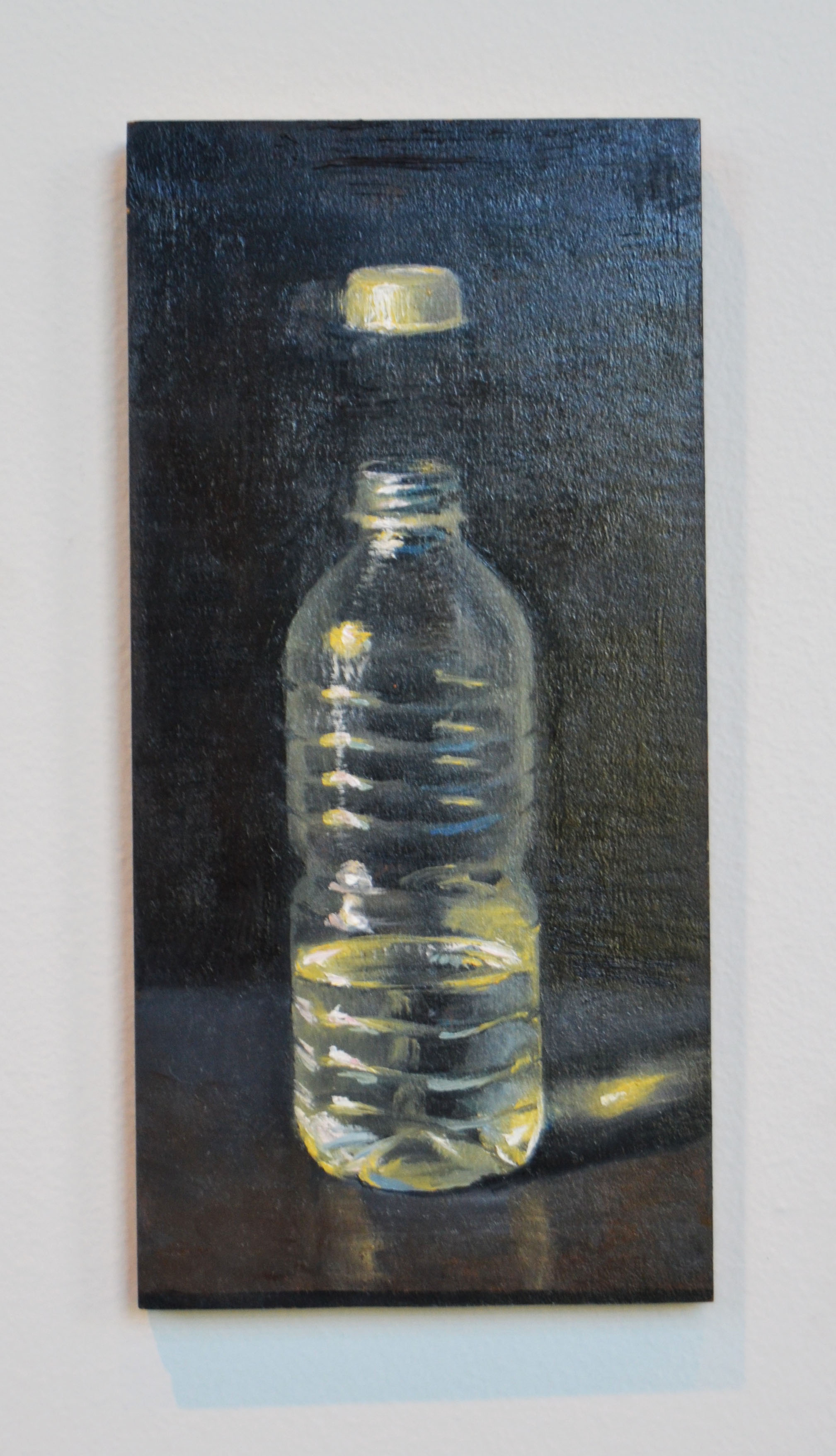
In her exhibition, Levitate, Anne Magratten presents two groups of paintings that explore how sexuality, gender, or class can provoke this type of avoidance. In her series of still life paintings How Queer, Dear, she toys with visual conundrums specific to modern sexuality, gender, and queer identity. Employing humor and formalism she cloaks the taboo in the boring. In Insulation, she groups small observational paintings on cardboard questioning how materials, perspective, gender, and class shapes the value of art objects.
Anne Magratten is a graduate of Mills College and received her MFA in Studio Art at The University of Oregon in 2015. She is an Instructor of Painting and Drawing at Linn Benton Community College. Additionally, she offers college Drawing courses within Oregon prisons. She is a member of the Eugene based artist collective Tropical Contemporary. Additional aspects of her art practice can be seen on her website and the website of the collective.
-
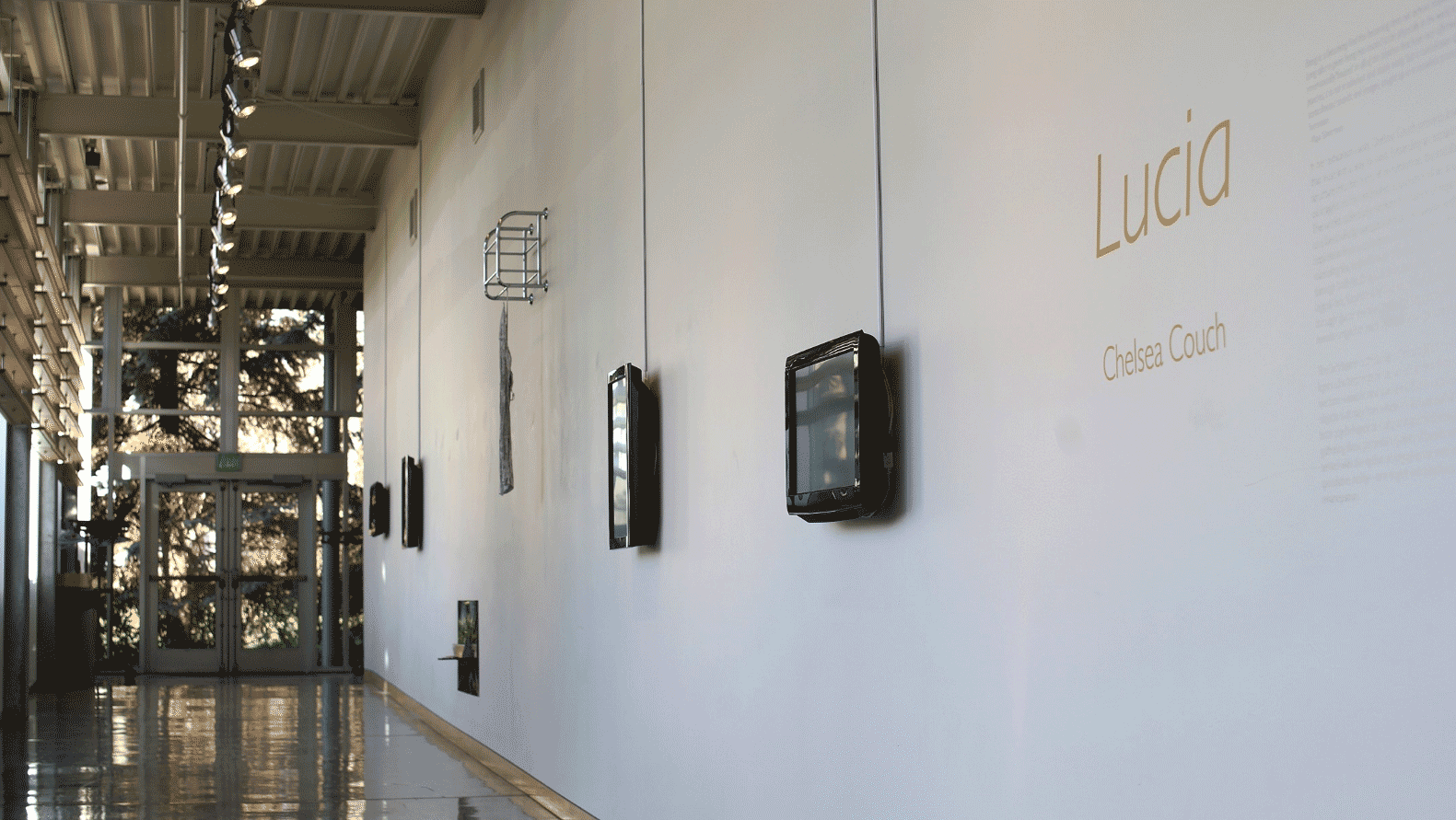
Lucia: Work by Chelsea Couch
(January 16 – May 16, 2018)
In her exhibition Lucia, Chelsea Couch presents images and objects that must find a way to exist. Expanding an experimental narrative structure into the form of an exhibition, the installation offers faceted insights on the embodied experience of an anonymous woman. The works collectively explore the fallacy of regarding an individual as a fixed, wholly encapsulated and knowable entity by drawing their inspiration from a collection of short stories—fictional yet uncannily mirroring the author's own traumas. This exploration of a woman through both truth and fiction mines her existence through an ontological lens, fascinated by her experiential, sensorial movement through space and time. Offering various sightlines, Lucia's truths remain unspoken yet they have been given a voice.
The installation collectively offers insights filtered through so many layers of interpretation and creation that their origin point has become nomadic and pixelated. There is a sense of place, imprints of objects that may have inhabited this person's life, and glimpses into both psychological and physical spaces she may have experienced. In gathering these potential imprints of Lucia's existence, we are presented with the option of engaging our own empathy through her speculative reality—one tinged with loneliness and a longing for emancipation.
Chelsea Couch is a graduate of The University of Tennessee at Chattanooga (BFA, 2013). She received her MFA in Studio Art at University of Oregon in 2017. She is currently a Visiting Assistant Professor of Sculpture and Expanded Forms at Willamette University.
More of her work can be seen on her website.
-
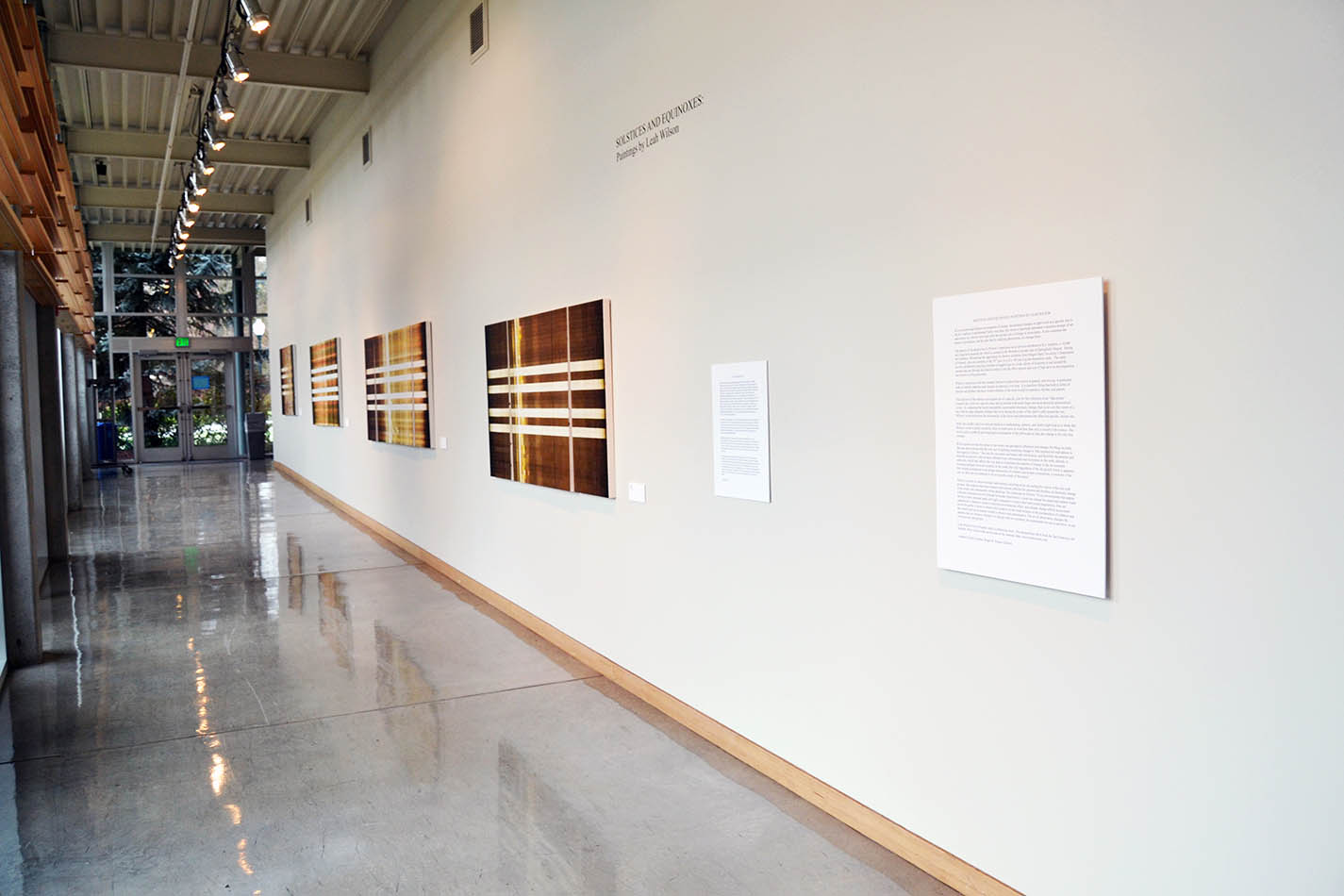
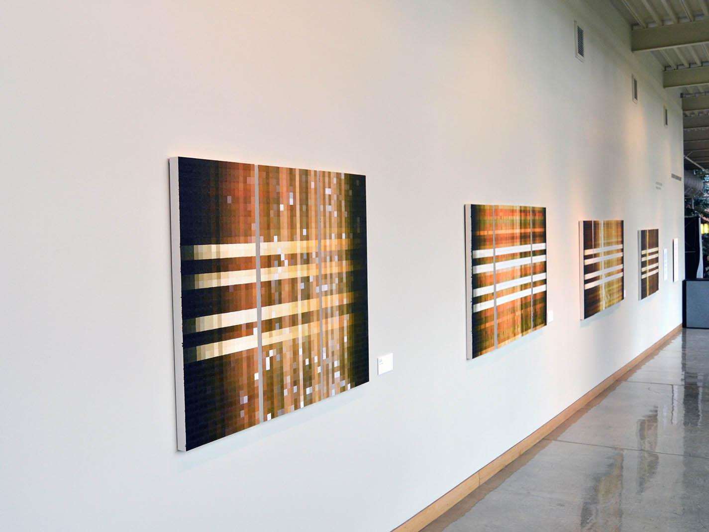
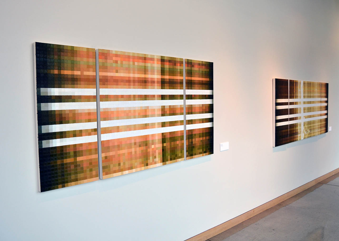
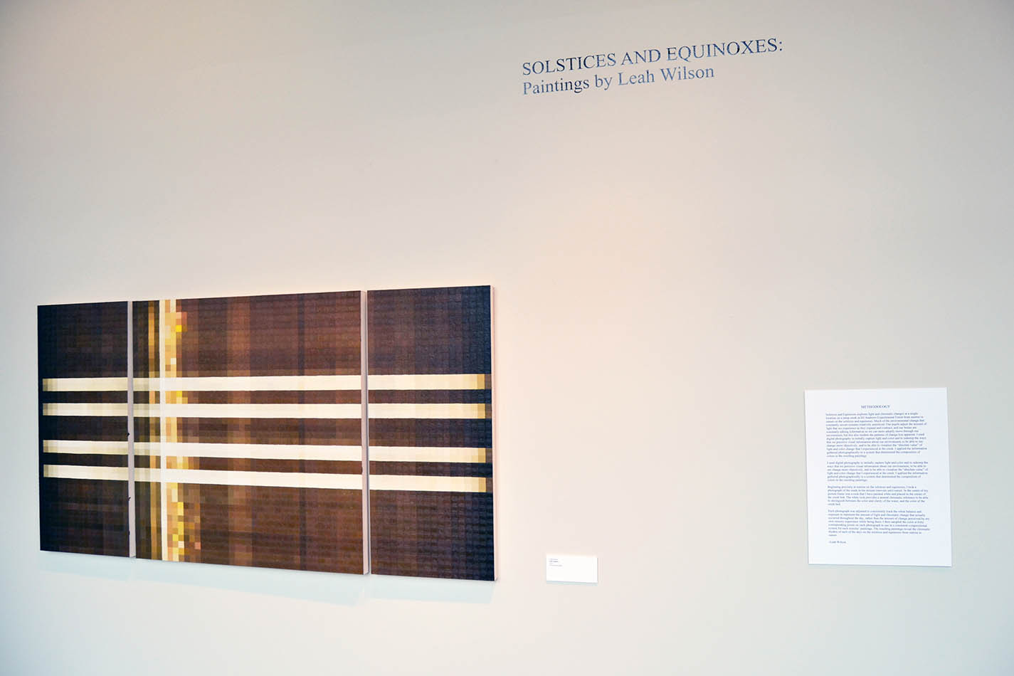
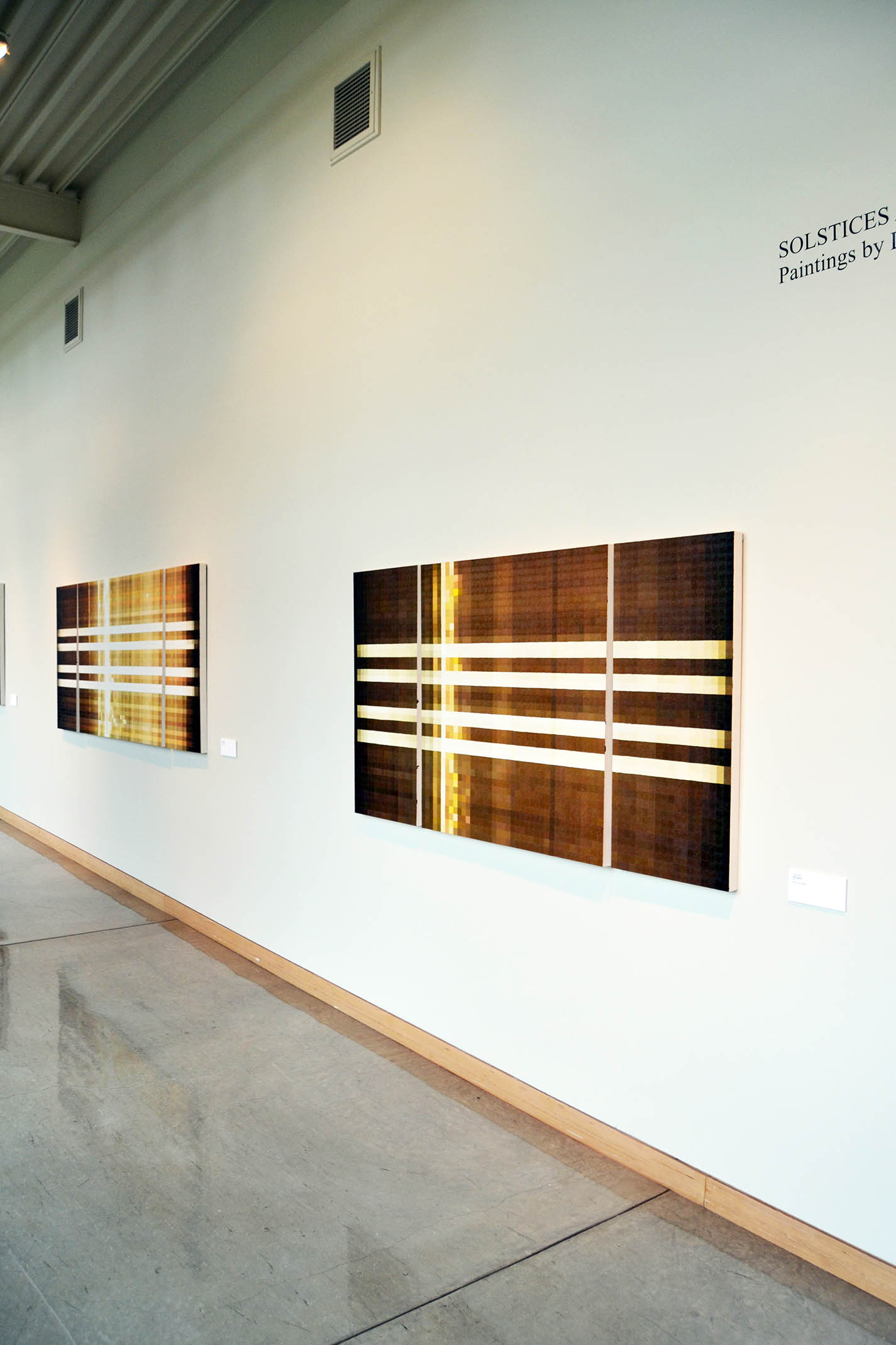
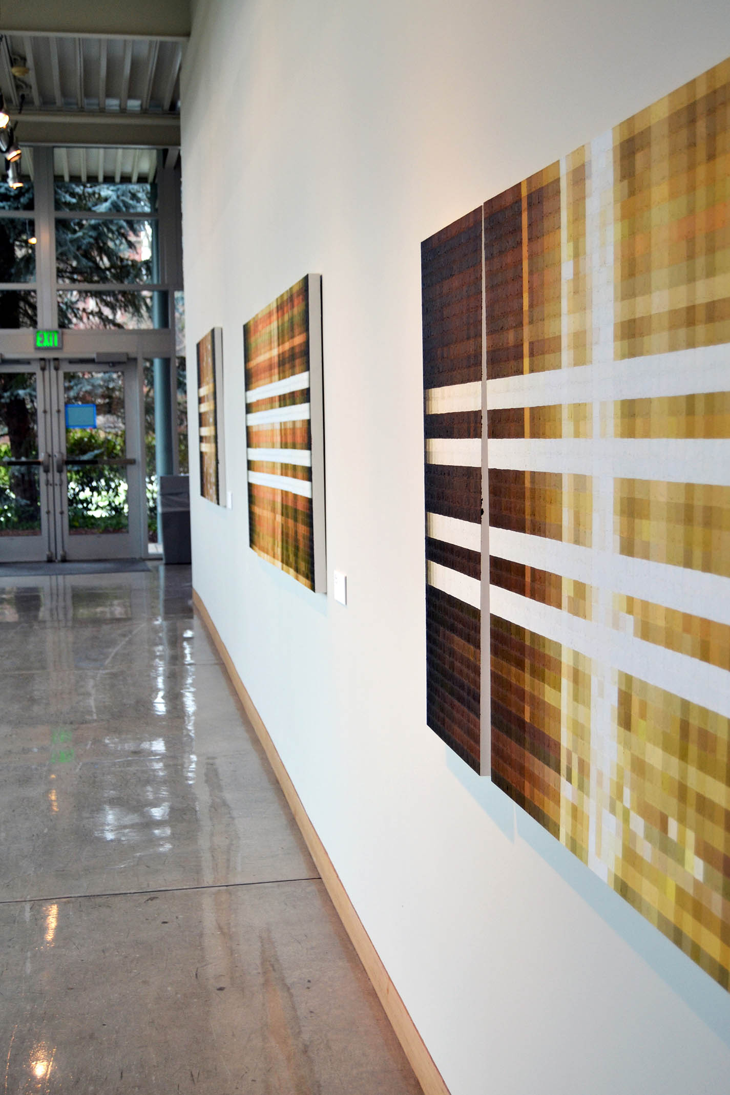
Solstices and Equinoxes: Paintings by Leah Wilson
(January 17 – May 16, 2017)
In its measured and diligent investigation of minute, incremental changes in light levels at a specific site in the H.J Andrews Experimental Forest over time, this series of paintings represents a seamless merger of art and science as it throws into high relief the pivotal role of change in ecosystems. It also examines the nature of perception, and the idea that by studying phenomena, we change them.
The genesis of the project lies in Wilson’s experience as an artist-in-residence at H.J. Andrews, a 16,000 acre long-term research site which is located in the Western Cascades east of Springfield, Oregon. During her residency, Wilson had the opportunity to observe scientists from Oregon State University’s Department of Forestry, who are currently in the 30th year of a of a 100-year log decomposition study. The study involves deliberately placing a number of tagged logs in a wide variety of locations in and around the streams that run through the forest in order to test the effect species and size of logs have on decomposition and nutrient cycling processes.
Wilson’s interaction with this research led her to realize that science in general, and ecology in particular, seeks to identify patterns (and changes in patterns) over time. It is therefore fitting that both in terms of process and product, the most evident element of the work would be repetition, rhythm, and pattern.
The selection of the solstices and equinoxes of a specific year for the collection of her “data points” connects the cycles in a specific place and ecosystem with much larger and more powerful astronomical cycles. In comparing the barely perceptible, incremental chromatic changes that occur over the course of a day with the large seasonal changes that occur during the course of the earth’s orbit around the sun, Wilson’s work underlines the universality of the forces and phenomena that affect her specific, chosen site.
While the careful, and even clinical attention to methodology, process, and detail might lead us to think that Wilson’s work is purely scientific, there is much more at work here than only a concern with science. Her work is also a symbolic and meaningful examination of the philosophical idea that change is the only true constant.
Wilson points out that the nature of our senses and perception influences and changes the thing we study. She also demonstrates that the very act of studying something changes it. She explains her realizations in this regard as follows, ” Not only do our senses and brains edit information, and therefore the patterns and rhythms we perceive, but we have affected every environment and ecosystem on the earth, directly or indirectly, which also affects the way that we experience the patterns of change in the environment. Looking upstream from my location on the creek, the wild ruggedness of the old growth forest is apparent. But looking downstream is an abrupt intersection of wildness and human construction, a reminder of the way we alter our environment to fit our specific needs of that place.”
Wilson was able to observe human interventions occurring at her site during the course of her one-year process. She explains that these human interventions affected the patterns and rhythms of chromatic change in the creek, and subsequently in her paintings. She elaborates as follows: “Even environments that appear wild and untouched are still affected by human intervention: a road can change the speed and redirect water during a storm; national parks are highly managed to control plant and animal populations; fires are suppressed or started to achieve a desired environmental effect; and climate change affects ecosystems across the globe. I chose to observe this location on the creek because of the juxtaposition of wildness and the constructed environment created to observe and understand it. The act of observation changes the patterns that we observe, whether it is though what we construct, the instruments we use to perceive, or our own physical perceptions. …..”
Leah Wilson lives in Eugene, and is a practicing artist. She obtained her MFA from the San Francisco Art Institute. More of her work can be seen on her website: http://www.leahwilson.com.
–Andries Fourie
Curator, Roger W. Rogers Gallery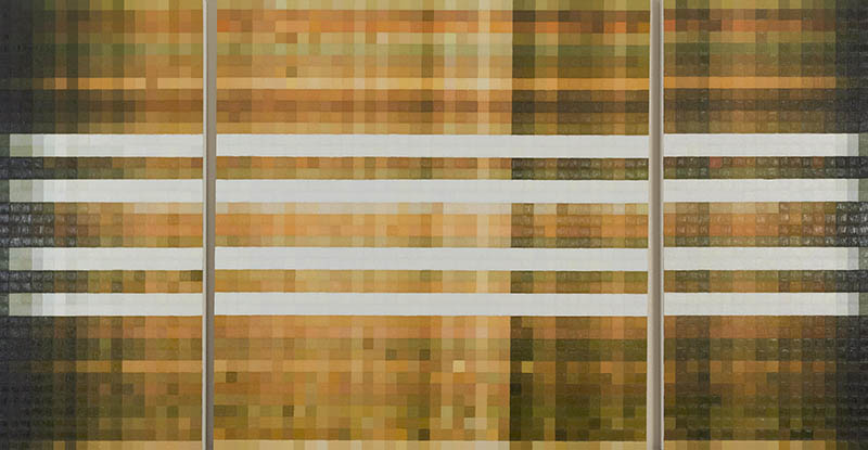

-
Border Crossings: Betty LaDuke
(January 17 – May 16, 2017)
Ranging from giclee prints to almost life-sized acrylic paintings on cut-out wooden panels, Betty LaDuke's artworks show farm workers in fields, families in refugee camps overseas and people struggling to cope with the aftermath of war or environmental degradation. LaDuke was inspired by her frequent travels to countries such as Eritrea, Syria, Bosnia and Mexico.
LaDuke’s art has been described as reminiscent of American Regionalism with its use of exaggerated forms to portray working class people. LaDuke also incorporates elements of folk art, such as bright colors, stylized motifs and repeated patterns.
LaDuke forms personal relationships with the people she portrays, often gathering their stories as she captures the daily routines of their lives in her sketchbook. The oral histories of Oregon farm workers appear alongside LaDuke’s sketches and finished artwork in her book “Bountiful Harvest,” which is available from the university library.
Several of LaDuke’s other works are in HFMA’s permanent collection, with some pieces on display in the third floor of the University Center. Her personal papers and sketchbooks are housed in the Pacific Northwest Artists Archives, a collaborative project of the Willamette University Archives and the Hallie Ford Museum of Art.
“Betty LaDuke has a long history of using the visual arts as a vehicle for social change,” says University Archivist Mary McRobinson. “She immerses herself into cultures, going into villages and fields to give voice to people who are often marginalized. As she says, her images ‘bridge people as well as continents. We are one.’”
-
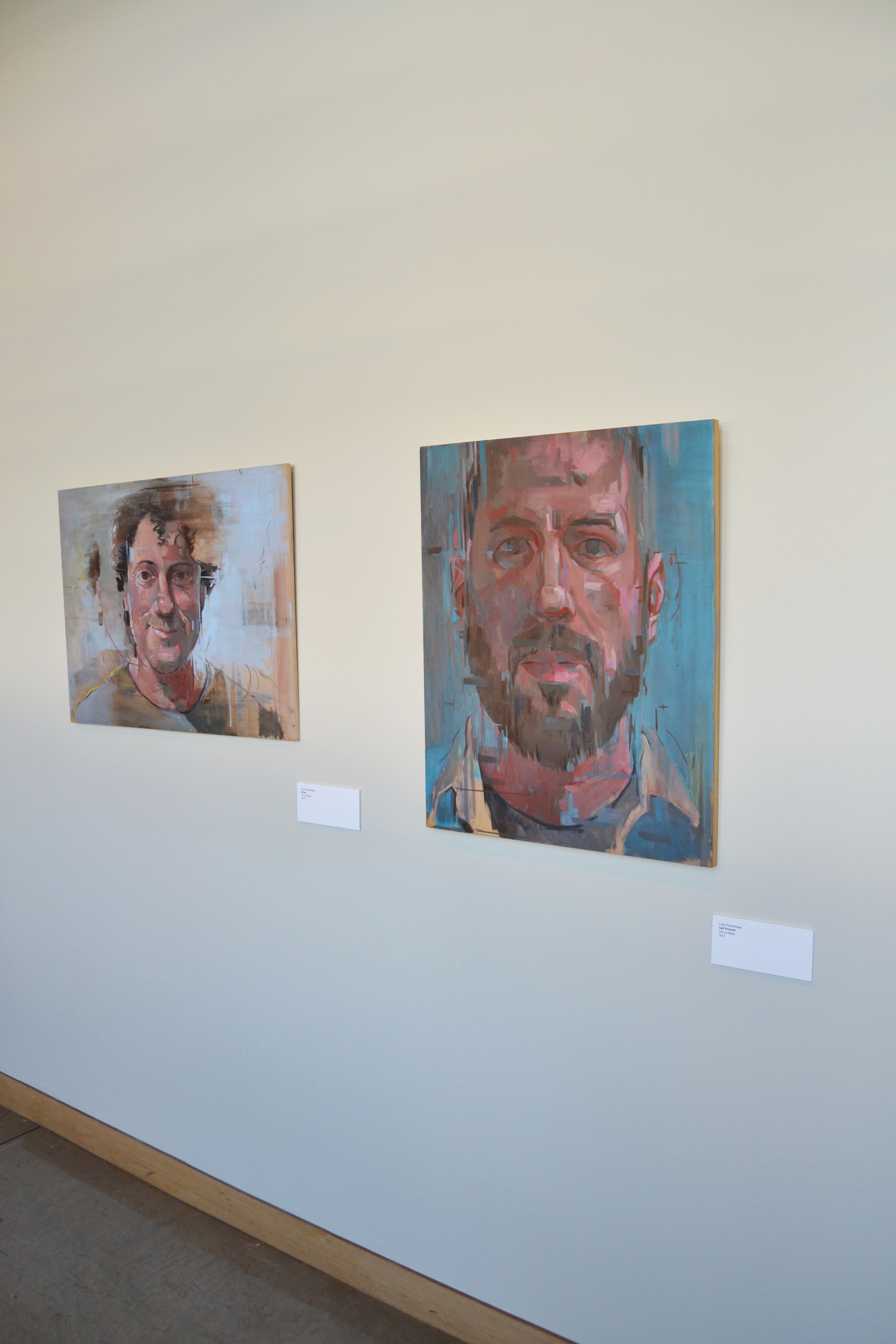
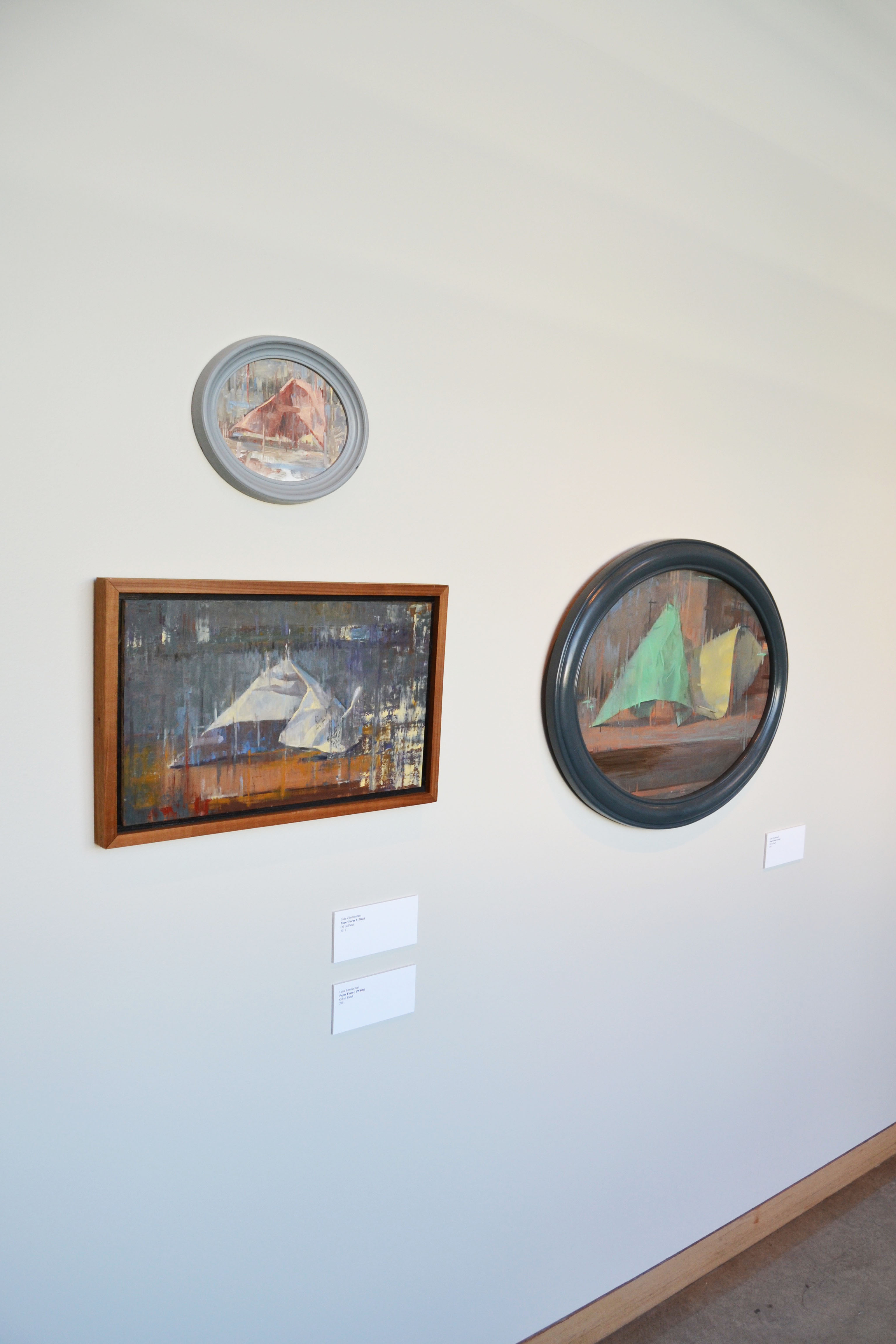
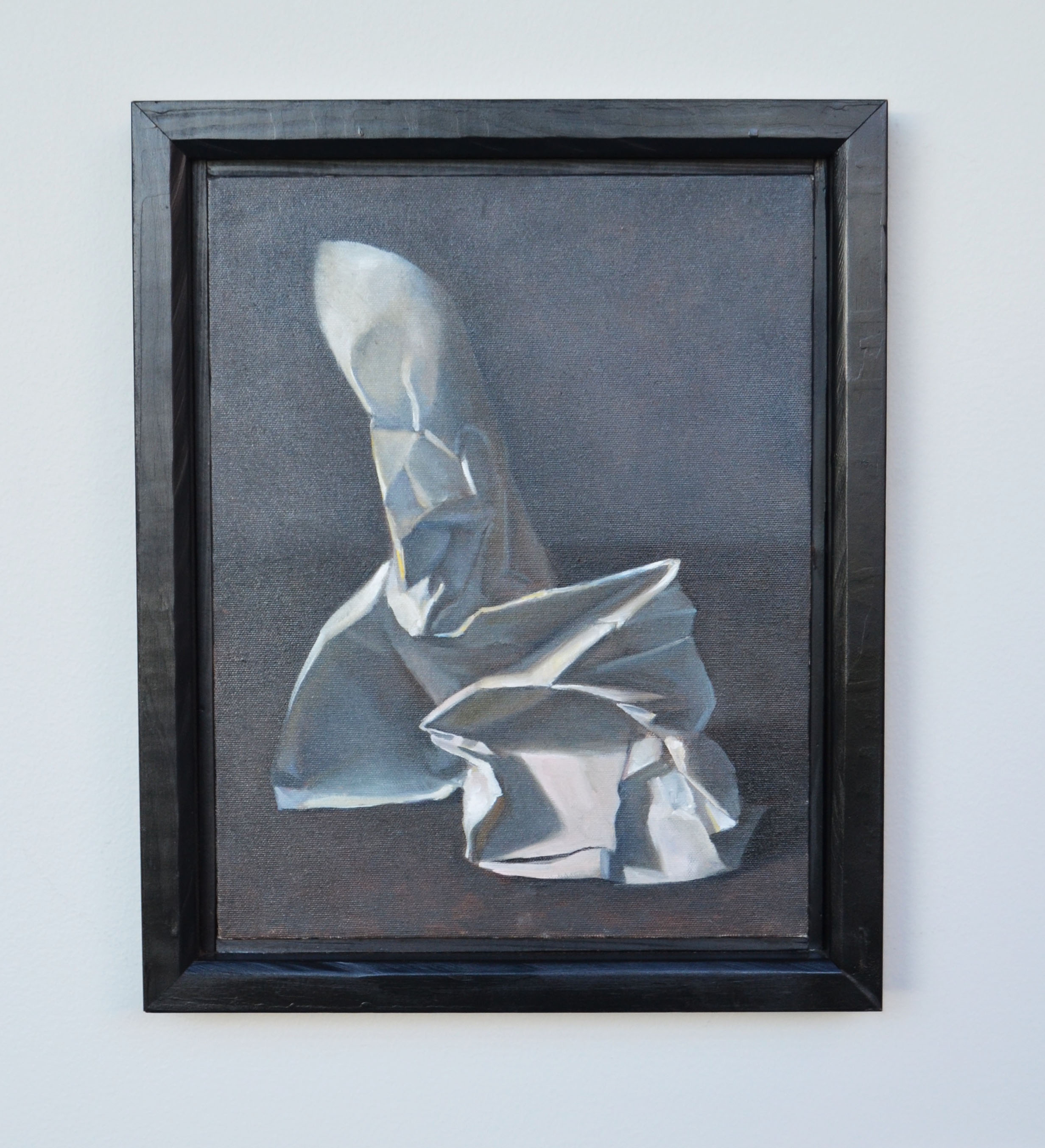
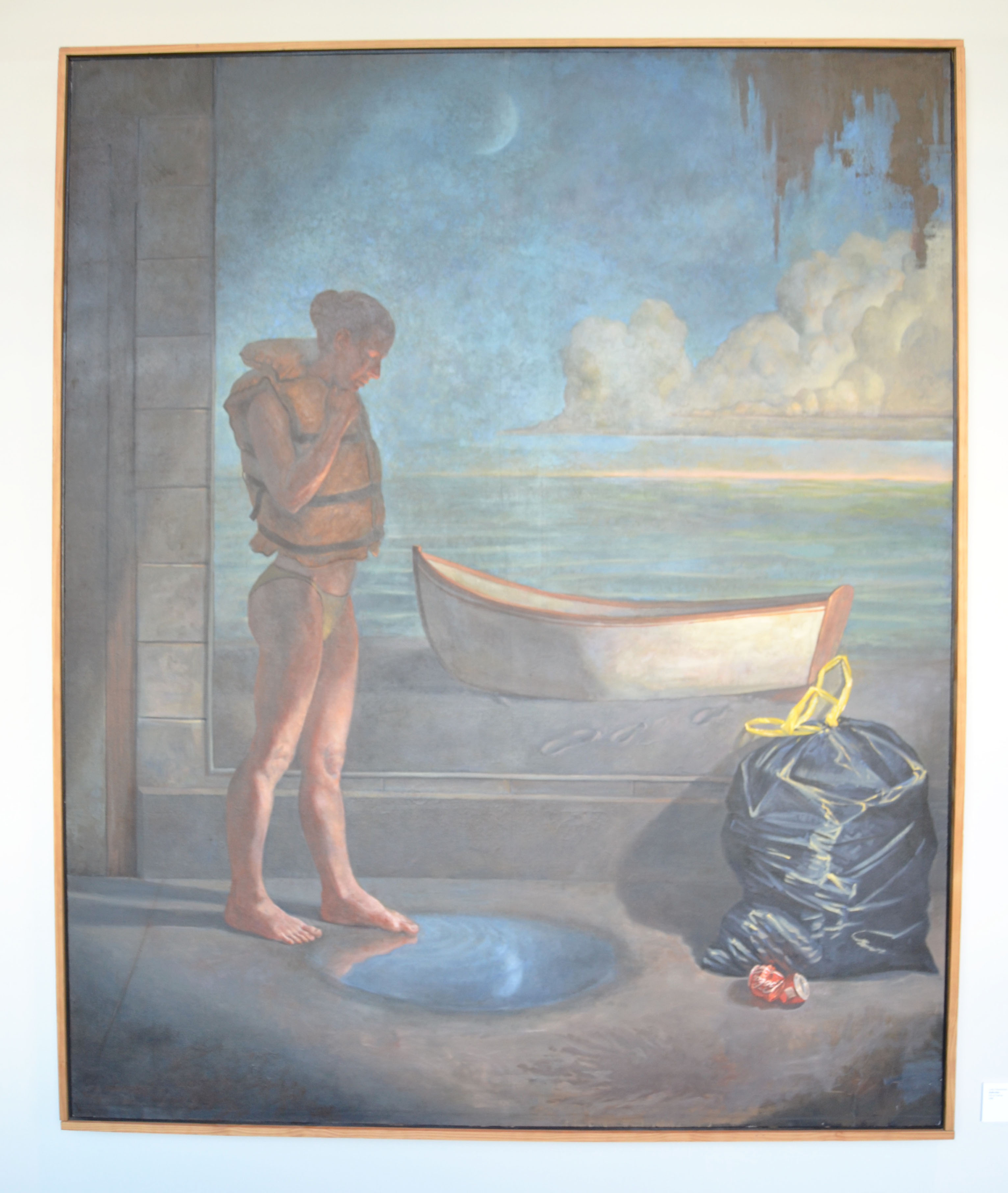
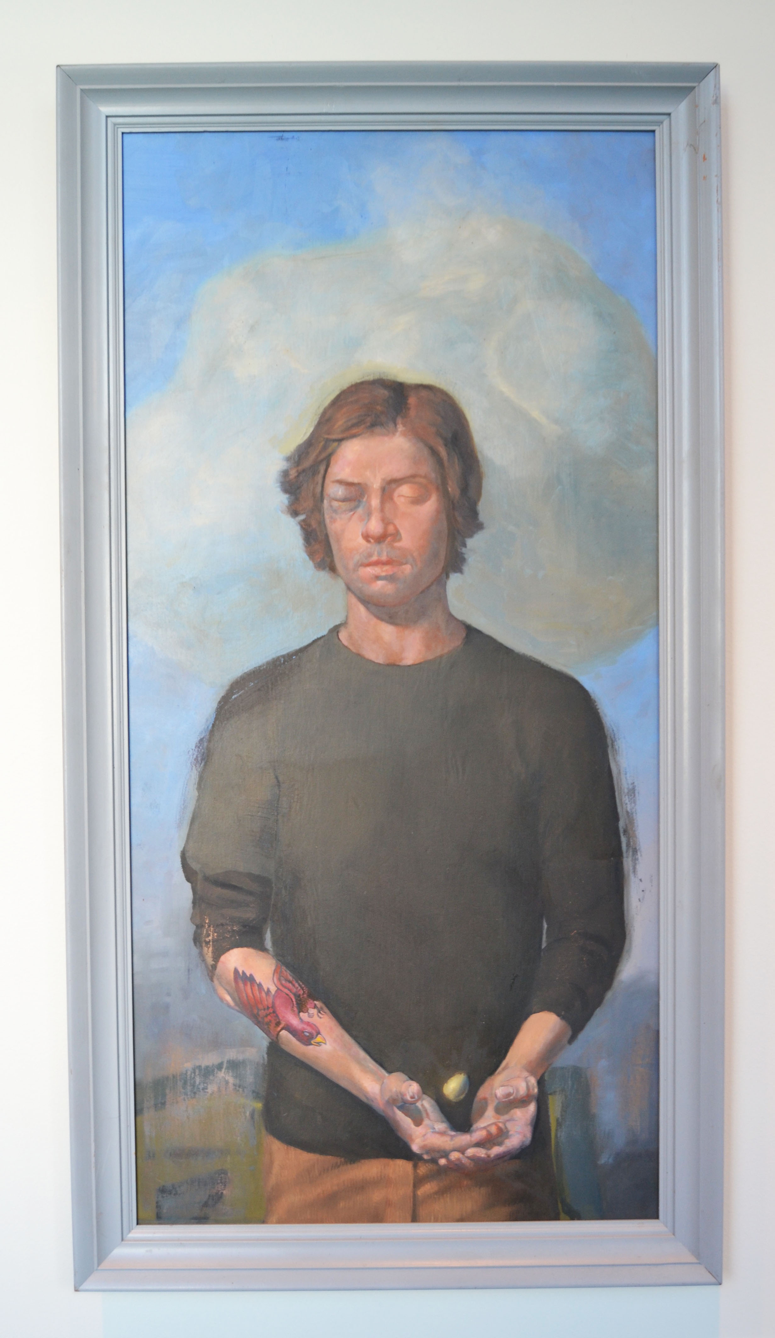
Never a Straight Line: Paintings by Luke Zimmerman
(August 29 – December 17, 2016)
In “Never a Straight Line”, we see the trajectory of Luke Zimmerman’s work over the last ten years (installed chronologically in the gallery from right to left). While Zimmerman has been very consistent in his focus on observation and perception, the work in this exhibition does describe an arc from narrative realism to a much more painterly meditation on the nature of seeing. In the earlier work perception and the resulting image-making are harnessed to the goal of attaining an accurate level of representation. It aims to achieve an image that is refined, precise and meaningful in terms of its communication of narrative and symbolism. In the later works we are given a window into the process of a painter who has become so interested in the process of perception that both visual precision and narrative becomes less important.
In his paintings that employ a specific narrative, Zimmerman is very wary of making didactic art. Instead of spelling out literal meaning, he prefers to ask questions rather than make statements. The result is a very productive kind of visual economy that is enigmatic and open to viewer interpretation. This approach is exemplified by “Untitled” of 2011. In this painting a young man, with his eyes closed, and one of them blackened from an accident or altercation, cups his hands to catch a small, golden egg. He stands in a loosely painted landscape with a nebulous cloud behind his head. The red bird tattooed on his arm seems to be lunging to catch the egg, its agitation in stark contrast with the young man’s calm, almost somnolent facial expression (but possibly a refection of his more turbulent inner thoughts. It’s as if the young man is closing his eyes to visualize the potential that he has yet to achieve, through the obstacles and distractions of reckless and stormy youth. The egg symbolizes potential, and it is fiercely guarded by the bird, possibly an oblique reference to parental nurturing or protection.
“Man” from 2016 represents Zimmerman’s more recent, and more painterly work. This portrait seems to dissolve before the viewer’s eyes into a floating vapor of brushstrokes. While still representational, it appears to be shifting and fugitive in nature. Zimmerman explains that he became increasingly interested in the process of perception that gives birth to image making. This led him to realize that, paradoxically, the specificity that he had for years aimed to attain in his work is antithetical to the real experience of seeing, which is about calling into question over and over the marks that you’ve made, as well as the sustained observation those marks were based upon. You arrive at a kind of certainty through doubt. Zimmerman says the following about this process, ”What I’m doing is not recording, but rather its own thing, and I have to respect it.” In becoming hyper-aware of the process of seeing, he realized that he had to be willing to embrace the absence of certainty. When we stare at something for hours and hours, our eyes become fatigued, and we see things that are not there. In a strange way the image is humanized and ennobled by including the imperfections of perception. This ties in with Zimmerman’s assertion that what makes something beautiful is not the thing itself, but the way in which it is observed. The end result is work that is quiet, reserved, and consistent in terms of its dedication to the craft of painting, the discipline of observation and the chimeric quirks of perception.
Luke Zimmerman received an MFA in Collaborative Design from The Pacific Northwest College of Art and Design. He teaches Art George Fox University.
–Andries Fourie
Curator, Roger W. Rogers Gallery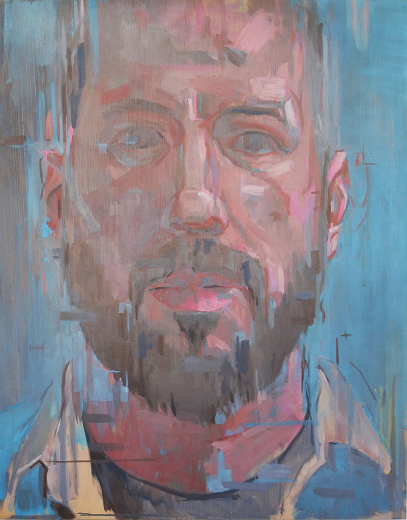
Luke Zimmerman
Self Portrait
Oil on Panel
2012

-
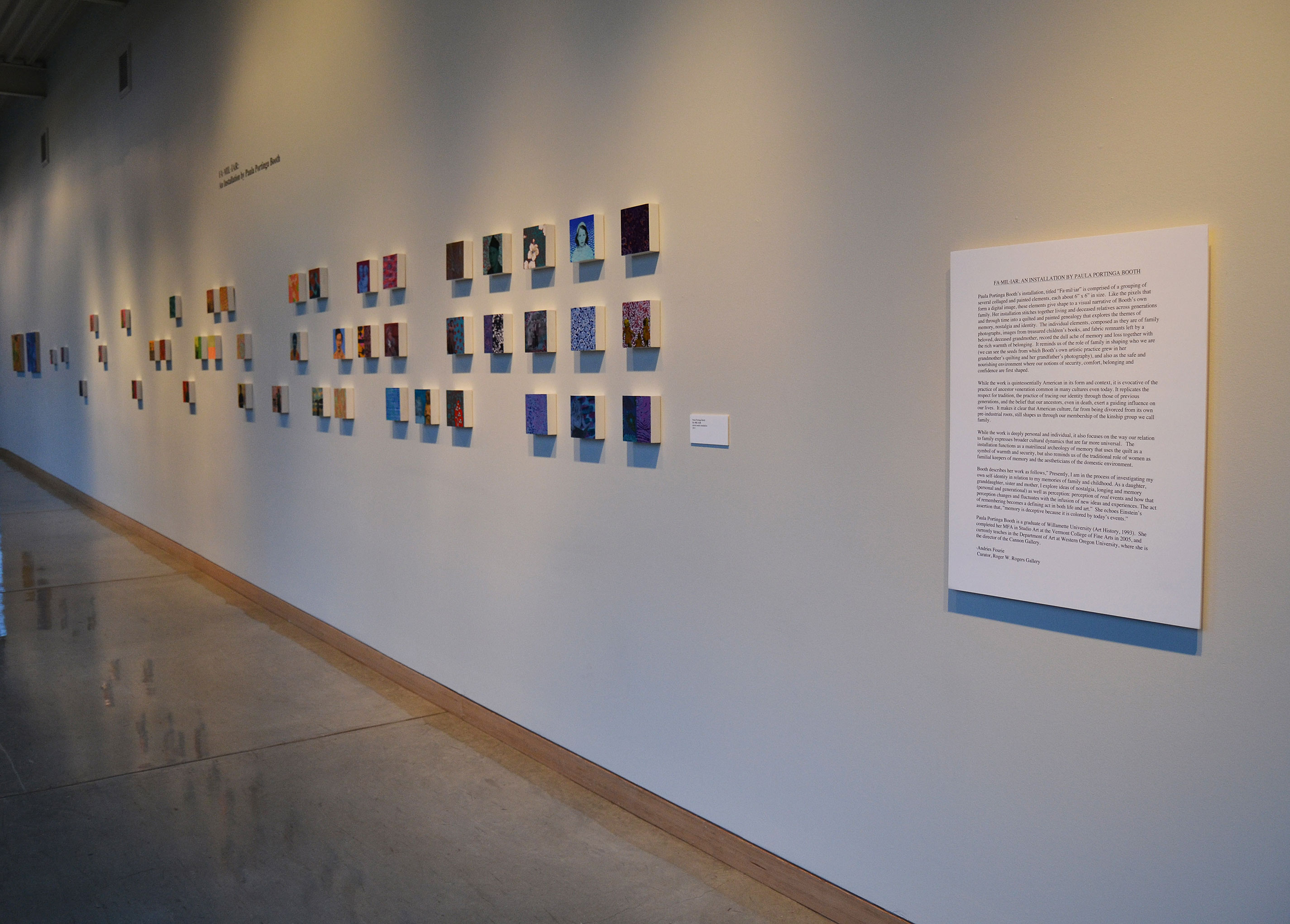
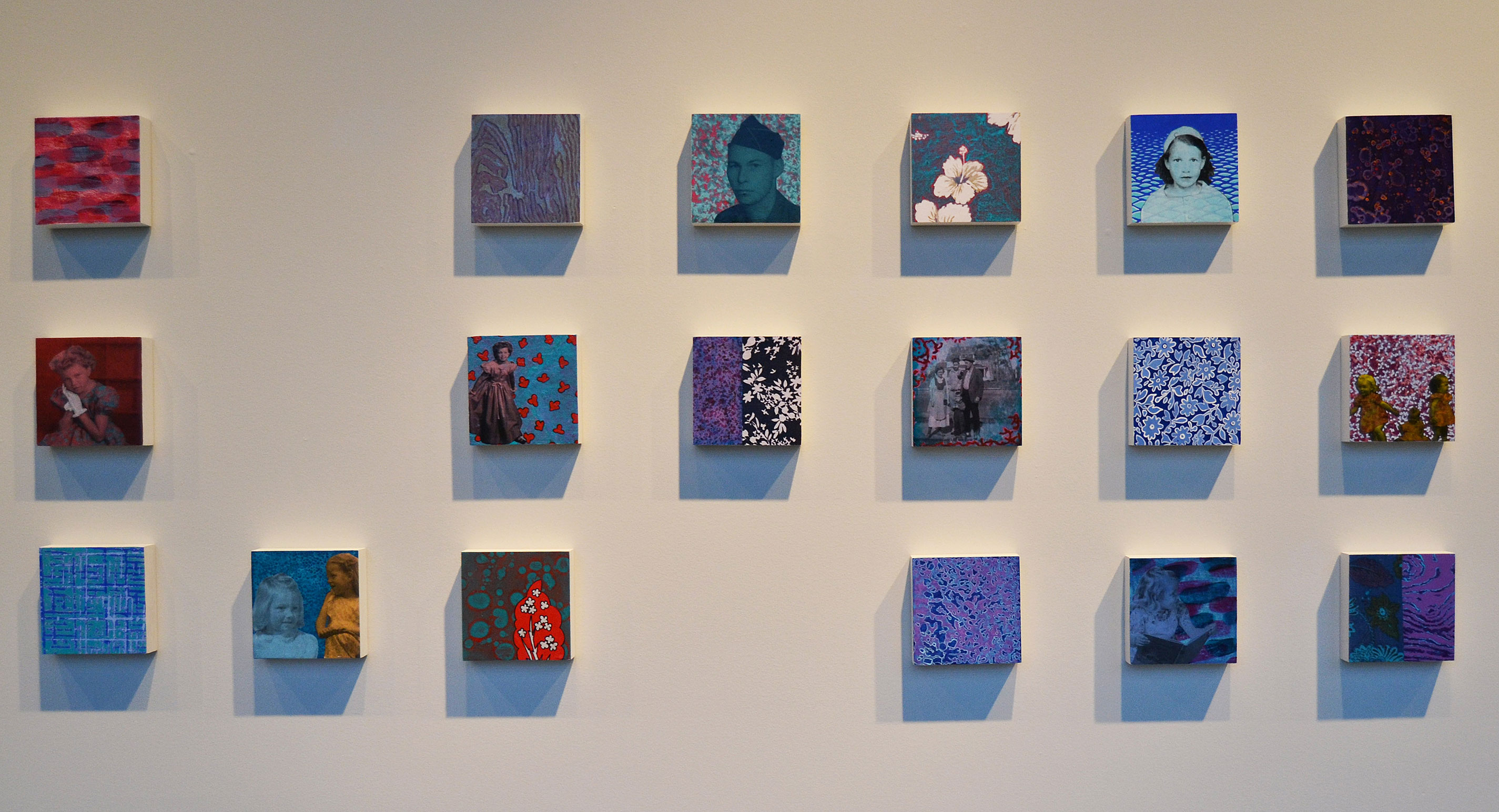
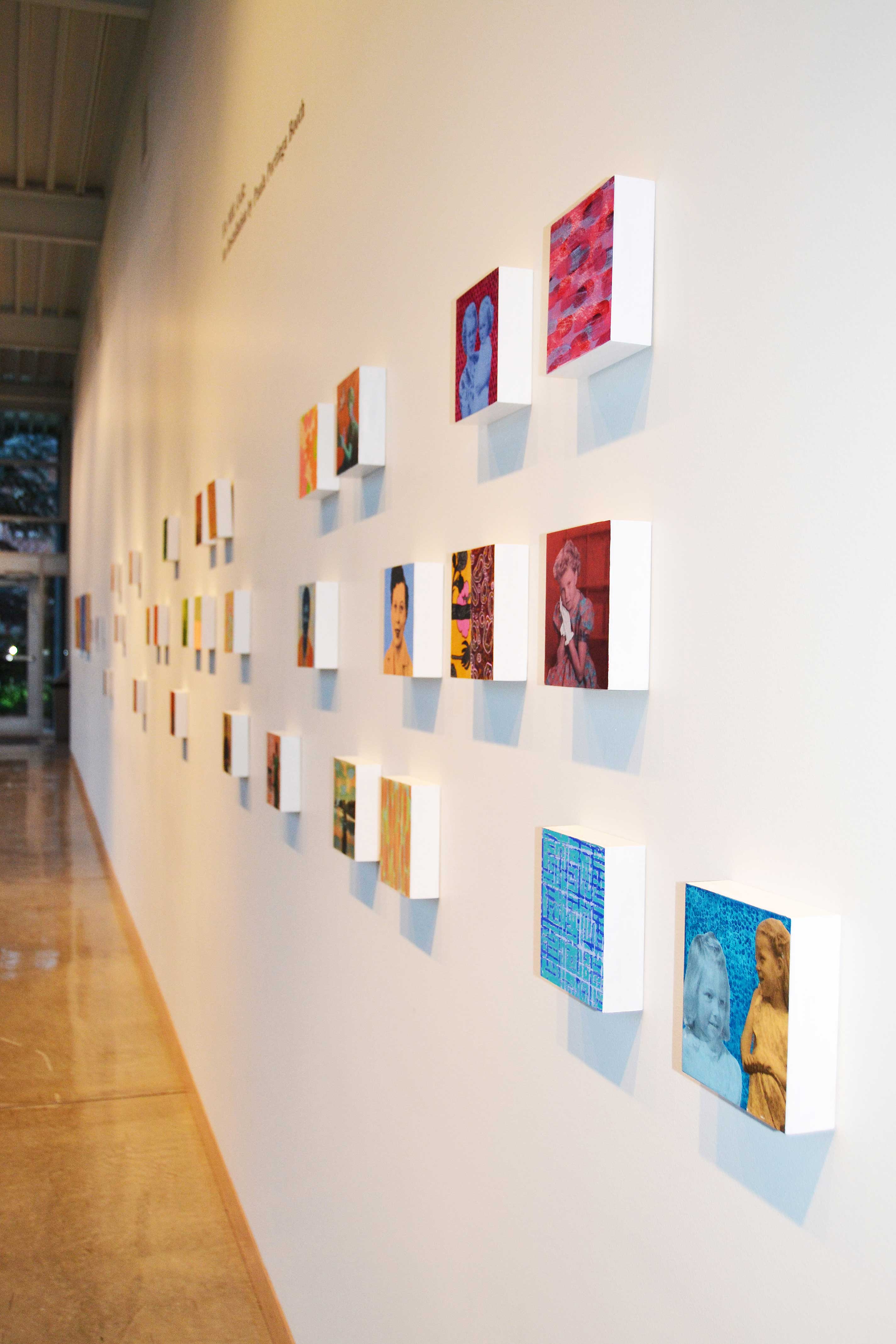
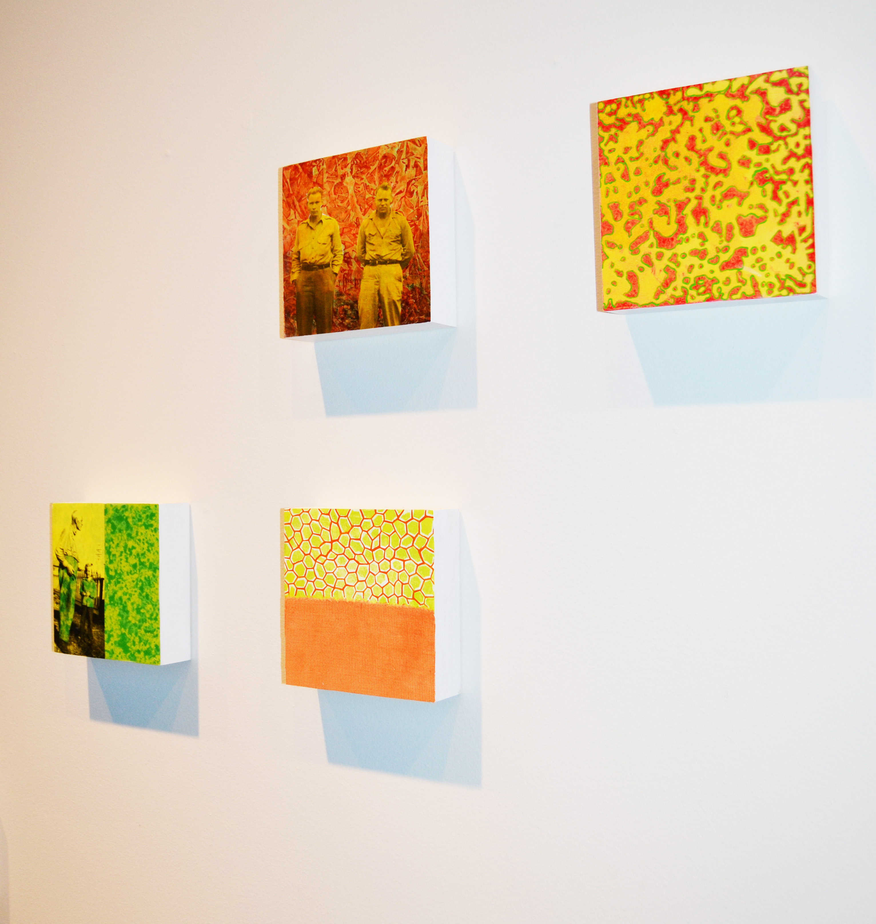
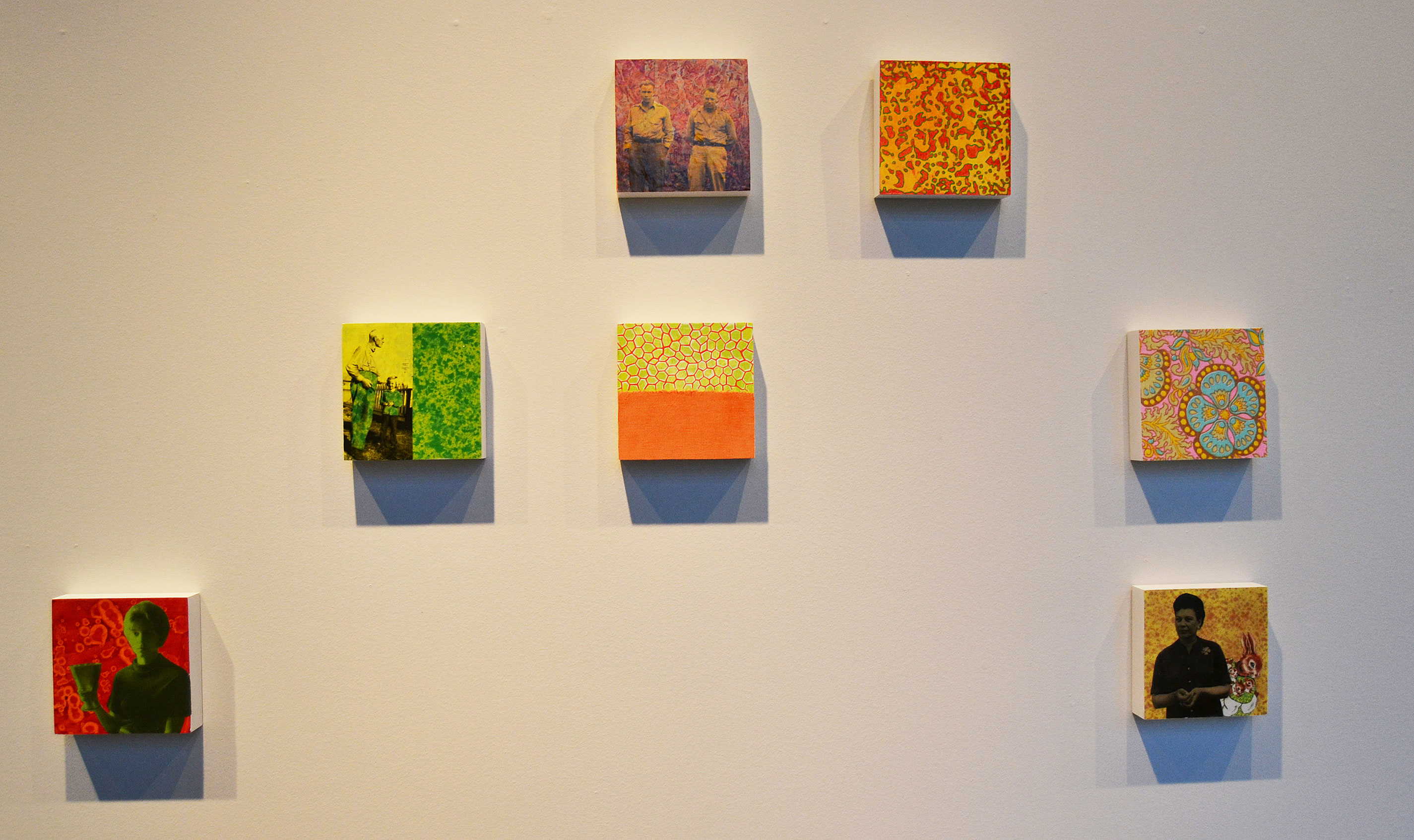
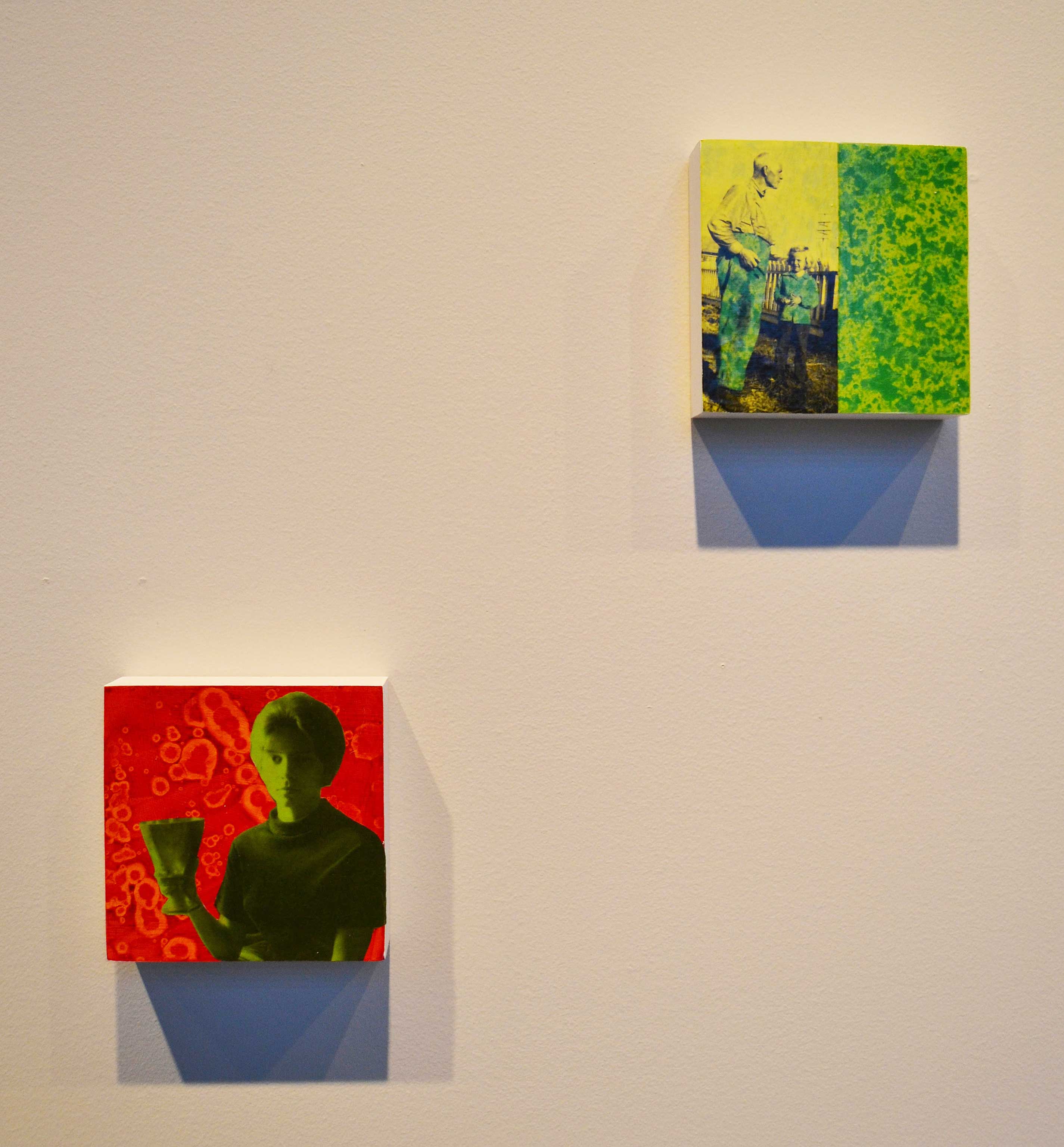
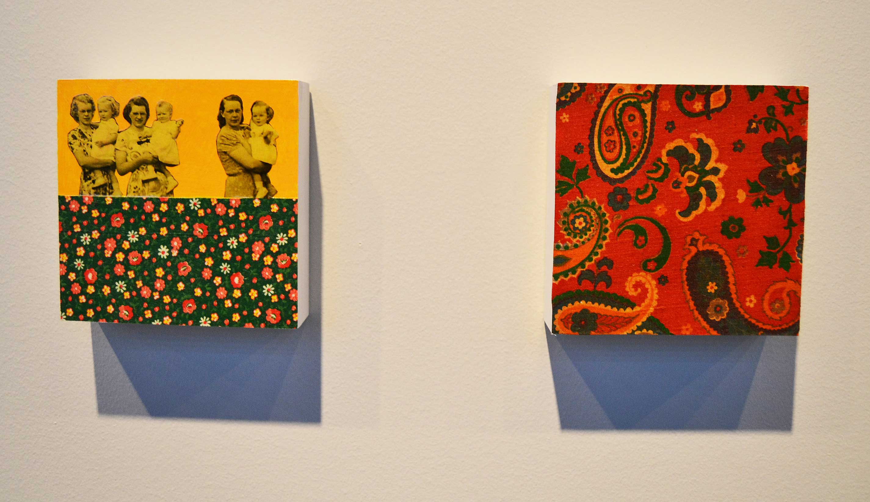
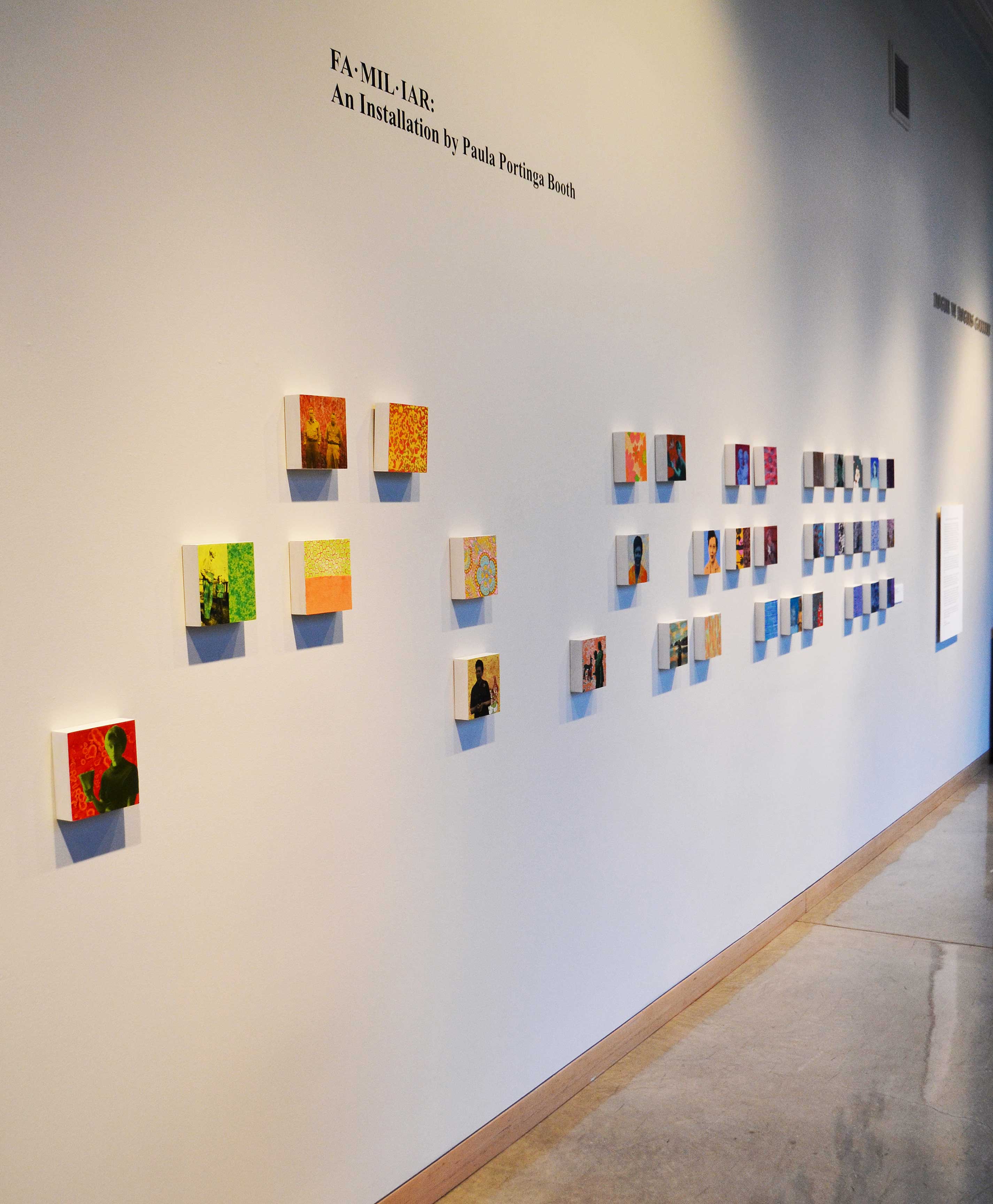
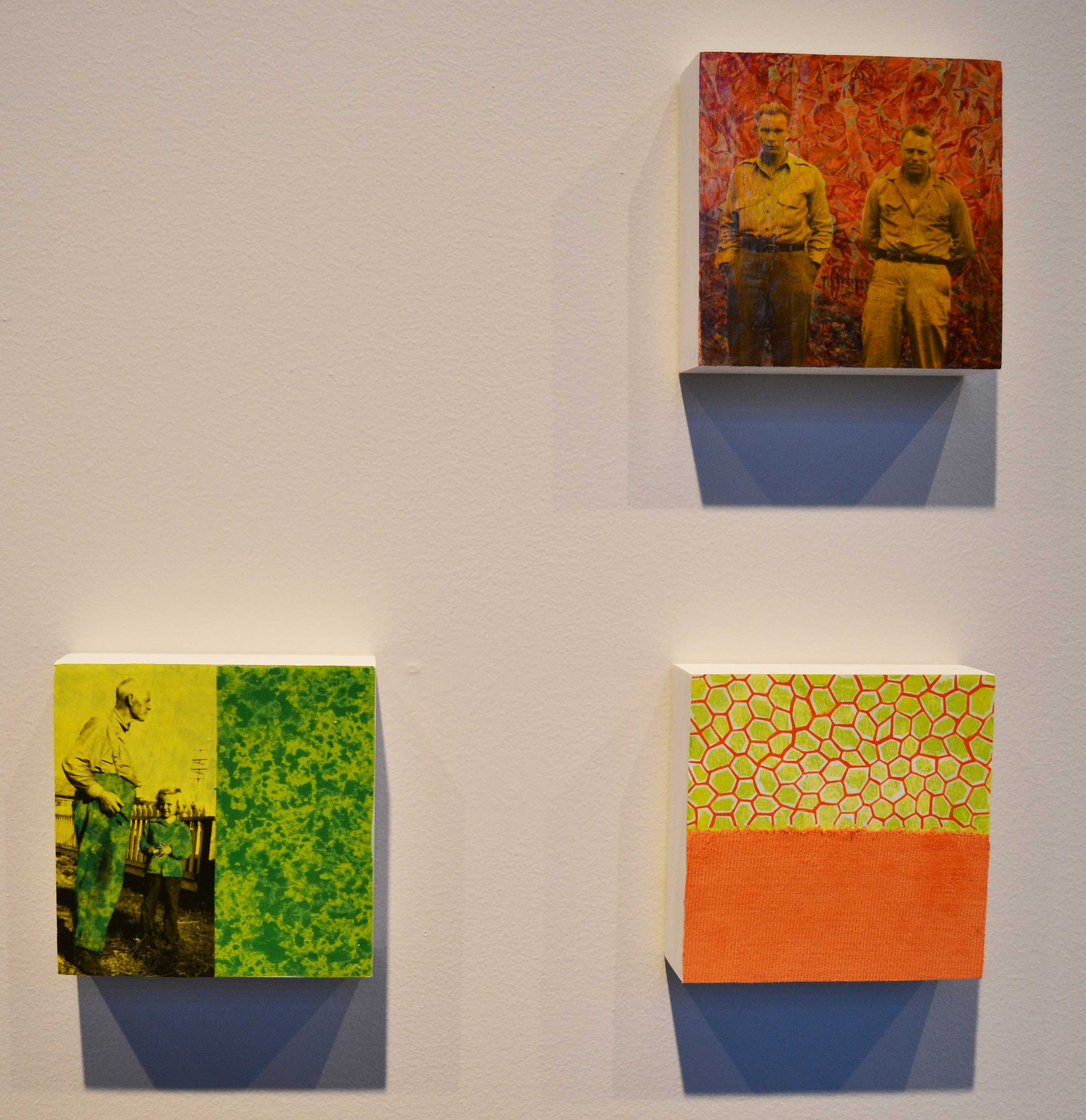
FA•MIL•IAR: A Mixed Media Installation by Paula Booth
(January 18 – May 16, 2016)
Paula Portinga Booth’s installation, titled “Fa·mil·iar” is comprised of a grouping of several collaged and painted elements, each about 6” x 6” in size. Like the pixels that form a digital image, these elements give shape to a visual narrative of Booth’s own family. Her installation stitches together living and deceased relatives across generations and through time into a quilted and painted genealogy that explores the themes of memory, nostalgia and identity. The individual elements, composed as they are of family photographs, images from treasured children’s books, and fabric remnants left by a beloved, deceased grandmother, record the dull ache of memory and loss together with the rich warmth of belonging. It reminds us of the role of family in shaping who we are (we can see the seeds from which Booth’s own artistic practice grew in her grandmother’s quilting and her grandfather’s photography), and also as the safe and nourishing environment where our notions of security, comfort, belonging and confidence are first shaped.
While the work is quintessentially American in its form and context, it is evocative of the practice of ancestor veneration common in many cultures even today. It replicates the respect for tradition, the practice of tracing our identity through those of previous generations, and the belief that our ancestors, even in death, exert a guiding influence on our lives. It makes it clear that American culture, far from being divorced from its own pre-industrial roots, still shapes us through our membership of the kinship group we call family.
While the work is deeply personal and individual, it also focuses on the way our relation to family expresses broader cultural dynamics that are far more universal. The installation functions as a matrilineal archeology of memory that uses the quilt as a symbol of warmth and security, but also reminds us of the traditional role of women as familial keepers of memory and the aestheticians of the domestic environment.
Booth describes her work as follows,” Presently, I am in the process of investigating my own self-identity in relation to my memories of family and childhood. As a daughter, granddaughter, sister and mother, I explore ideas of nostalgia, longing and memory (personal and generational) as well as perception: perception of real events and how that perception changes and fluctuates with the infusion of new ideas and experiences. The act of remembering becomes a defining act in both life and art.” She echoes Einstein’s assertion that, “memory is deceptive because it is colored by today’s events.”
Paula Portinga Booth is a graduate of Willamette University (Art History, 1993). She completed her MFA in Studio Art at the Vermont College of Fine Arts in 2005, and currently teaches in the Department of Art at Western Oregon University, where she is the director of the Cannon Gallery.
-Andries Fourie
Curator, Roger W. Rogers Gallery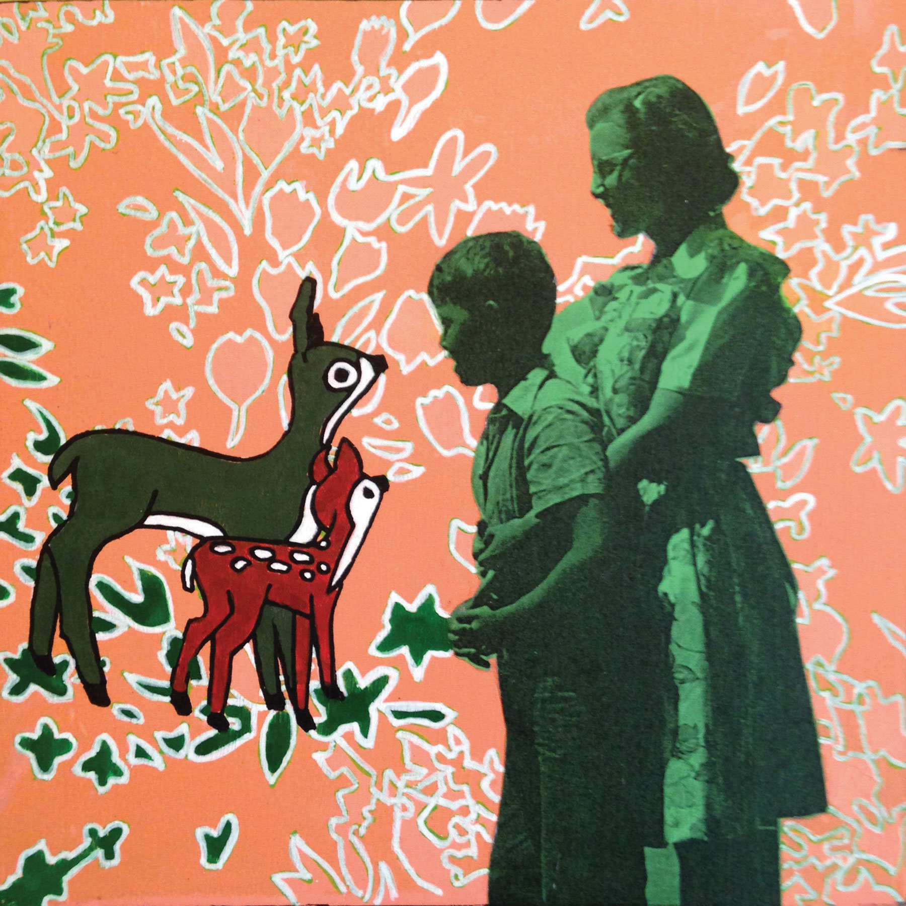
Paula Portinga Booth
FA·MIL·IAR (detail)
mixed media installation
2015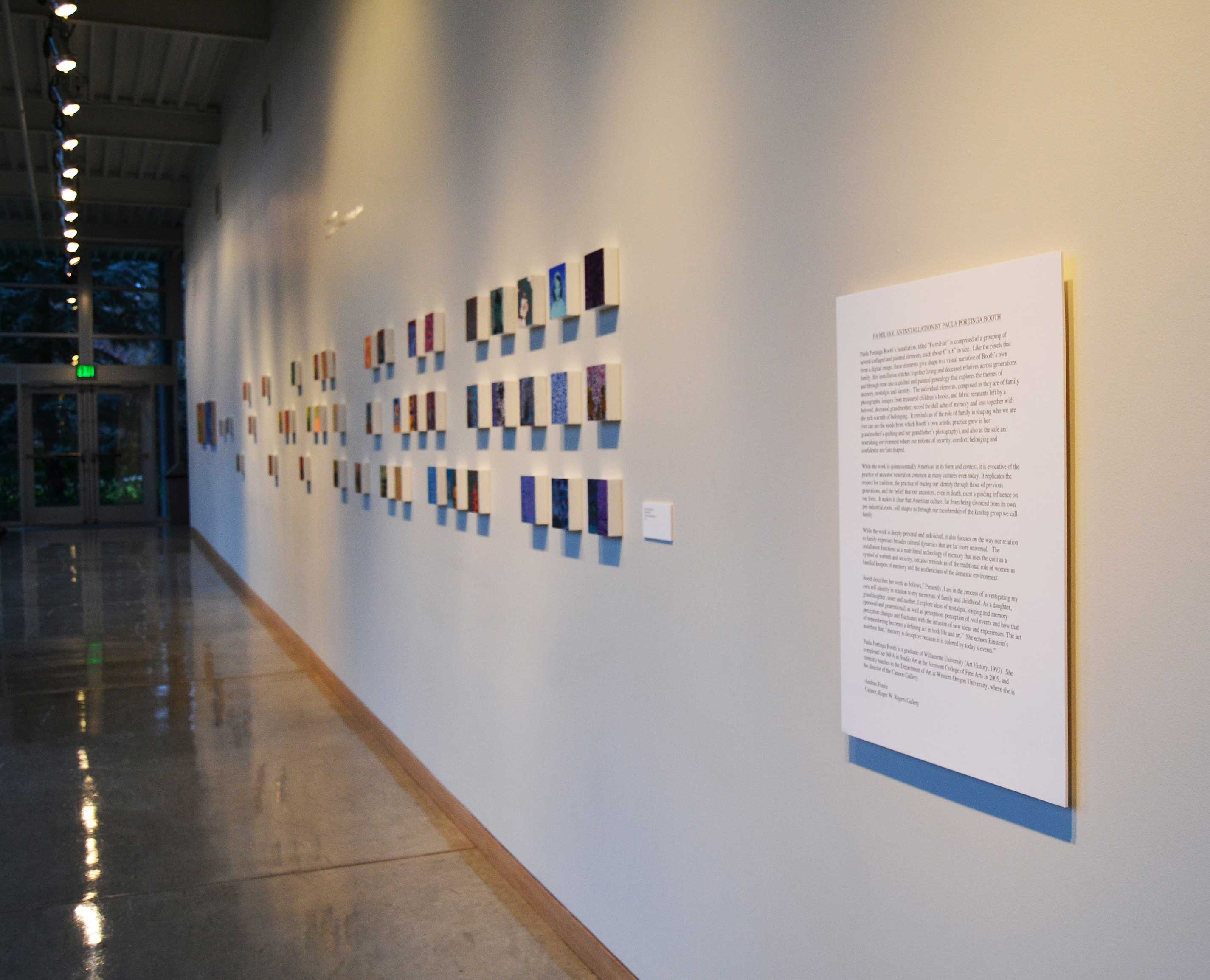
-
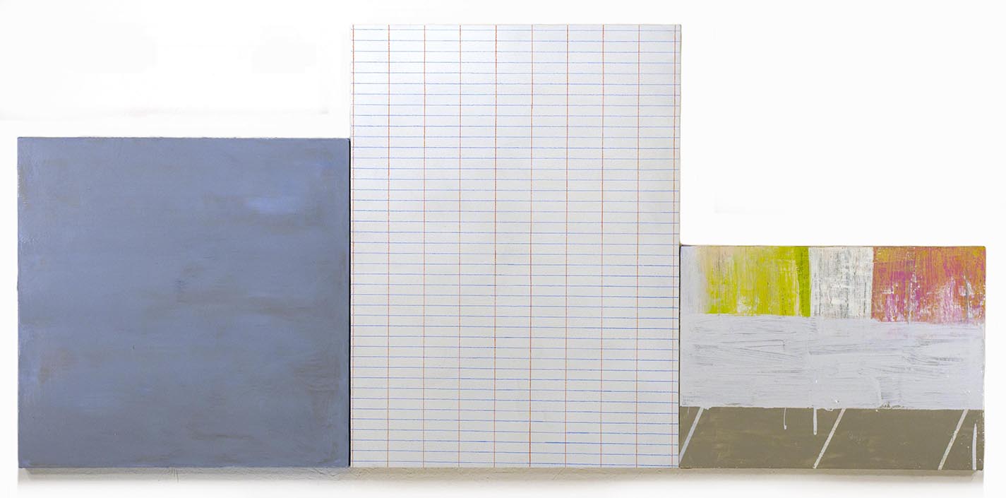
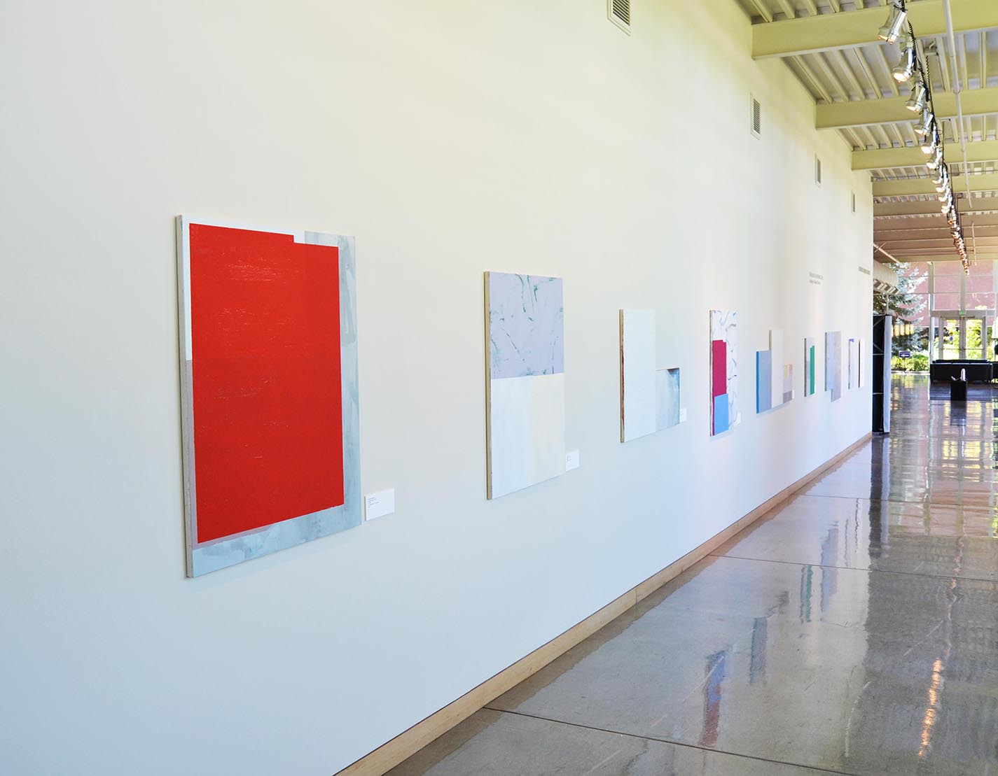
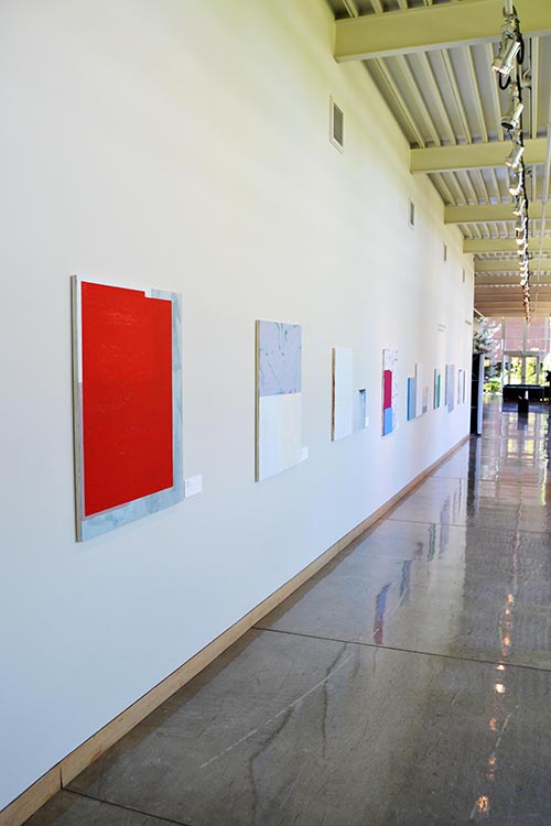
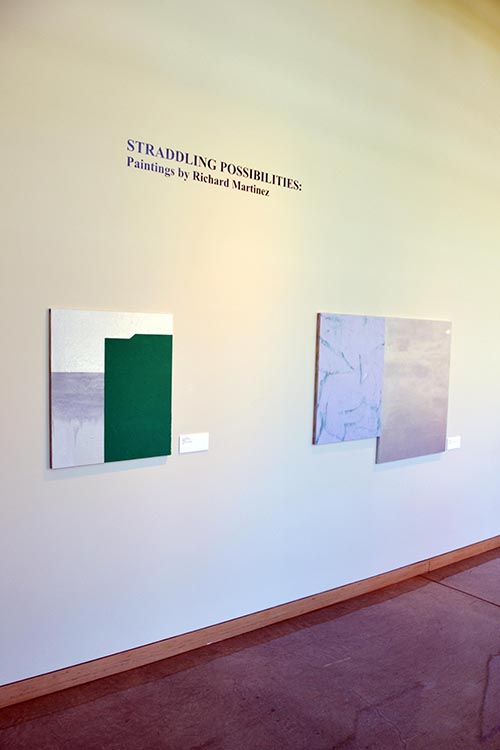
Straddling Possibilities: Paintings by Richard Martinez
(August 24 – December 12, 2015)
At first glance Richard Martinez’ recent paintings, composed as they often are of a series of joined (and at times sharply contrasting) canvasses, appear to have much in common with a grafted tree that surprises us by bearing several different kinds of fruit at the same time. His recent compositions pair understated minimalist grids with bright and saturated fields of color, and juxtapose hard-edged geometric forms with expressive brushstrokes. He places emphatic, confident and angular forms right next to tentative and gestural brushstrokes, and even carefully-rendered and intricate representational silhouettes.
While Martinez’s paintings call to mind a kind of visual polyglotism, like the cascade of languages overheard at a street market in a particularly cosmopolitan city, they stop short of being a discordant cacophony of conflicting tones. As such his paintings can be read as a metaphor for the diverse and often contested society we live in. The works, with their near-absence of imagery, and titled as they are only with the date of their completion, seem to assiduously avoid explicit and narrative meaning, but they do seem to be a meditation upon the symbolic and historical meaning inherent in the formal and technical decisions made by the artist. With this in mind, it is almost as if Martinez intends to contrast visual influences as varied as the dense richness of the aesthetic of Latin American Catholicism and the sparse, iconoclastic, and reductive aesthetic of Anglo-Protestantism. This comes as no surprise, given his dual cultural background.
In this work Martinez has abandoned the consistently controlled and very intentional elegance of his earlier paintings in favor of a dynamic that privileges process, welcomes the accidental, and creates a visual tower of Babel that embraces and seeks out strange bedfellows and eschews the harmonious, the settled, and the resolved in favor of the improvised, the hybrid and the experimental. One could say that the unifying principle of this work is its refusal to be homogenous and comfortable in its approach. While this makes his work difficult to access at first, and forces us to wrestle with it, his paintings reward the patient and attentive viewer with rich details and unexpected harmonies that remind us that the duality of opposites often means that they have unanticipated commonalities. His choices are daring in that he is willing to take chances and work in an open-ended way that carries a substantial risk of failure.
The way in which Martinez is able to quote the vernacular of artists as diverse as Agnes Martin, Mark Rothko, Willem de Kooning, and Cy Twombly in the same work tells us that he is a keen student of the history of painting in general, and late modernist painting in particular. He voraciously and omnivorously absorbs influences and inoculates them with one another to produce something that has become a distinct and original idiom rather than simply a compendium of copied strategies and solutions. Martinez has made a virtue of openness to influence.
Richard Martinez is an Associate Professor at Whitman College in Walla Walla, Washington, where he teaches painting. More of his work can be seen at his website: http://www.richardmartinezpaintings.com.
-Andries Fourie (Curator, Roger W. Rogers Gallery)
Richard Martinez
American, born 1965
6-29-15
oil, enamel, natural resin on wood panel
2015
-
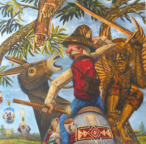
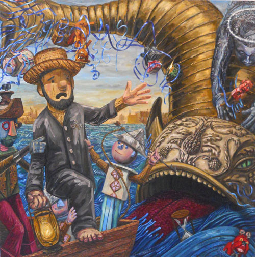
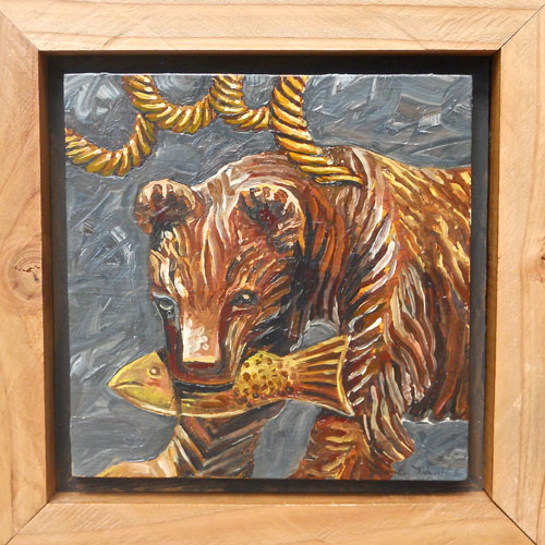
Musicality, Metaphor and Metonymy: Paintings by Tim Timmerman
(January 19, 2015 – May 17, 2015)
• Musicality (noun): The quality of resembling music; being melodious; harmonious.
• Metaphor (noun): 1. A figure of speech in which a term or phrase is applied to something to which it is not literally applicable in order to suggest a resemblance. 2. Something used, or regarded as being used, to represent something else; emblem; symbol.
• Metonymy (noun): A figure of speech that consists of the use of the name of one object or concept for that of another to which it is related, or of which it is part.Tim Timmerman’s paintings reveal him to be an inveterate collector of objects and stories who is fascinated by human relationships in general, and the dynamics of friendships in particular. His work shows us that we are most human in our friendships because we enact the full and messy spectrum of our humanity in these close relationships, which cast both our virtues and our frailties in high relief. It is as if he wants to remind us that we are at our most fallible and our most noble in our friendships, which are, after all, the lived manifestation of the untidy encounter between our best ideals of loyalty and selflessness, and the unsettling reality of our selfishness and insecurity.
Timmerman confesses that his paintings narrate the events and dynamics of his own friendships. He does so by physically creating small, assemblage characters (often using toys and figurines), which he then casts as protagonists and antagonists in the painted dramas that he stages and paints to illuminate, symbolically and allegorically, the dynamics of real relationships. By having his whimsical and humorous characters act as mirrors to the sometimes painful plots of close relationships, he hopes to create enough distance from the events and emotions to make them more bearable. His use of humor to soften the blow reminds us of Will Rogers, who explained that humor is pain in retrospect. While his allegories are often dark, they do have an underlying optimism. The stories he tells are complex and challenging, but they do give us some hope. Stream, a painting that shows a weeping character whose tears keep the fish he holds in his hands alive, is clearly a meditation on the redemptive potential of sorrow. The deeply personal nature of this work is revealed when we realize that the artist was working on this painting as his father was dying.
As someone for whom faith is important, Timmerman also uses narratives from the Old Testament in his work. He explains that he uses these stories because, like contemporary human relationships, they are messy, filled with seemingly contradictory messages, and they seldom end in the manner we would like them to. In their complexity and inconsistency they are similar to our relationships with the people closest to us.
It’s also clear that Timmerman has made a very careful study of the history of allegorical painting. The compositions of several of his paintings are derived from historical works. Timmerman’s painting Submission and Revelation, Balaam, for instance, is based closely on Paolo Veronese’s 16th century painting Allegory of Love; Infidelity, but rather than slavishly copying the style and sentiment of the source-work, he leavens it with a very contemporary influence, namely the work of German painter Neo Rauch. He also introduces his own imagery, subject matter, and meaning: the scene where Balaam and his donkey are confronted on the road by an angel reminds us of the fact that we don’t always get to do what we want to, and that life and fate often seem frustratingly arbitrary and inconsistent.
Timmerman manages to make work that is sensitive, courageously personal and revealing, and layered in its meaning. In doing so he examines serious subject-matter from a very human perspective, and shows us that we are frail beings, who try to be there for each other despite our failings. He lends a kind of heroism to the everyday struggle to live up to the better angels of our nature when it comes to relationships.
Tim Timmerman is a Professor in the Department of Art & Design at George Fox University, where he teaches Sculpture and Art History. More of his work can be seen on his website: www.timtimmerman.com
-Andries Fourie, Curator, Roger W. Rogers Gallery
-
Consilience: Paintings by Elise Richman
(August 21 – December 13, 2014)
The saturated, azure washes of Elise Richman’s paintings call to mind aerial photographs of the dramatic convergence of land and water that characterizes the landscape of Puget Sound. It is not surprising that the regional landscape and a sense of place would play a central role in Richman’s work, given that she was born in Seattle, and her mother’s family has lived in the San Juan Islands for many generations.
While Richman’s paintings certainly chart a watery landscape of islands, inlets and peninsulas, they are much more than just maps or perceptual representations. Her works, filled as they are with swirls and pools of color, are the antidote to the distanciation and passivity of traditional landscape painting because she represents the landscape without slavishly depicting its physical appearance or treating it as a backdrop for myth, history, or other human-centered subjects. Her strategy of representation is a synthesis of science, aesthetics, and a sense of place, and represents a true consilience or convergence of themes and sources to reach a unified, but complex conclusion. She combines perceptual and conceptual concerns with the sensibilities of the artist, chemist, cartographer, ecologist and sociologist.
Richman fittingly builds her painting by means of the same processes that shaped the landscapes they refer to: the dynamics of hydraulic deposition and erosion. Richman works like a chemist. She combines inks, acrylics and liquefied, powdered pigment mixed with gum Arabic in rich, liquid washes. In doing so she takes advantage of the differences in viscosity between these media. The colors swirl and eddy as they rise to the surface or sink to the bottom of the washes she applies. Anyone who has ever seen oil glisten and ebb as it floats on water would also recognize this dynamic of dueling viscosities. The result is a turbulent, expressive and meaningful kind of chromatography, an aesthetic examination of the laws of physics that govern liquid matter. Besides being an experimental investigation of materiality, her paintings are also a potent reminder that materials, method and meaning can serve the same purpose.
Richman embraces the tension between chance and intentionality in her process. She explains that each painting represents a balance between collaboration with and control of materials. “I allow the application of the inks and paints mixed with a range of different acrylic mediums to enact and solidify processes as pigments meld, intermingle, and resist one another. I then respond to the pools, rivulets, and inlets that emerge from the material’s collaboration with gravity, evaporation, and relative viscosity by deepening color, adjusting the quality of particular edges and heightening or obscuring contours.”
The result of Richman’s process is a kind of meaningful, contemporary, and conceptual abstract expressionism, where painting, no longer narcissistically self-absorbed, has turned its gaze back onto the world around it. Richman’s work certainly engages in a dialogue with the history of painting: her treatment of the optics and mechanics of water calls to mind the approach and technique of artists as different as J.M.W. Turner and Helen Frankenthaler. The most obvious difference between their work and hers is her focus on the conceptual. The most obvious conceptual content her paintings convey is ecological. The fact that her work reminds the viewer of oil or chemicals suspended in water is no accident. As anyone who has spent time in the Puget Sound region knows, densely populated and heavily industrialized developed areas are closely mixed in with wetlands, rivers and large bodies of seawater that connect to the open ocean. In an ecosystem characterized by the dynamic and cyclical movement of water, pollution and contaminants are a persistent threat to the diverse natural biomes and human populations of the area. This brings us to the social aspect of Richman’s work. She describes her intent as follows,” The conceptual motives behind my process are socially as well as environmentally driven. Imbalanced power-differentials lead to the aestheticization and exploitation of the natural world and groups of people.” While this meaning is subtly expressed, it nonetheless forms an important part of the content her work conveys.
Elise Richman received an MFA in painting from American University in Washington DC. She is an Associate Professor in the Department of Art & Art History at The University of Puget Sound. One of the courses she teaches there is a seminar titled Space, Place and Values.
-Andries Fourie, Curator, Roger W. Rogers Gallery
-
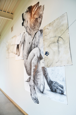
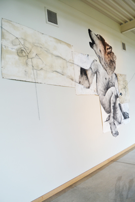
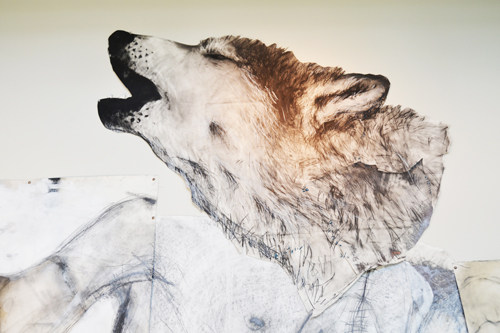
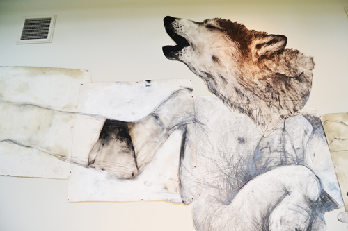
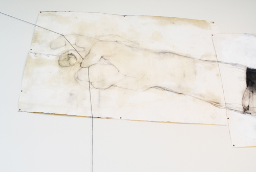
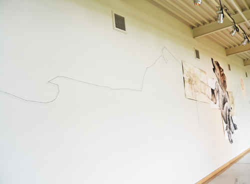
Where-Wolf (Willamette University): A Drawing Installation by Andrew Myers
(January 13, 2014 – May 15, 2014)
Where-Wolf (Willamette University), a mixed-media installation by Oregon artist Andrew Myers, explores the concepts of “place” and “home” metaphorically through the story of OR-7, a male gray wolf that abandoned the Wallowa County Imnaha pack in the summer of 2011. OR-7 subsequently traveled alone from northeastern to southwestern Oregon and northern California in an unsuccessful search for a mate with whom to establish a new pack. He became world famous when biologists tracked his extensive and solitary journey by means of a GPS/radio-telemetry collar. This technology allowed scientists to map his progress from Wallowa County to Crater Lake, and from there to California's Siskiyou, Lassen, Shasta, Modoc and Tehama counties. OR-7 spent much of last summer hunting deer at high elevation in the wilderness south of Mount Lassen, and returned to southern Oregon in March of 2013. He is the first wolf to be sighted west of the Cascades in more than eighty years.
Myers explains that OR-7’s journey mirrors his own life experience in several ways, “This story of futility and hope was very interesting to me, and being from Northeastern Oregon myself and now in Western Oregon, I felt a lot of connections. Still being single at my age with most of my friends married and having families made me think about OR-7′s story even more and led me to explore ideas of ‘home’ and ‘place’ and what they mean.” As the son of a wildlife biologist and someone who is intrigued by the concepts of isolation, exploration, and loneliness, it seems quite natural that Myers would recognize the parallels between OR-7’s journey and his own experience. The title of the installation is also a play on the word “werewolf.” As such it refers to the tension between the instinctual and the rational, and alludes to some of the mythical ways in which one could become transformed into a werewolf (by drinking water from a wolf’s footprint or by sleeping outdoors with the light of the full moon on your face).
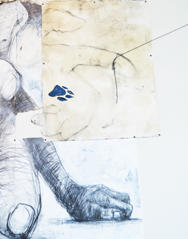
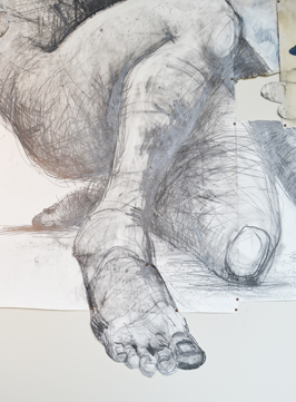
The installation includes a large scale half-human, half-wolf figure made from a patchwork of collaged drawings. The human hands of this hybrid figure hold the ends of two strands of string: one connecting it to the moon, and the other to the diagonal, zig-zag path of OR-7’s journey across an implied map of Oregon. The use of string as a device to trace a path reminds us of Theseus’ entry into the minotaur’s labyrinth (a myth that similarly explores the conflict between the rational and the instinctual, and also involves a therianthropic figure with a human body and the head of an animal). It is as if Myers wants to remind us that his work combines the approaches of both science and myth in order to represent the complicated and sometimes contradictory reality of human experience.
Myers draws in a very expressive and gestural way. His drawings, assembled as they are from modular, collaged elements, feel more constructed than drawn, and this gives them a remarkable physicality. The drawings appear to evolve naturally, even organically. Myers embraces chance and accidental mark-making (look for the canine footprints on the drawings), and maximizes the visual effect of erasure and overlapping. In its tactility, his handling of charcoal and other media brings to mind the work of his influences, which include William Kentridge, Rick Bartow, Egon Schiele and Susan Rothenberg. Myers combines well-observed and carefully-rendered specificity with robust and expressive mark-making to produce drawings that are visually striking and sensitive at the same time.
Andrew Myers received his MFA from Portland State University in 2003. His work has been showcased in Art in America, and is also part of the viewing program at the Drawing Center in New York. Myers currently teaches drawing at Oregon State University and in Rome, Italy in a program sponsored by Oregon State University and the University of New Mexico. More of his work can be viewed on his website: www.andrewrmyers.com
-Andries Fourie, Curator, Roger W. Rogers Gallery
-
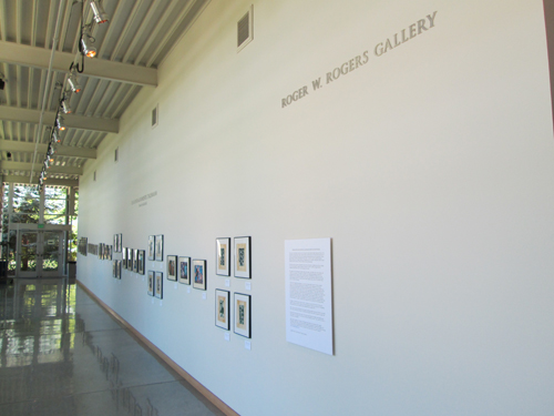
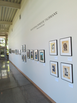
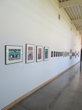
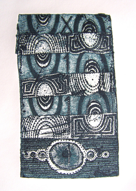
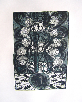
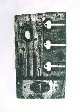
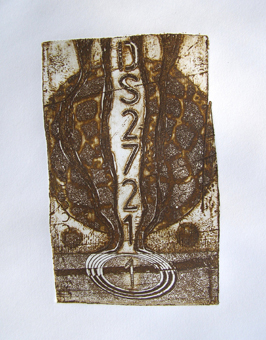
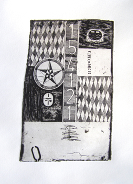
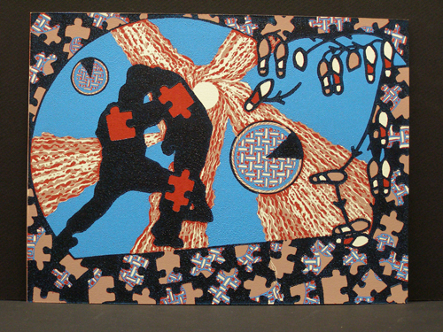
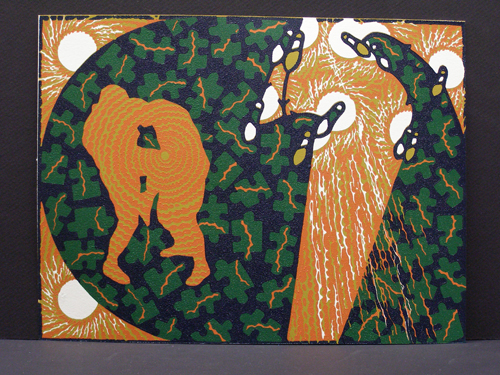
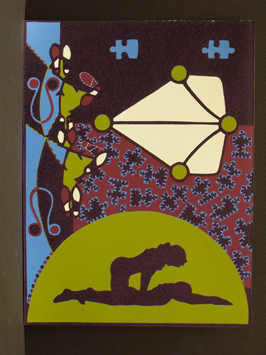
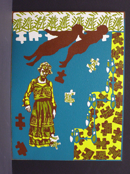
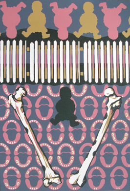
Dead Ends and Domestic Talismans: Prints by Keith Dull
(August 26 – December 12, 2013)
The work in this exhibition is drawn from five consecutive series of prints (titled Cyphering between Fear and Reality, Robotomunculus, Boogie, Solitaire Boogie, and Barbarians at The Gate) that trace the arc of the artist’s relationships through the end of a marriage and subsequent divorce to the experience of being single, dating, re-marrying, and ultimately having a child. As such they explore primarily domestic themes, but they do so in a highly unusual way: through the use of a complex and arcane system of visual symbols taken from sources as varied as alchemy, history and genealogy.
The artist uses these symbols to present the viewer with visual puzzles or riddles that invite us to engage the work and untangle the strands of meaning. He leaves us a trail of symbolic images that, like metaphorical breadcrumbs, lead us to the meaning of his work.
Dull employs the visual language of graphic design in his prints. The bright colors, iconic images, and symbols he uses remind us of the images we normally see in manuals and pamphlets, which aim to communicate explicit meaning in a clear and literal way that is immediately accessible to the viewer. Paradoxically, Dull uses this kind of imagery to weave dense visual riddles that explore the power and value of ambiguity instead. He reminds us that the artist sometimes plays the role of a trickster whose goal it is to reveal by obscuring.
To this end he frequently uses imagery in a way that very intentionally removes it from its original context. In his “Resurrection Boogie” prints, for example, he uses the silhouettes of Girl Scouts employing life-saving techniques on drowning victims (gleaned from a 1920’s manual). By removing these images from their original context, Dull gives them a new kind of meaning, which might leave the viewer quite baffled at first. The images may even seem oddly intimate. It is only when we note that they are paired with diagrams of dance steps and puzzle pieces that can’t be assembled that we realize that the silhouettes represent the dynamic in some relationships where one partner is always “saving” the other. Dull describes the Boogie series as dealing with the search for companionship in the seemingly limitless field of partially productive relationships. In some cases, the interaction is adversarial (the Death Roll Boogie prints), or in others, a single person is doing all the work (the Resurrection Boogie prints).
Eventually we realize that each of Dull’s works is a mystery we can solve if we look at it long and carefully enough, and that they function as the visual equivalent of zen koans: the process of untangling their meaning becomes more important and rewarding than the meaning itself.
Dull’s work also refers to the historical use of prints as guides and magic talismans. It seems only natural that, at times when humans feel alone or vulnerable, they might feel the need for protection or good luck.
Dull writes the following about his work: “Art is about transforming the mundane, and embracing the ritual inherent in that process. It is more than a collection of aesthetic choices. It is a search for clarity in the complex and intangible”.
Dull’s prints incorporate a wide range of techniques that include color reduction relief, intaglio, lithography, mixed media, as well as the encaustic intaglio printing process, which he developed. He received his MFA in Printmaking from the University of South Dakota in 1995, and is currently Associate Professor of Art at Ashland University in Ashland, Ohio.
More of his work can be viewed at www.keithdull.blogspot.com
-Andries Fourie, Curator, Roger W. Rogers Gallery
-
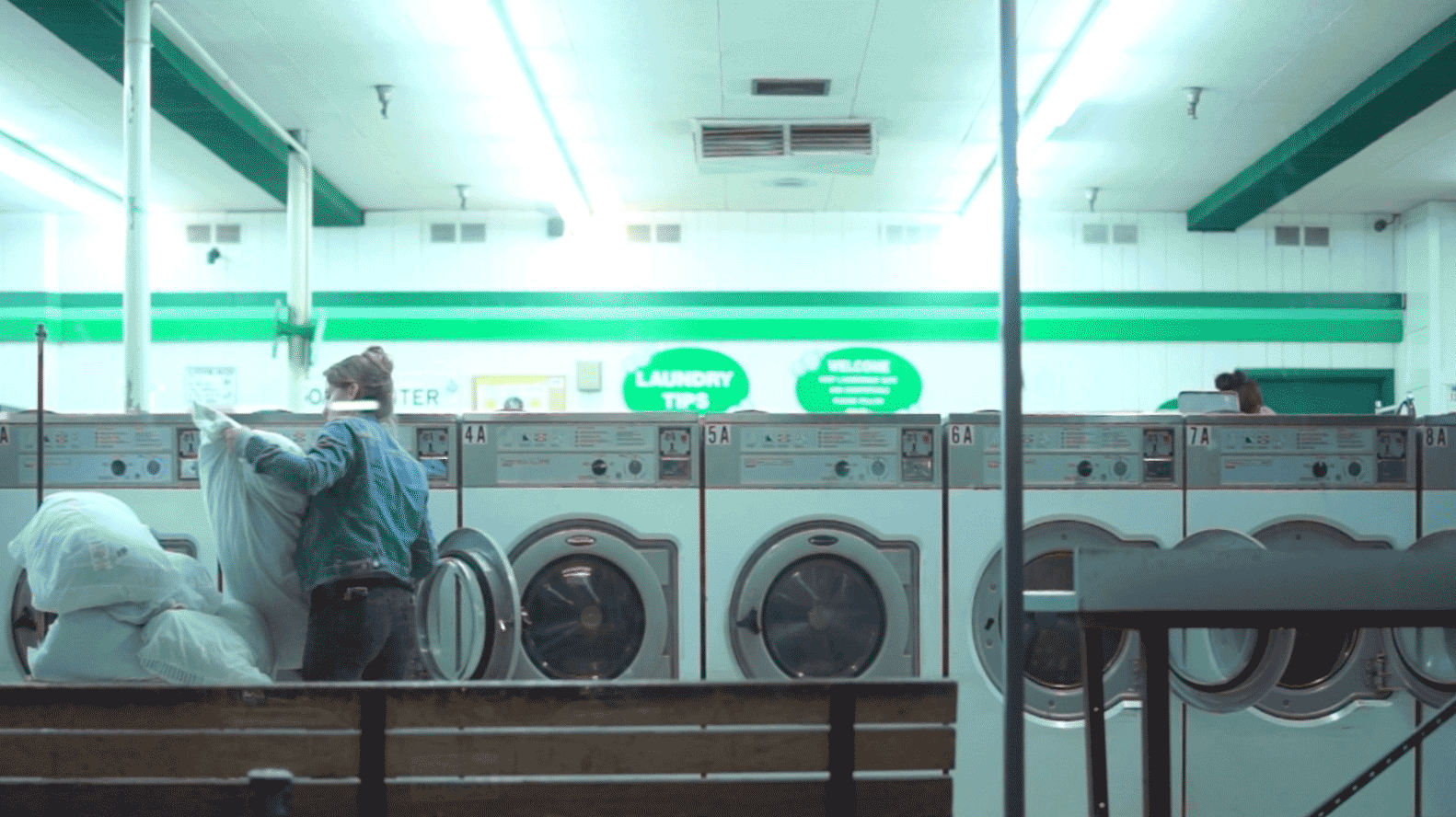
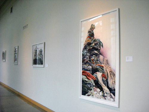
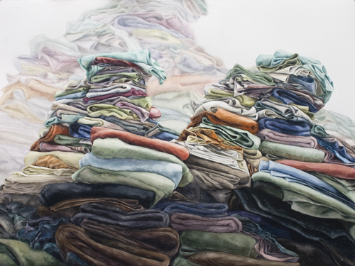
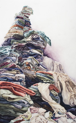
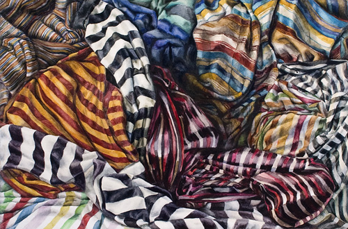
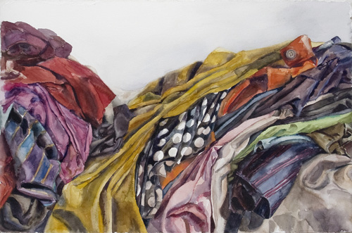
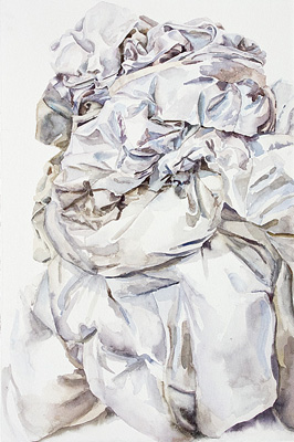
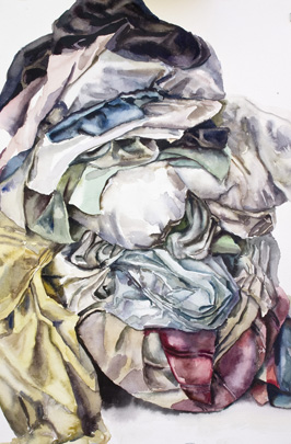
Piling Up: Paintings by Bethany Hays
(January 14 – May 15, 2013)
Anyone who has ever watched in despair as their home fills with a mountain of laundry waiting to be washed can relate to the recent series of watercolor paintings by Bethany Hays. As a single mother Hays is intimately familiar with the feeling of being swamped by the mundane domestic tasks that are necessary for the everyday maintenance of family life. Her paintings offer a glimpse into the endless daily battle between entropy and order that characterizes the struggle to tame domestic chaos.
While her works are grounded in the reality of daily experience, they also refer to the history and traditions of art. The first and most obvious reference is to the history of painting. Hays’ paintings call to mind 17th century European still life paintings in general, the work of early women painters like Maria van Oosterwijck and Geertgen Wyntges in particular, because they similarly present lush, detailed and inviting studies of domestic objects. These paintings remind us that during the 17th century the home was still considered a sacred space. At the time still life paintings were considered a lower status genre than portraits and landscapes, and so became out of necessity the domain of early women painters whose gender confined them to the home, whereas male painters were free to explore the world and even paint dramatic mountainous landscapes. Hays comments on this double standard by piling up laundry to create, paradoxically, a dramatic domestic version of the sublime landscape paintings women were not at liberty to paint.
The other element that connects these paintings to the history of painting is their relationship to the tradition of drapery studies. Historically, the painting of sumptuous and luxurious folds of drapery is a marker of skill and craft. Hays cleverly subverts this convention by painting drapery in watercolor, a medium that lacks the credibility and grandeur of oil paintings because of its craft and hobby associations.
Hays’ paintings also relate closely to the Feminist movement in Art’s focus on domestic routine and maintenance as ritual and performance. The intention of her work is to raise the profile of undervalued and overlooked domestic subjects while at the same time recording the ebb and flow of the energy that moves through the “ecosystem” inside a home. She speaks of the act of painting these works as being, in a sense, meditative, and sees the works as a kind of record of accidental domestic sculptures as well as being both metaphorical landscapes and self-portraits.
Bethany Hays grew up in Washington State, and received her MFA in Contemporary Art practices from Portland State University in 2009. She is currently a visiting Assistant professor of Art at Willamette. More of her work can be seen on her website: www.bethanyhays.com.
-Andries Fourie, Curator, Roger W. Rogers Gallery
-
The Hand That Finds, The Hand That Feeds, The Hand That Fails: An Installation of Sketchbook Drawings by Nathan Lewis
(August 28 – December 7, 2012)
This installation of the sketchbook pages of painter Nathan Lewis provides us with a valuable opportunity to observe the evolution of his work firsthand. Lewis’s sketchbook is filled with his energetic drawings, compositional studies, technical experiments, anatomical and architectural studies, and copies of masterworks...
Much is made nowadays of the lack of connection between contemporary art and the public. Perhaps this schism exists because the contemporary artist’s creative process is widely misunderstood by the general public, who remain attached to outdated 19th century notions about artmaking.
While art has evolved dramatically to accommodate new genres, media, resources and theoretical frameworks, the public’s view of the artistic process still hinges on Oscar Wilde and the Aesthetes’ characterization of the artist as a romantic genius who relies on inspiration to transform emotional expression into art. The truth is that the artistic process for most contemporary artists has more in common with the mechanisms of Darwinian evolution than the mythological sculptor Pygmalion’s obsessive romanticism.
I equate the creative process with Darwinian evolution because both processes depend on accidents, or rather productive accidents. In evolution these accidents take the form of spontaneous mutations, which are usually deleterious, sometimes neutral, but on rare occasions can unintentionally result in adaptations that enhance the fitness of individual organisms and their offspring. In art these productive accidents alert the artist to new compositional devices, techniques, or strategies for communicating meaning. The ability to recognize and exploit a productive accident while avoiding or reversing the unproductive ones consequently becomes one of the artist’s most important skills. The willingness to fail becomes both a virtue and a necessity.
The problem, of course, is that the viewer is accustomed to seeing only the resolved, completed works of an artist, and therefore has no inkling of the trail of accidents, failures or unintended consequences that established the aesthetic, technical or conceptual qualities of the finished product. When our cultural definition of virtuosity demands the creation of a work that appears effortlessly resolved and polished, the work’s rambling genealogy and messy birth must naturally remain hidden. In a perverse way we are prevented from seeing the elements that would tell us most about the work, and by extension the artist. Often it is only by looking at the artist’s sketchbook and preparatory studies that a work’s evolution is revealed because it is there that the artist feels free to make mistakes or fail without the consequences of being exposed to public criticism.
This installation of the sketchbook pages of painter Nathan Lewis provides us with a valuable opportunity to observe the evolution of his work firsthand. Lewis’s sketchbook is filled with his energetic drawings, compositional studies, technical experiments, anatomical and architectural studies, and copies of masterworks.
His sketchbook is a repository of visual reference material and ideas, an optical instrument to record the process of visual experience as it occurs, a workshop for resolving the mechanics of composition, a classroom to learn from his predecessors, and a laboratory for open-ended, even escapist experimentation where he invites the kind of accidents that will allow his work to grow and develop as these studies evolve into finished oil paintings.
His sketchbook is also a means for Lewis to engage the history and traditions of painting. He explains his intent as follows,” When I’m painting I almost consider it a battlefield where the present and history have to come to terms together. Things have to contend with each other in the picture, so I’m constantly looking back at history, but also trying to relate to the present.” This engagement with both the history of art and contemporary culture helps Lewis to weave dense and rich allegories that invite the viewer’s interpretation.
In these sketches and studies we see Lewis blend humor, literary, historical and mythological references and storytelling to explore the elements which allow his paintings to create a kind of Narrative Humanism. The studies are unified by his devotion to naturalistic representation, which he explains as an attempt to “get back to that moment of experiencing whatever it was that my eyes saw before I named it.”
Nathan Lewis is an Assistant Professor of Art at Sacred Heart University in Fairfield, Connecticut. His paintings can be viewed on Nathan Lewis' website.
-Andries Fourie, Curator, Roger W. Rogers Gallery
-
The Geography of Phenomena: Paintings by Kendra Larson
(January 13 – May 13, 2012)
Kendra Larson’s landscapes engage the grand tradition of using depictions of the land as a mirror to reflect our cultural attitudes towards nature, our sense of the geography of memory and identity, and our desire to see the epic of nature as an expression of the sublime...
Kendra Larson’s landscapes engage the grand tradition of using depictions of the land as a mirror to reflect our cultural attitudes towards nature, our sense of the geography of memory and identity, and our desire to see the epic of nature as an expression of the sublime.
Her paintings examine the nostalgic lens through which we view the mythical landscape of the West. These works, painted from photographs or sketches of actual locations in Oregon visited by the artist from childhood onwards, embody the idea of landscape as a reflection of personal memory. While they aim to record the physical appearance of the state’s mountains and forest, they also convey the sense of childlike awe and wonder experienced in wild places.
While their aesthetic is contemporary in terms of the use of color and the application of paint, the ethos behind the works is more closely tied to the 19th century Romanticism of painters like Caspar David Friedrich, and a belief that the sublime can be experienced directly and viscerally through solitude in nature. The complete absence of people and man-made structures in the paintings heighten the sense of the forests of the Pacific Northwest as a pristine Eden. She presents the landscape as an idealized, perfect and pure paradise: verdant, sublime and virgin. The paintings seem to give flesh to the childhood fantasy that one could be the first human being to set foot in an unspoiled land. There is an inherent paradox at the heart of the work in that this fantasy, pleasant though it may be, is at odds with the reality of the landscape. The forests Larson paints have been explored and fought over, logged and replanted, and carry the deep imprint of Native Americans who’ve lived in them for thousands of years. The fact that several of the paintings are made on wood cut from the forests she paints underscores this paradox. Larson’s work acknowledges the fact that Oregon’s largely urban population views the land as both a place for pantheistic contemplation and a commercial commodity.
Larson explains the monochrome background of her paintings as recording the physical geography of the places she paints, while the brightly colored designs in the foreground aim to document invisible phenomena like smells, sounds or even what she describes as spiritual or mythical elements. The abstract designs aim to make the invisible visible. Her goal is to create a framework within which two contrasting experiences of the land can coexist: the measurement and recording of scientific examination, and the sense of spiritual wonder the experience of nature’s grandeur evokes.
Larson feels that her generation, buffeted by political and economic uncertainty, seeks refuge in their nostalgic view of the landscape as a powerful and unchanging spiritual force and lynchpin of Northwest identity. No doubt it also evokes the innocent and uncomplicated pleasure of childhood.
Larson’s paintings depict the landscape as being both majestic and intimate at the same time. While the scope of the vistas in the background are grand, the details in the foreground are often fragile and intimate in scale. This fragility reminds us that the Western landscape, rugged and epic though it may be, is under threat. She points out that humans are prone to destroying even the things they romanticize.
Kendra Larson is a Visiting Assistant Professor of Art at Willamette University. More of her work can be seen at www.kendralarson.com
-Andries Fourie, Curator, Roger W. Rogers Gallery
-
Technology Transforms Tradition: Digital Drawings by Mikko Ijäs
(August 30 – December 9, 2011)
While Mikko Ijäs made the drawings in this exhibition from direct observation in a very traditional manner, the means by which he executed them is anything but traditional: He used his finger to draw them directly on the touch-screen of a portable, digital device. By combining the disciplined observation and skill of a traditional draftsman or painter with the capabilities of contemporary digital equipment and technology, the works Ijas produces with the Brushes application on an iPhone and iPad are imbued with a startling and productive tension. His luminous and colorful drawings are simultaneously steeped in the history of art and on the edge of technological innovation...
While Mikko Ijäs made the drawings in this exhibition from direct observation in a very traditional manner, the means by which he executed them is anything but traditional: He used his finger to draw them directly on the touch-screen of a portable, digital device. By combining the disciplined observation and skill of a traditional draftsman or painter with the capabilities of contemporary digital equipment and technology, the works Ijas produces with the Brushes application on an iPhone and iPad are imbued with a startling and productive tension. His luminous and colorful drawings are simultaneously steeped in the history of art and on the edge of technological innovation.
The success of these landscapes, still life artwork, portraits, self-portraits, and interiors executed in France, Namibia, India and Finland is built on the experience gained from many years of working with traditional media. While Ijäs is a skilled draftsman, he is anything but a traditionalist. Using digital media enables him to work quickly and directly in his chosen landscape or setting. The device’s portability allows him to capture the exact quality of a mid-day, sunlit landscape viewed from a hilltop in Namibia’s remote Damaraland, as he does in Ugab River. I’ve had the privilege of watching Ijäs work on such plein air drawings in the Namibian desert and was surprised at how unexpectedly tactile the process of building an image is for him. It is most akin to finger painting, but with a near-infinite variety of colors, line thicknesses, and line qualities. He can apply color with any one of a vast number of tools, and erase, edit, and revise the works just as easily.
The very nature of non-traditional media encourages experimentation and risk-taking. The artist is liberated and empowered by technology, which gives him abilities and opportunities that working in traditional media would preclude. Technology also enables him to distribute the work via the internet and social media to his audience the moment he has completed it, or to exhibit it later in a variety of ways: as in-process animations, as projected backdrops for theater productions, or as prints on paper and canvas in more traditional museum and gallery settings.
In his drawings Ijäs balances an interest in perception and realism with meaningful, productive distortion. In doing so his work is in dialogue with the history and traditions of painting. His interest in the work of Matisse, the Fauves, and Van Gogh is reflected in his use of luminous, intense color, expressive linework, and a painterly approach. While Ijäs is clearly interested in historical perceptual strategies like cubism, he also acknowledges the influence of contemporary artists like David Hockney, who explores a similar interest in drawing on hand-held electronic devices. What separates Ijas from Hockney is the clear joy he finds in perceiving and depicting beauty. His works in this exhibition are consistently joyful, regardless of whether they admire the grandeur of nature, or celebrate the quiet bliss of an intimate, domestic scene.
Mikko Ijäs is a Finnish visual artist and researcher who lives and works in Helsinki, Finland. He received his Master’s degree in Studio Art in 2006 from the department of photography of the University of Arts and Design, Helsinki, and is currently working on his Doctorate in Art Theory at Aalto University in Helsinki, where his dissertation (titled The Eye, Hand and Mind) deals with the evolution of art in the context of art history, human perception, neuropsychology and the practice of fine arts. He has exhibited widely in Europe, the United States and Africa. More of his digital works can be seen on his website: www.mikkoijas.com
-
Remains: Photographs by Frank Miller
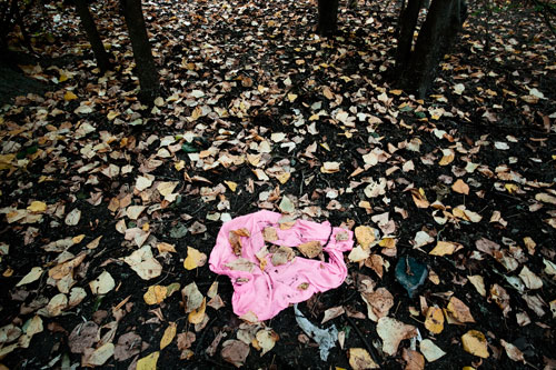
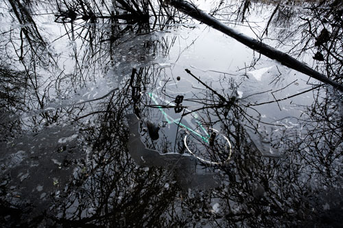
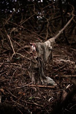
(Spring 2011)
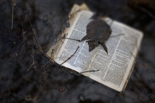
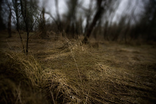
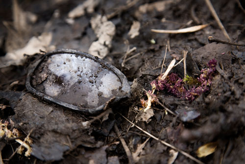
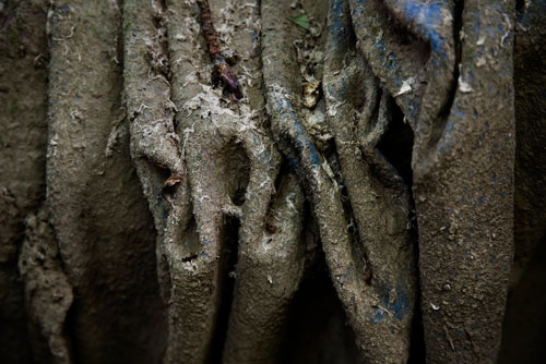
In his series “Remains”, Frank Miller finds beauty in ugliness and value in the worthless. The photographs record discarded consumer items found along the banks of the Willamette River in Salem’s Minto Brown Park, and are characterized by a startling contrast between the verdant landscape and the mundane items of trash that litter it. Far from presenting the discarded items as ugly and intrusive, Miller has photographed them with a sensitivity that borders on reverence. It is as if the act of photographing abandoned objects represents an effort to restore their value and dignity...
In his series “Remains”, Frank Miller finds beauty in ugliness and value in the worthless. The photographs record discarded consumer items found along the banks of the Willamette River in Salem’s Minto Brown Park, and are characterized by a startling contrast between the verdant landscape and the mundane items of trash that litter it. Far from presenting the discarded items as ugly and intrusive, Miller has photographed them with a sensitivity that borders on reverence. It is as if the act of photographing abandoned objects represents an effort to restore their value and dignity.
The photographs have a post-apocalyptic feeling. They give us a sense of what the world would be like if people simply disappeared from the face of the earth overnight. They are filled with a sense of absence and loss. The images present a littered and empty Garden of Eden, a skewed and dystopian paradise.
On one level Miller conducts what could be described as a visual archeology of consumerism, but on another level he invites the viewer to construct a narrative for each object that tacks its trajectory from being treasured and new to being worn and discarded. Miller reminds us that all things must end, and that endings are often intertwined with loss and sadness.
The objects Miller records with such care were at one point an intimate part of people’s lives: a private item of clothing, a cherished bible, a warm, familiar comforter, and the door of a once-beloved car. These formerly treasured objects, once used by people to define and express their individuality, are now poignantly abandoned and divorced from their original context.
Miller explains that the impetus for this series came from the experience of travelling to Cambodia on his honeymoon. He visited the meadow outside Phnom Penh where the Khmer Rouge conducted most of their executions, and was struck by the bits of clothing that protruded from the ground, which was saturated by the bones of the dead. Miller explains his experience as follows:”Wandering through all of this the horror of what had happened hit home when I found the fragments of a woman’s bright floral blouse coming out of the ground. I immediately had a mental image of this woman’s fingers moving over the clothing in a store, making the selection that she did, thinking that it made her feel happy, prettier-and then ultimately dying in it. That this bit of cloth was the only way I could know of her existence was at once sad and humiliating, and I felt useless in the face of history.”
Frank Miller is the Visual Assets Manager for Willamette University’s Office of Marketing Communications. He has worked at Willamette since 2002, providing photographs and video for various university communications. His personal work has been exhibited at the Portland Museum of Art, The Jordan Schnitzer Museum in Eugene, and the Bush Gallery in Salem. This is his first exhibition at Willamette.
-Andries Fourie

-
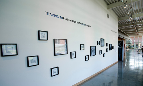
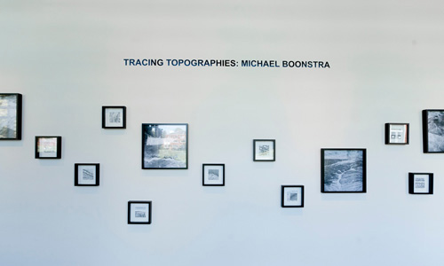
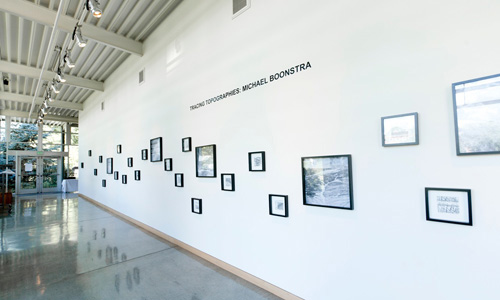
Tracing Topographies: An Installation by Michael Boonstra
(Fall 2010)
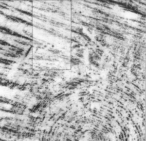
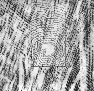
In this installation, mixed-media artist Michael Boonstra responds to the landscape of the American West in two very different, but related ways. He combines a suite of graphite drawings on paper entitled “Division Drawings: Fall Creek Tree (24 of 57 total segments) with a group of inkjet prints of aerial photographs entitled “Spending time in places I have not been... (the drawing we all are creating)”...
In this installation, mixed-media artist Michael Boonstra responds to the landscape of the American West in two very different, but related ways. He combines a suite of graphite drawings on paper entitled “Division Drawings: Fall Creek Tree (24 of 57 total segments) with a group of inkjet prints of aerial photographs entitled “Spending time in places I have not been... (the drawing we all are creating)”.
The visual language of the two bodies of work in the installation are clearly related. Formally, they both employ a narrow but nuanced black and white palette, are essentially found images, and have a shared vocabulary of grainy marks and lines combined with simple geometric forms. While the installation combines photographs with drawings, the photographs are clearly not made with the sensibility of a traditional photographer, but rather concern themselves with the visuality of drawing. Their graininess, heavy pixilation, and lack of detail aim not for clarity, but rather emulate the kind of markmaking one expects from a charcoal drawing.
The photographs are cropped and enlarged details from black and white aerial images of the western landscape. They were taken by Boonstra from a mile above the ground through the windows of commercial airliners. The images are purposely taken of landscapes that are unfamiliar to him (he has not been within 200 miles of most of the locations in the photographs). All of the images show both natural, geological features and man-made marks caused by such processes as road construction, logging, and agriculture. The organic landforms rub shoulders with the rectilinear forms defined by fenced, grazed pastures, and the large-scale circles of spindle-irrigated fields. The horizon reference is removed, and the images are blown up so that their scale becomes ambiguous.
The drawings are small sections taken from a graphite rubbing made from a 5-foot wide tree stump in a section of forest at Fall Creek in the Willamette National Forest that had been salvage-logged after a severe forest fire. This landscape, about 45 minutes southeast of Eugene, is very familiar to Boonstra, who regularly took his children to a favorite swimming hole in the forest for several years before the fire. The surface of the stump and the rubbings show both natural and man-made marks in the form of growth rings and chainsaw scars. The large rubbing was cut into square sections of uniform size in much the same way that the log was processed, divided and transformed into a saleable commodity. The process of division and the uniformity of the sections literally refer to the industrialized process employed by the lumber industry in making commercial wood products from the original tree.
The resulting drawings were then minimally and intuitively manipulated through subsequent markmaking or erasure. Geometric forms were added that are reminiscent of the man-made marks that transform parts of the natural landscape. The growth rings in the drawing could easily pass for plowed contour lines in a hillside field. The comparison between the tree’s growth rings and topographic contour lines, as well as the process of mapping is a clear reference to two very different paradigms: an intimate relationship with the landscape on a micro level, and a far less intimate relationship with the land on a continental, macro level.
While Boonstra’s installation addresses environmental issues, he does so in a subtle way that avoids the simplistic dichotomies that often typify the “man vs. nature” debate. In the drawings he is interested in observing change in a familiar old growth landscape recovering from a cataclysmic fire and subsequent logging. His primary interest in these works is specificity, process, and materiality. In the photographs he is more concerned with examining the interface between evidence of human activities and geological or organic phenomena: the marks humans have left on the landscape on a scale that is even visible from far above the planet’s surface. Boonstra sees these marks as being a kind of visual language. He takes the undeniable evidence of man’s environmental impact and transforms it into something subtle and meditative.
Andries Fourie
-
The Sordid Life of Toys: Photographs by Dennis Raines
(Spring 2010)
While we like to think of childhood as a time of innocence and adventure, it has a darker side. In childhood we fall prey to a catalogue of fears and terrors. We fear abandonment, we fear darkness, and we fear the imagined creatures under our beds. In his black and white images Raines emphasizes this side of being a child. While the photographs are beautiful, they are also dark and foreboding. The not so oblique reference to a traumatic incident in Disney’s “Bambi,” in Raines’ work “My mother is dead-finish what you started,” exemplifies this approach...
While we like to think of childhood as a time of innocence and adventure, it has a darker side. In childhood we fall prey to a catalogue of fears and terrors. We fear abandonment, we fear darkness, and we fear the imagined creatures under our beds. In his black and white images Raines emphasizes this side of being a child. While the photographs are beautiful, they are also dark and foreboding. The not so oblique reference to a traumatic incident in Disney’s “Bambi,” in Raines’ work “My mother is dead-finish what you started,” exemplifies this approach.
The photographs also seem to critique the process by which young boys are socialized to see and define themselves as masculine beings. They question the cultural construction of masculinity, and its depiction in film and popular culture. Several of the titles could easily have been appropriated straight from a Sergio Leone western, or “Dirty Harry”. By linking them with the iconography of childhood, Raines points out that we expose boys to the portrayal of an aggressive and un-nuanced masculinity from an early age.
In terms of technique and process, Raines takes these images using traditional analog photography techniques, before scanning, manipulating and then printing the images using modern digital technology. Consequently even his process is a dialogue between past and present, nostalgia and the clinical practicality of contemporary technology.
- Andries Fourie
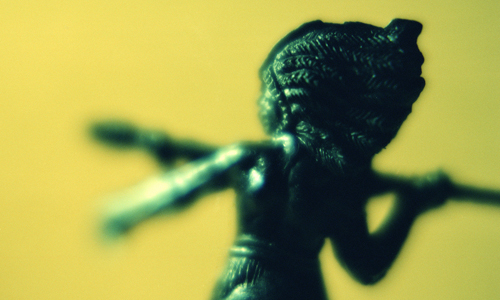
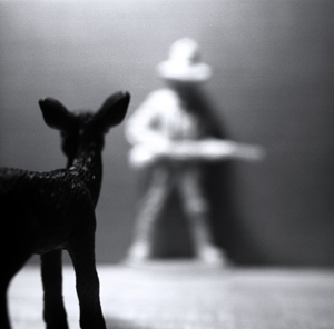
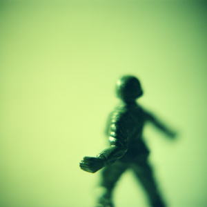
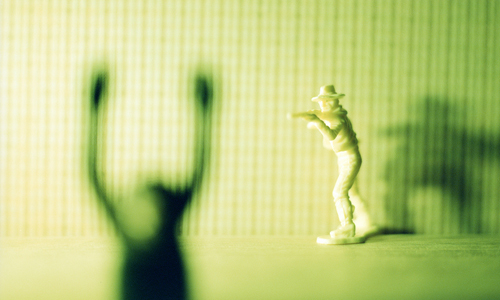
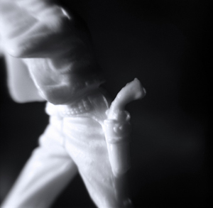
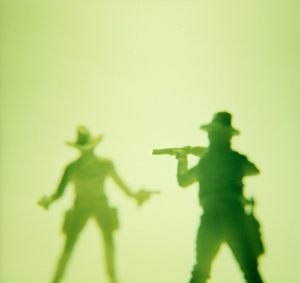
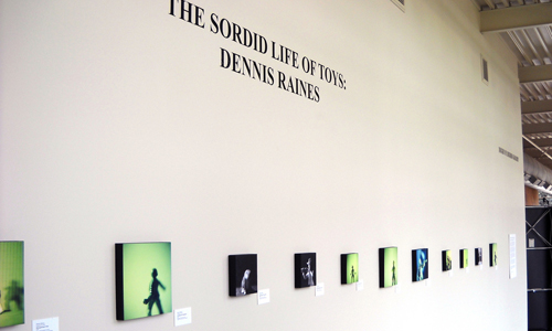
-
Tropic: New Drawings by Richard Martinez
(Fall 2009)
At first glance the latest series of drawings by Richard Martinez reads like a tempestuous and fatalistic version of the Lloyd’s shipping register, but the works gradually and subtly reveal themselves to be nuanced meditations on the nature of history and identity.
The mixed-media wet and dry drawings fix dramatic nautical scenes on a frosted but translucent surface as small, austere and minimalist silhouettes. The restrained palette and minimal treatment seem to deny the inherent romanticism and drama of shipwrecks, voyages of discovery and an elemental struggle against the violence of storms. It’s as if these seascapes are rendered in a way that embodies the clash between J.M.W. Turner’s paintings of ships outlined against golden, turbulent skies, and the ascetic minimalism of a work by Donald Judd. The tension between heroic, dramatic subject matter, and cool, formalist execution seem to argue that history is more complicated than any one perspective or depiction might suggest...
At first glance the latest series of drawings by Richard Martinez reads like a tempestuous and fatalistic version of the Lloyd’s shipping register, but the works gradually and subtly reveal themselves to be nuanced meditations on the nature of history and identity.
The mixed-media wet and dry drawings fix dramatic nautical scenes on a frosted but translucent surface as small, austere and minimalist silhouettes. The restrained palette and minimal treatment seem to deny the inherent romanticism and drama of shipwrecks, voyages of discovery and an elemental struggle against the violence of storms. It’s as if these seascapes are rendered in a way that embodies the clash between J.M.W. Turner’s paintings of ships outlined against golden, turbulent skies, and the ascetic minimalism of a work by Donald Judd. The tension between heroic, dramatic subject matter, and cool, formalist execution seem to argue that history is more complicated than any one perspective or depiction might suggest.
The decision to paint on Duralar, a translucent and to some degree transparent medium, is no accident. Transparency evokes impermanence and fragility and calls to mind the mechanisms of memory and history, which allow us to view the present through the filter of the past. Formally, the frosted medium creates a lucid membrane on which forms are silhouetted crisply while they seem to be suspended in space in the same way that specific events and memories float in the ether of time. Duralar is also the material that blueprints are printed on. This is fine example of meaningful materiality, since our view of history provides a blueprint for our understanding of the present.
Martinez also addresses the complicated dynamics of identity in these works. He seems to suggest that to be Hispanic in America often means to be aware of the two great cultural influences that shape your identity: the richness of indigenous American culture rooted in the soil which you came from, and the genetic and cultural influence of the Europeans who came to the new world in their sailing ships (the age’s equivalent of weapons of mass destruction and the vehicle of globalization’s early manifestation). The conquest of the continent, brutal and catastrophic though it was for the indigenous peoples, left its cultural and genetic traces in their descendents to such an extent that to separate the indigenous from the introduced would mean the loss of half of one’s identity.
Given this context, Martinez’s treatment of the nautical images is intentionally and understandably ambiguous. The silhouetted ships become ciphers on which the viewer can project his or her own view of the events and ideas presented. Although the works are undeniably beautiful and elegant, there is also something ominous about the darkly silhouetted ships. Martinez seems to delight in the hybridity that comes from creating a work of art that is the product of examining an idea from a multiplicity of aesthetic, historical and cultural perspectives.
Richard Martinez teaches painting at The University of Texas at San Antonio. He received his BA from Southern Oregon University and his MFA from The University of California, Davis. His work has been exhibited in Texas, Oregon, Florida and California
- Andries Fourie